Worst Map Ever Contender: Lord of the Rings Online
![]()
I recently started playing Lord of the Rings Online (also known as LotRO), an MMO from Turbine that was originally released way back in 2007. Fully disclosure, I don’t have very much experience with MMOs - I played a little bit of the first Guild Wars back in the day, but I didn’t get real far.
I do, however, have a lot of experience whining about world maps! See posts on Final Fantasy XIII, Mass Effect 2, Borderlands 2, The Witcher 2, and even one on different ways to access the world map. Despite the game originally coming out 6 years ago, I’m still nominating Lord of the Rings Online to have the worst world map ever.
I’ve limited myself to three major beefs with this map:
- The quest markers are barely visible
- Places that are zoom-able aren’t labeled at all
- The various hint texts on the map aren’t consistently located, and zooming out isn’t real intuitive without it
Let’s have a look at the map first:
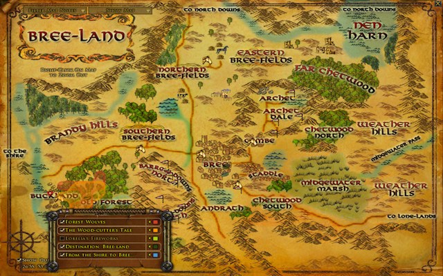
Beef 1: Quest Markers
In LotRO, there are a wide variety of usability issues with quests (that we won’t go into here), so it makes sense that they persist here to the map. In the game, the player can be tracking only five quests at once, which can be seen in the box that’s sitting on top of the lower left part of the map. On the actual map, there are tiny rings that represent where each quest takes place, or an area of color, depending on what type of quest it is.
So you probably noticed the red and orange areas right above the quest box. That’s not too hard to pick out. But there are two rings located in the town of Bree. Can you spot them? Okay, now, can you actually identify which one is blue, and which one is dark green? Yeah good luck.
The map itself is a little busy, so putting these extremely dull and hard to pick out rings on top of it is a terrible idea. Hovering over one of the quests makes the rings on the map very gently pulsate - from what you’re seeing in the screenshot to nearly translucent. Right, so they managed to build in an animation that makes it EVEN HARDER to spot where the quests are. Okay, maybe that’s an exaggeration - I appreciate their effort. A better way might be to have a glow pulsate around the quest marker instead?
The idea for fixing this isn’t complicated - just make the rings easier to see. Heck, put some giant arrows pointing at the ring if you’re hovering over the quest title, that would be great.
Beef 2: Secret Detailed Maps
There are a lot of maps in this game, which I do appreciate. But LotRO doesn’t make it obvious what areas are covered in a more detailed map. Hovering over areas of the map sometimes reveals some crosshairs, indicating there’s more map to be found. Check it out, in the lower-right side of this map:
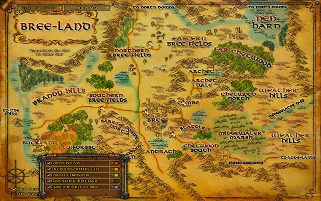
In the lower-right side, you’ll see the crosshairs along with a little tooltip with the location. Most of the time, these expanded maps are in big cities. Like Bree, in the center of the map - there’s another map for those details. But this one that I’m hovering over in this screenshot is essentially a random section of map. There’s no information scent here to let people know there might be something else to look at.
Of course, pointing at it with your mouse isn’t exactly uncommon. Still, an icon or different styled text or dotted outline would make me happier about this.
Beef 3: Zooming Out and Inconsistent Labeling
Zooming out on the map is performed by right clicking on the mouse. It’s one of those things that makes sense (zoom in with a left click, zoom out with a right click), but wasn’t immediately intuitive for me. And the map does tell you to right click to zoom out. But that help text is in a different spot on each map. See this map of Bree:
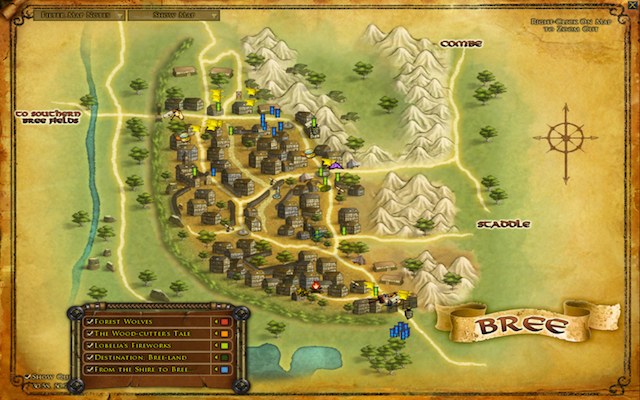
While the active quest box is in the same spot, the map title, zoom out help text, and compass rose are all in different spots here. Sure, this is probably a little bit more thematic. But it also introduces a problem where your quest tracker could be covering any of these things. And having that help text moving around on each page just looks goofy.
I’d rather see a corner (or two) dedicated to consistently displaying this information. And, a dedicated back/up navigation button. Clearly, I’m not the only person who hasn’t immediately figured out how to go back a level, since there’s a sentence dedicated to that help text on every map.
The quest tracker can be hidden, if you just want to look at the map. I wonder how frequently the maps are used in this way? Being a new player, I’m not sure. Regardless, making the quest tracker movable feels like the developers are just offloading the task of fitting everything on the screen to the player. That’s usually not a good thing. Especially in a case like this, where you know there can only be five items, that’s a problem that should have been solved already. If it was a hugely variable number, it might be a different story. But it’s not.
Conclusion
And that’s just the world map. The mini-map in this game introduces its own level of frustration, but that’s another post for another day.
As I said in the beginning of this article, I have very little experience with MMOs. How do world maps compare in other MMOs? I know there are some seriously gigantic worlds out there, can anybody chime in with better/worse experiences? What would you nominate for the worst map ever? Lets discuss in the comments!