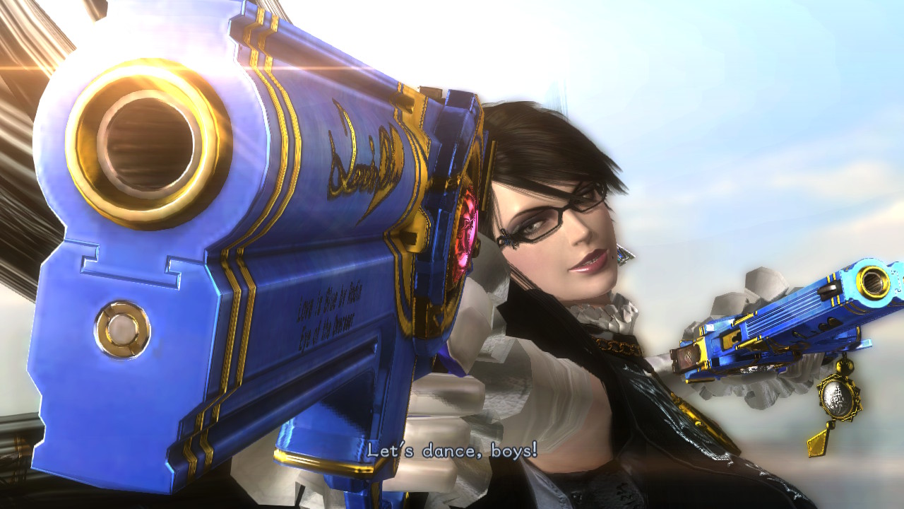
<?xml version="1.0" encoding="utf-8"?><feed xmlns="http://www.w3.org/2005/Atom" ><generator uri="https://jekyllrb.com/" version="3.9.5">Jekyll</generator><link href="http://www.thatgamesux.com/feed.xml" rel="self" type="application/atom+xml" /><link href="http://www.thatgamesux.com/" rel="alternate" type="text/html" /><updated>2024-02-17T21:44:32+00:00</updated><id>http://www.thatgamesux.com/feed.xml</id><title type="html">That Game’s UX</title><subtitle>Because gamers are users too</subtitle><author><name>Mark DeHate</name></author><entry><title type="html">Bayonetta 2: Saving Me a Trip to Wikipedia</title><link href="http://www.thatgamesux.com/bayonetta-2-saving-me-a-trip-to-wikipedia" rel="alternate" type="text/html" title="Bayonetta 2: Saving Me a Trip to Wikipedia" /><published>2018-08-20T00:00:00+00:00</published><updated>2018-08-20T00:00:00+00:00</updated><id>http://www.thatgamesux.com/bayonetta-2-saving-me-a-trip-to-wikipedia</id><content type="html" xml:base="http://www.thatgamesux.com/bayonetta-2-saving-me-a-trip-to-wikipedia"><![CDATA[<p><img src="images/bayonetta2-letsdance.jpg" alt="Bayonetta pointing a large gun very close to the camera with the caption &quot;Let's Dance, Boys&quot;" /></p>
<p>For most games, as soon as I see the credits roll, I immediately grab my phone and go to Wikipedia to read the summary of the game’s plot. I’ve got to be honest here, I’m always <em>somewhere</em> on the confusion spectrum. Occasionally I have no idea what happened - I’m looking at you Final Fantasy XV - but usually it’s a point or two that I may have missed.</p>

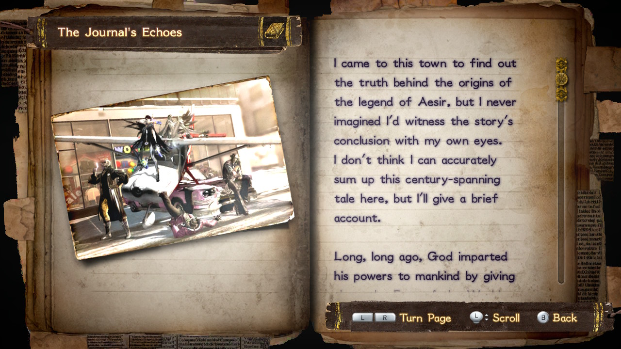
<p>I just wrapped up Bayonetta 2, and I was pleasantly surprised to see they at least tried to save me the trip. In Bayonetta 2 you gather up lore books as you progress through the levels, written from the POV of a journalist. Upon completing the story, you get one more entry automatically added for you that contains a recap of the game’s plot.</p>

<p><img src="images/bayonetta2-book.jpg" alt="Partial journal entry in Bayonetta 2 displaying a summary of the game's plot" /></p>

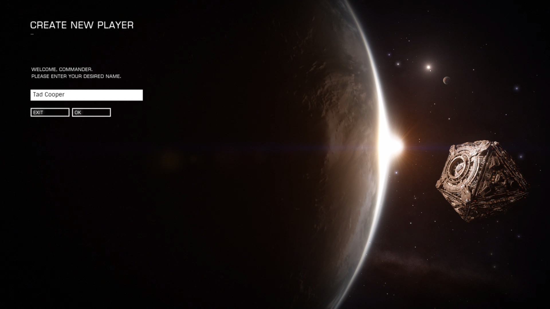
<p>Of course, I didn’t notice this until after I returned from Wikipedia, but in any case I appreciate the developers being realistic about gamers like myself who may have lost track of what’s going on in the story along the way!</p>]]></content><author><name>Mark DeHate</name></author><category term="action" /><category term="console" /><category term="bayonetta" /><category term="game-experience" /><category term="plot" /><category term="user-experience" /><category term="ux" /><summary type="html"><![CDATA[]]></summary></entry><entry><title type="html">Elite: Dangerous: Can I Change My Name?</title><link href="http://www.thatgamesux.com/elite-dangerous-can-i-change-my-name" rel="alternate" type="text/html" title="Elite: Dangerous: Can I Change My Name?" /><published>2017-12-17T00:00:00+00:00</published><updated>2017-12-17T00:00:00+00:00</updated><id>http://www.thatgamesux.com/elite-dangerous-can-i-change-my-name</id><content type="html" xml:base="http://www.thatgamesux.com/elite-dangerous-can-i-change-my-name"><![CDATA[<p>I picked up <a href="http://store.steampowered.com/app/359320/Elite_Dangerous/">Elite: Dangerous</a> recently in a Steam sale, as it’s a game I’ve threatened to get excited about for a while now. Upon booting it up the first time, I found one of the most difficult decisions facing me: what to name my character. And Elite: Dangerous leaves out some pertinent information that would help inform that decision.</p>

<p><img src="images/20171217171958_1.jpg" alt="" /></p>
<blockquote>
  <p>Commander Tad Cooper, I believe in you</p>
</blockquote>

<p>Naming characters is always something I struggle with - you know, I want it to be witty, but not something I’m going to regret later. And this decision is made worse in situations like these, because Elite: Dangerous doesn’t give the player enough information about how weighty this decision actually is.</p>

<p>Mainly, <strong>can you change your character name</strong> later, when you’re in the shower and come up with that perfect name? If the name can be changed later, this greatly reduces the amount of time I’ll sit and ponder - even if there’s a fee associated, or some kind of time limit, knowing that up front makes a big difference.</p>

<p>Some other questions (that are less relevant in this example, a clearly massively multiplayer game) include, 1) how important is your name? In games like Diablo 3, you can’t change your character name, but it also really doesn’t matter much throughout the game. And 2) does this name have to be unique? If it does, that already makes the player think differently about what the possible names are.</p>

<p>For me, the start of my Elite: Dangerous career was delayed a few minutes while I hopped on my phone and googled what the parameters of this name is. I learned that <a href="https://support.frontier.co.uk/kb/faq.php?id=69">no, you can’t change your name in Elite: Dangerous</a> unless you contact their support team (although they do suggest you can delete your save and start over, which uhhh, I suppose is true). Also <a href="https://www.reddit.com/r/EliteDangerous/comments/57z32w/commander_name_suggestion/">this reddit thread</a> suggests the initials of your name are used as an identifier, which would <em>totally</em> be valuable to know when naming my character.</p>

<p>These small facts would be <em>wonderful</em> to stick on this giant “name your commander” screen to help direct new players, and streamline their decision process.</p>]]></content><author><name>Mark DeHate</name></author><category term="action" /><category term="pc" /><category term="first-time-users" /><category term="game-usability" /><category term="gamesux" /><category term="steam" /><category term="usability" /><category term="user-experience" /><category term="ux" /><summary type="html"><![CDATA[I picked up Elite: Dangerous recently in a Steam sale, as it’s a game I’ve threatened to get excited about for a while now. Upon booting it up the first time, I found one of the most difficult decisions facing me: what to name my character. And Elite: Dangerous leaves out some pertinent information that would help inform that decision.]]></summary></entry><entry><title type="html">WWE SuperCard: Onboarding</title><link href="http://www.thatgamesux.com/wwe-supercard-onboarding" rel="alternate" type="text/html" title="WWE SuperCard: Onboarding" /><published>2014-09-11T00:00:00+00:00</published><updated>2014-09-11T00:00:00+00:00</updated><id>http://www.thatgamesux.com/wwe-supercard-onboarding</id><content type="html" xml:base="http://www.thatgamesux.com/wwe-supercard-onboarding"><![CDATA[<p><img src="images/wwe-supercard-logo-300x163.png" alt="wwe supercard logo" /></p>

<p>When I heard there was a digital CCG coming out in the WWE universe…I was confused more than anything. After hearing that WWE SuperCard (<a href="https://itunes.apple.com/us/app/wwe-supercard/id775402833?mt=8">iTunes</a>, <a href="https://play.google.com/store/apps/details?id=com.catdaddy.cat22&amp;hl=en">Play</a>) <a href="http://www.joystiq.com/2014/08/25/wwe-supercard-superkicks-1-5-million-downloads/">was downloaded 1.5 million times</a> in the first week and a half of being available, I knew I had to give it a shot (for science!). After two days and some sore thumbs, I can see why it’s so popular.</p>

<p>But before a CCG can start hooking players into that sweet, sweet drip of new cards, it has to get players in the game first. Lets take a look at what all of those 1.5 million players had to get through before their first match in WWE SuperCard!</p>

<h2 id="1-title-screen">1) Title Screen</h2>
<p><img src="images/menu-225x300.png" alt="menu" /></p>

<p>The game starts out like so many others with a title screen that doesn’t offer much. This is where the Options menu lives.</p>

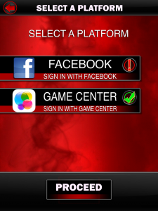
<h2 id="2-select-platform">2) Select Platform</h2>
<p><img src="images/1-select-platform-225x300.png" alt="1-select platform" /></p>

<p>Here, the onboarding process starts officially with the account creation process. I’m not sure what the Android version looks like, but the iOS version offers Facebook and Game Center logins. Having a Game Center login is really awesome, because that means I basically never have to login again, AND I don’t have to create another one-off account that I need a password for.</p>

<p>Of course, I need Game Center to work reliably, which maybe is a sketchy proposition. But for the moment, it’s working out just fine.</p>

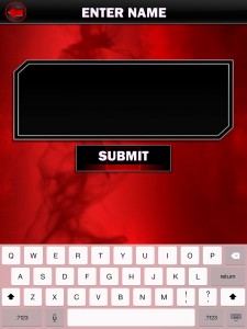
<h2 id="3-enter-name">3) Enter Name</h2>
<p><img src="images/2-enter-name-225x300.jpg" alt="2-enter name" /></p>

<p>Here, WWE SuperCard very ambiguously asks for a name. This is one of those situations where I’d like a little bit more information before I can confidently put an answer in the box. In the context of a CCG, is the game really asking for my actual name, or is it more of a handle/username? Can I change it later? All questions that make me a little nervous about what to put in the box.</p>

<p>Okay, this isn’t a huge deal. But it’s definitely something that caused me to think twice.</p>

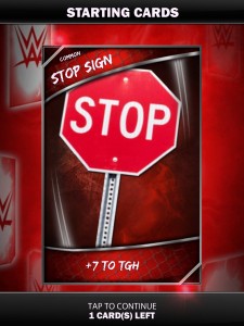
<h2 id="4-starting-cards">4) Starting Cards</h2>
<p><img src="images/3-starting-cards-225x300.jpg" alt="3-starting cards" /></p>

<p>At this point, WWE SuperCard makes like its name and gives you a starting deck of cards. It’s a bit of a slow process - each card in your deck is displayed one at a time, with a bit of an explosion, and a zooming in animation. This level of drama probably makes sense - this is a card battling game after all, and your deck is the entire point. But at the same time it’s a little weird, because as the cards flash onto the screen, none of the stats are really meaningful to the player quite yet, so it’s hard to know what to make of what you’re seeing.</p>

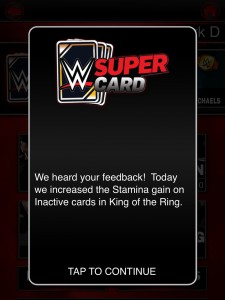
<h2 id="5-message">5) Message</h2>
<p><img src="images/4-message-225x300.jpg" alt="4-message" /></p>

<p>After this, I was presented with a message talking about some change in the game. This means absolutely nothing to me as a first-time player, and is entirely unnecessary. Whatever kind of message the game is sending, it sure doesn’t seem worth interrupting a new player before they have even gotten started.</p>

<h2 id="6-main-menu">6) Main Menu</h2>
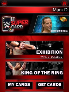
<p><img src="images/5-main-menu-225x300.jpg" alt="5-main menu" /></p>

<p>And finally, the game’s main menu appears. There are only a couple of things to do here, though the game doesn’t ever help the player figure out what to do next. Both the Exhibition and King of the Ring modes do have good tutorials once you get into them, thankfully. But picking one the first time though, is definitely a leap of faith.</p>

<p>Side note: If you stick the Options menu on this screen, you have no need for a title screen. Why does every game need a useless title screen? I don’t know.</p>

<h2 id="conclusion">Conclusion</h2>

<p>I think the onboarding process in WWE SuperCard is fairly mediocre, usability-wise. Sure it could use a few touch-ups, but overall it’s at least not offensive (remember <a href="http://thatgamesux.com/madden-nfl-13-social-a-terrible-first-impression/">Madden 13 Social</a>?). The actual card-battling mechanic is both extremely simple and fairly engaging, but that’s another topic for another post.</p>

<p>Now if you’ll excuse me, I have some cards to level up…</p>]]></content><author><name>Mark DeHate</name></author><category term="card-board" /><category term="casual" /><category term="mobile" /><category term="android" /><category term="ios" /><category term="mobile-2" /><category term="onboarding" /><category term="wwe" /><summary type="html"><![CDATA[]]></summary></entry><entry><title type="html">Hearthstone: That New Card Smell</title><link href="http://www.thatgamesux.com/hearthstone-new-card-smell" rel="alternate" type="text/html" title="Hearthstone: That New Card Smell" /><published>2014-08-05T00:00:00+00:00</published><updated>2014-08-05T00:00:00+00:00</updated><id>http://www.thatgamesux.com/hearthstone-new-card-smell</id><content type="html" xml:base="http://www.thatgamesux.com/hearthstone-new-card-smell"><![CDATA[<p><img src="images/Hearthstone_Logo.png" alt="Hearthstone_Logo" /></p>

<p>Blizzard’s <a href="http://us.battle.net/hearthstone/en/">Hearthstone</a> (full name, Hearthstone: Heroes of Warcraft) is a digital collectible card game that’s currently out on Mac, PC, and iPad. The obvious comparison is to the biggest CCG around, Magic: The Gathering. While MTG is a physical game that also has a digital component, Hearthstone is a purely digital game, designed to be purely digital. That poses both interesting challenges and opportunities.</p>

<p>Being a <em>collectible</em> card game, a huge hook of both of these game is of course, getting new cards. A recovering former MTG player myself, there is nothing quite like the experience of opening a new booster pack of cards. And while Hearthstone doesn’t reproduce that new card smell, it does go out of its way to try and evoke the same feelings as the real thing.</p>

<p>Opening a fresh booster pack is always a ton of fun - from baseball cards to Magic: The Gathering to even this random <a href="http://www.cardboardconnection.com/2009-topps-heritage-american-heroes">Topps American Heritage</a> series that I spotted at Best Buy a while back (I scored a combo Lincoln/Obama card once!). There’s so much potential in each wrapper! In a CCG, it’s not just the thrill of hunting a rare and/or valuable card, each new card also presents a bit of new strategy that expands your game.</p>

<p>So, packs of cards are great. But in a digital game like Hearthstone, there’s no physical counterpart to the wonder of unwrapping that sealed pack. Thankfully, Blizzard took the time to make this interaction actually meaningful, and recreate some of that suspense.</p>

<p>That suspense means there are thousands of videos on YouTube of players opening packs of cards. Here’s a quick one to give you a rundown of the opening process:</p>

<iframe width="560" height="315" src="https://www.youtube.com/embed/cBDaxdMmTFM?si=BjbzQ3FecE-HuygO" title="YouTube video player" frameborder="0" allow="accelerometer; autoplay; clipboard-write; encrypted-media; gyroscope; picture-in-picture; web-share" allowfullscreen=""></iframe>

<p>Let’s walk through this interaction.</p>

<h2 id="step-1-drag-pack-to-center-of-the-circle-with-explosions">Step 1: Drag pack to center of the circle, with explosions</h2>

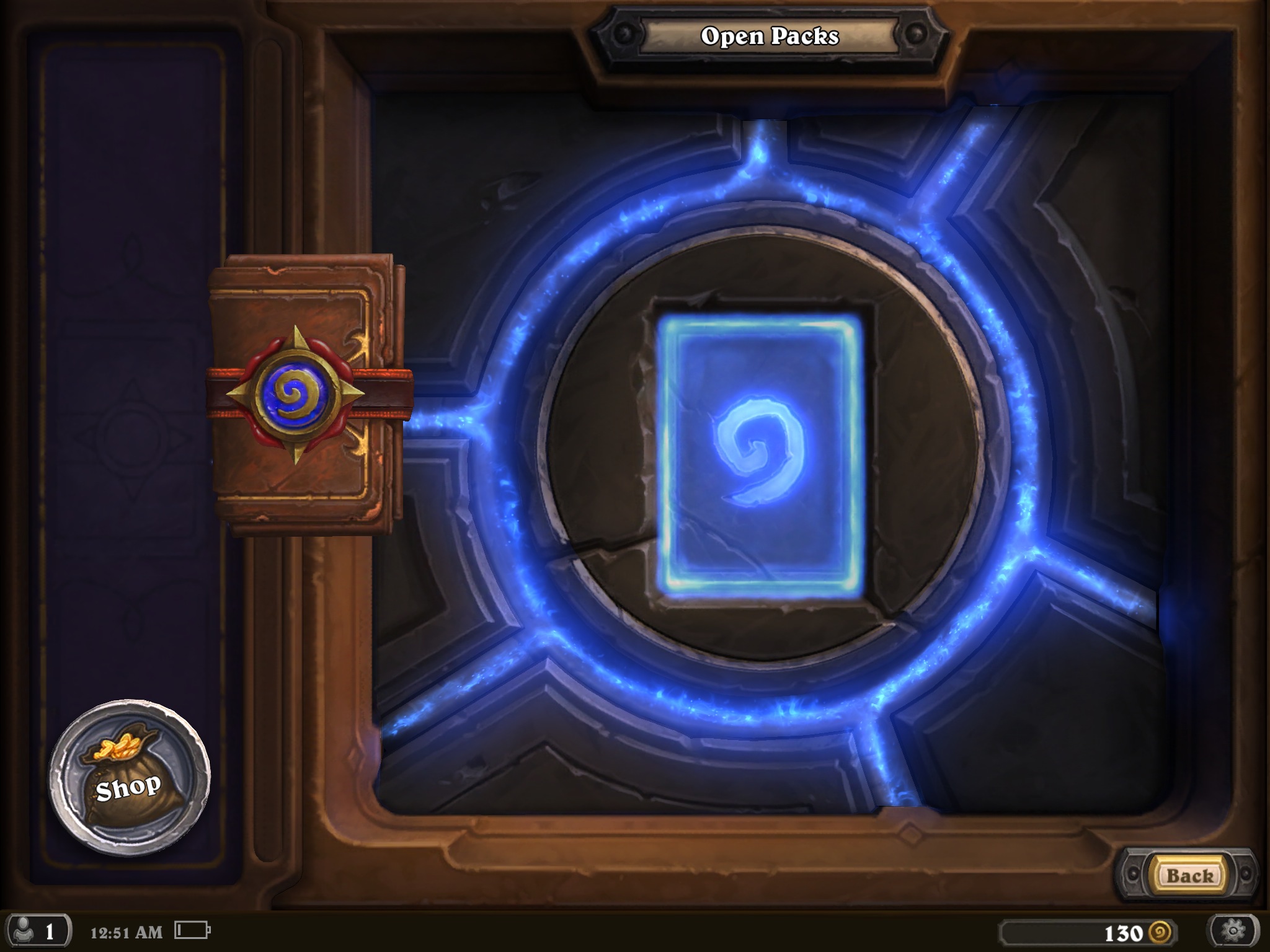
<p><img src="images/IMG_0021.jpg" alt="A sealed Hearthstone booster pack, ready to be opened" /></p>

<p>Unopened booster packs are on the left side of the screen, and there’s a large glowing rectangle in a big circle. The icon on the pack matches the icon in the rectangle, plus the giant blue glow leaves no doubt as to what’s supposed to happen here. The screenshot shown here is from the iPad version, where I’m mid-drag.</p>

<p>Dropping the card on the center then <strong>explodes</strong> the pack, revealing the cards inside in a face-down circle.</p>

<h2 id="step-2-hoverover-cards">Step 2: Hover over cards</h2>

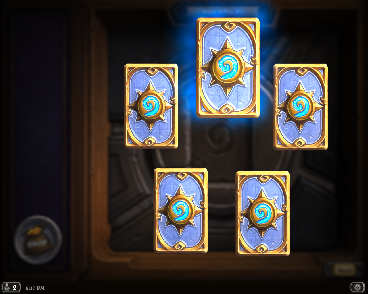
<p><img src="images/Pack_SS_6.jpg" alt="Five face-down Hearthstone cards, with a rare being hovered over" /></p>
<blockquote>
  <p>source: <a href="http://hearthstone.gamepedia.com/Card_pack">http://hearthstone.gamepedia.com/Card_pack</a></p>
</blockquote>

<p>From here, hovering over the back of each card (or a tap-and-hold on the iPad) causes the card to glow according to the rarity. So the player gets a little hint of how lucky this pack actually is before they choose to view the cards. Everybody seems to have their own ritual - some just pause on each card before flipping, others investigate each card and then flip in order of rarity, and others don’t worry about it and just immediately flip.</p>

<h2 id="step-3click-on-each-card-with-explosions">Step 3: Click on each card, with explosions</h2>

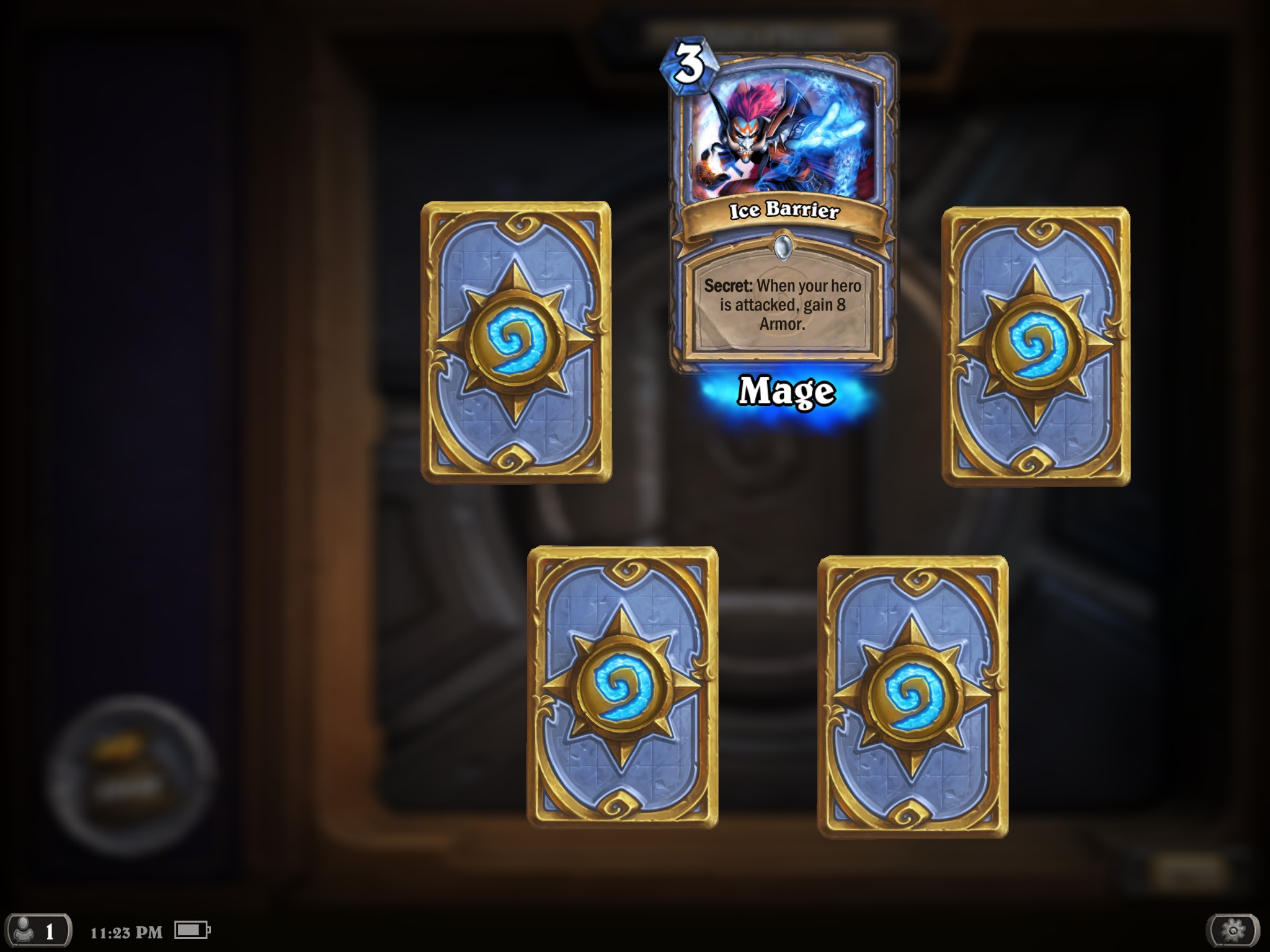
<p><img src="images/IMG_0015.jpg" alt="IMG_0015" /></p>

<p>Then of course, the moment of truth - clicking on the card to flip it over. And as if you weren’t excited enough, as rarity increases, so does the quality of the explosion that flips the card over. I mean, it makes sense - those legendary cards are sure heavy.</p>

<h2 id="conclusion">Conclusion</h2>

<p>Blizzard goes out of their way here - all of these extras make it a little more special each time that a pack is opened. The interaction was really well thought out, and it’s a great example of how the most efficient process isn’t always the most meaningful one. They don’t feel forced either - while it’s not exactly like the real-world counterpart of opening a booster pack, it doesn’t feel like the player is forced to jump through unnecessary hoops. Each step in the process is both fast and satisfying.</p>

<p>Of course, it’s critical to mention that Blizzard isn’t exactly doing this out of the kindness of their hearts, or due to a takeover by their UX department. Booster packs aren’t free; they are the primary way that players spend money on Hearthstone. If I just spent $1.99 to see five cards immediately pop-up on my screen, I wouldn’t be nearly as inclined to drop another two bucks.</p>

<p>If you’re looking to maximize the value that players get from your game’s purchases, it’s never going to hurt to add in a little extra fun. After all, those explosions make a big difference in making me feel like I’m getting a little more <em>bang</em> for my buck.</p>]]></content><author><name>Mark DeHate</name></author><category term="card-board" /><category term="casual" /><category term="mobile" /><category term="pc" /><category term="sim" /><category term="card-games" /><category term="game-experience" /><category term="ipad" /><category term="ux" /><summary type="html"><![CDATA[]]></summary></entry><entry><title type="html">MLB 14 The Show: Menu Usability Misses</title><link href="http://www.thatgamesux.com/mlb-14-show-menu-usability-misses" rel="alternate" type="text/html" title="MLB 14 The Show: Menu Usability Misses" /><published>2014-06-05T00:00:00+00:00</published><updated>2014-06-05T00:00:00+00:00</updated><id>http://www.thatgamesux.com/mlb-14-show-menu-usability-misses</id><content type="html" xml:base="http://www.thatgamesux.com/mlb-14-show-menu-usability-misses"><![CDATA[<p>Console baseball games are few and far between these days. <a href="https://en.wikipedia.org/wiki/MLB_14:_The_Show">MLB 14: The Show</a> is the latest entry in the Sony-produced series, and basically the only option for fans of baseball sims. It’s one of the first sports games to come out on the next-gen console generation (the PS4 in this case), and accordingly, it’s graphically quite sexy. If you’ve ever paid attention, crowds in sports games have been laughably terrible for a long time, so I’m excited to see some much-needed diversity in crowd animations.</p>

<p>Anyway, being a sim-style sports game, there are a ton of modes to choose from, and of course, an equal number number of menus to go through. I started playing through the Road to the Show mode, which has me creating and controlling a lowly minor league ballplayer. Playing through games earns experience, allowing me to build up my minor leaguer’s stats, and waiting for that call-up to the majors.</p>

<p>Along the way, MLB 14 has some difficulties in the way of usability. I almost expect it at this point - that these big sim-style sports games have terrible menus - but that doesn’t make it any better.</p>

<h2 id="press-option-toenter">Press Option to Enter</h2>

<p><img src="images/title.jpg" alt="MLB® 14 The Show™_20140510001453" /></p>

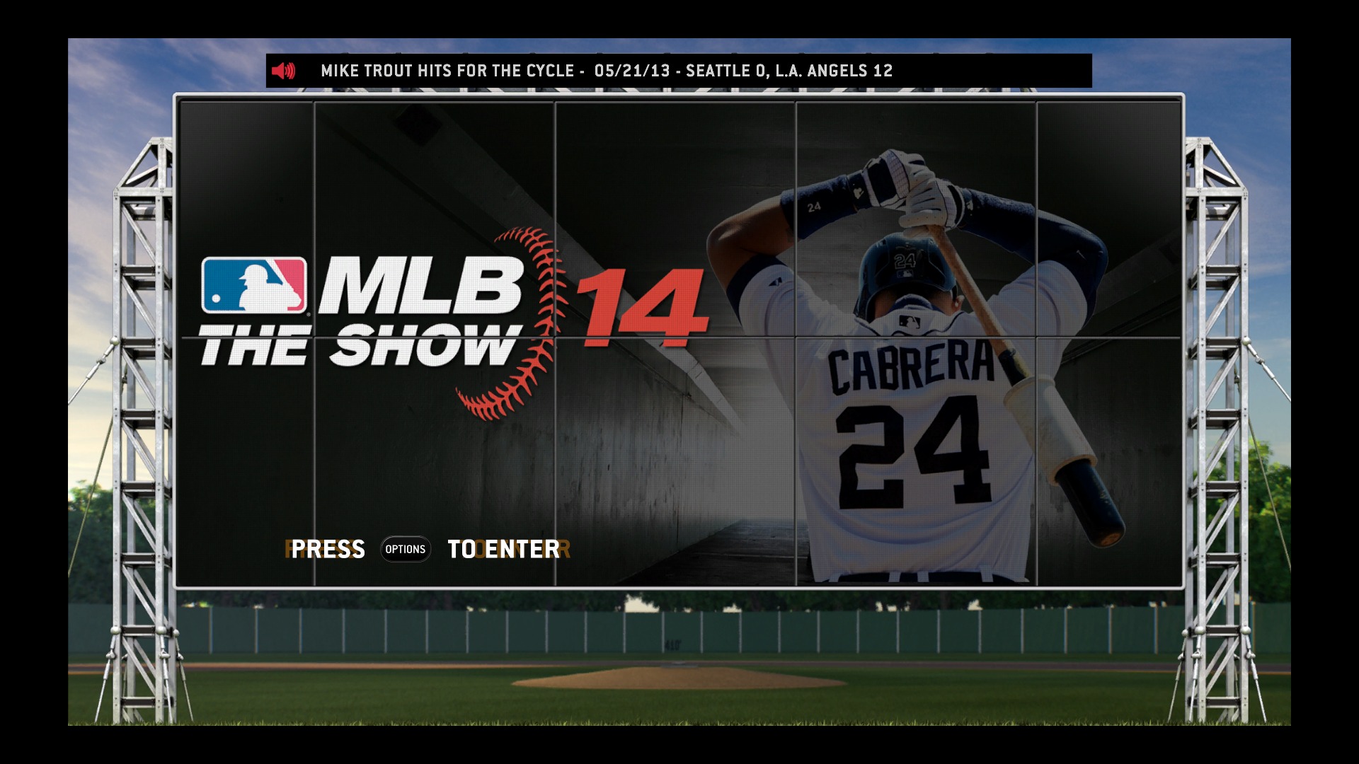
<p>Title screens. I’ve complained about <a href="http://thatgamesux.com/title-screens-because-you-arent-done-waiting-just-yet/" title="Title Screens: Because You Aren’t Done Waiting Just Yet">how useless these are before</a>, and this one is no different, so I’ll make it brief. Load times are really long in MLB 14: The Show, so after waiting a long time to get to the title screen, I have to press a button, then wait some more for the real menu to load. It’s dumb. Just take me to the menu.</p>

<p>Okay, something new - lets talk about the “Options” button. On the PS4’s DualShock 4 controller, the Start button has disappeared, and instead, games seem to be using “Options” in its place. The Options button is vaguely in the same <em>physical</em> place as the old Start button was. But it’s called “Options”. Would it make more sense to use a more abstract button - like “X” or “O” for example - to commence games? Or just use “press any button”? Why even specify? This is interesting to me; I might have to do some more research on how widespread using the Options button for decidedly-not-accessing-options is actually becoming.</p>

<h2 id="naming-the-roster-save-file">Naming the Roster Save File</h2>

<p><img src="images/roster-save-name.jpg" alt="MLB® 14 The Show™_20140510001519" /></p>

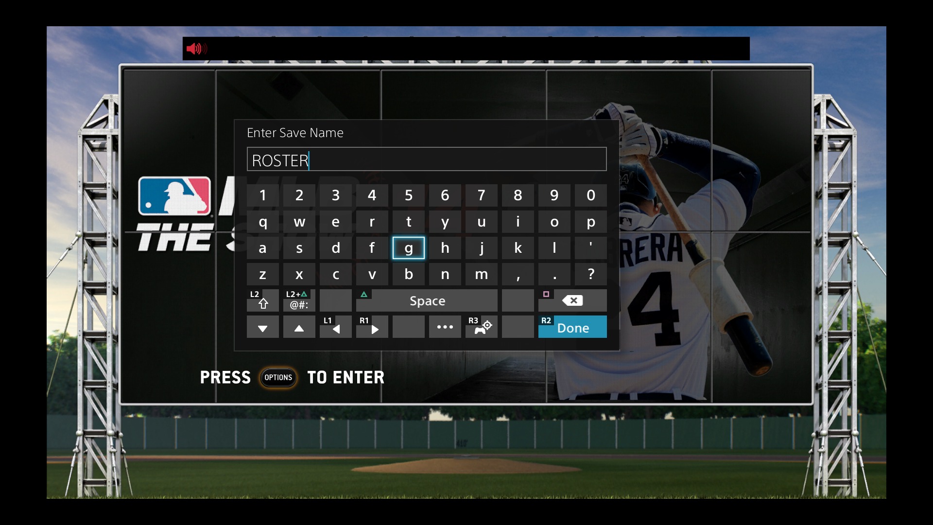
<p>It’s fairly common for games to ask the user to name some kind of save file. I’m guessing that the majority of the time, nobody ever needs to change the default name. Either it’s named well enough by default, or you’ll never have more than one of them. If you happen to have two gamers in the same household, sharing the same console, I can definitely see the use case there of changing the name of your save file.</p>

<p>However, what I don’t see the use case for, is renaming the MLB roster update file. Periodically MLB 14: The Show will ask the user to download a new, updated roster file that matches the current MLB rosters. It’s treated just like any other save file - so the user is asked to name it. And I always save over the last roster file, and it always asks me to confirm that I’m overwriting it, which always makes me nervous that I’m accidentally saving over the wrong thing.</p>

<p>I would love it if the game would do some hand waving and take care of this behind the scenes. Here’s how this interaction should go:</p>

<p><strong>The Game</strong>: Hey there’s a new roster update <strong>Me</strong>: Okay, please install it <strong>The Game</strong>: Great! &lt;downloading, installing&gt; It’s ready now!</p>

<p>If you’re saving a custom roster file, I get it - for sure, you want to name that. If you’re renaming the Boston Red Sox to match your local FOX news anchors, I get that you don’t want to accidentally lose all that work. But for normal MLB updates, it doesn’t need to be as hard.</p>

<p><strong>Mandatory Installation</strong></p>

<p><img src="images/install-crop.jpg" alt="MLB® 14 The Show™_20140510001733" /></p>

<p>This is a tiny indicator in the upper-left corner of the main menu[/caption]</p>

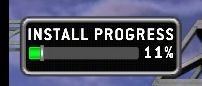
<p>Finally, I’m in the game’s main menu. What the game doesn’t tell you, is that there’s a mandatory installation that has to take place before you can do anything. You can troll around the menus, but not actually play the game. This is interesting - would I rather just sit at a blank installation screen with just a progress bar? Probably not. So I appreciate the effort here.</p>

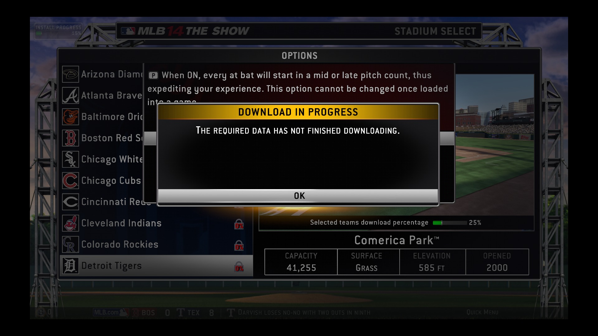
<p>Two things though - first, it took me a while to figure out what was going on. I totally missed the tiny indicator in the above picture, and instead, as I tried to start a game, I got the following message:</p>

<p><img src="images/not-finished-downloading.jpg" alt="MLB® 14 The Show™_20140510002215" /></p>

<p>“The required data has not finished downloading” really had me confused. I had purchased the disc copy of the game, what does this mean? A more straightforward message - oh you know, like anything that actually mentions the installation that’s going on - really would have helped.</p>

<p>The second thing - in that screenshot above, I’m picking what stadium to play in. Each stadium has a lock next to it, indicating it’s not ready yet, along with a download percentage. However, you can’t prioritize which stadium to download first. So…theoretically, I think you could find one that’s downloaded and play there. But if the game knows what teams I want to play with and in what stadium…prioritize the installation of those assets.</p>

<p>I didn’t time the total installation time, because I was literally falling asleep in my chair waiting for the game to install. I’ve heard in the neighborhood of an hour though - so long enough that prioritizing things to install would be legitimately helpful.</p>

<h2 id="demo-mode--long-load-times--sadness">Demo Mode + Long Load Times = Sadness</h2>

<p>Once everything is installed, don’t linger on that main menu for too long. Because if you do, MLB 14: The Show will kick you into a demo mode where the computer is playing itself. Demo modes are generally unhelpful, but the load times involved here ratchet up the annoyance. It takes about 60 seconds to load a game - so that means you need to wait 60 seconds before pressing a button to get back to the main menu. Thankfully getting back to the main menu is much shorter (maybe 15 seconds).</p>

<p>Regardless, I have no idea why the demo mode exists in the first place, and it only causes me sadness. Although, I will give the game a small thumbs because while in the demo, you can press Option to take over one of the teams. I don’t know why you’d do this. But it’s something.</p>

<h2 id="my-naming-operation">My Naming Operation</h2>

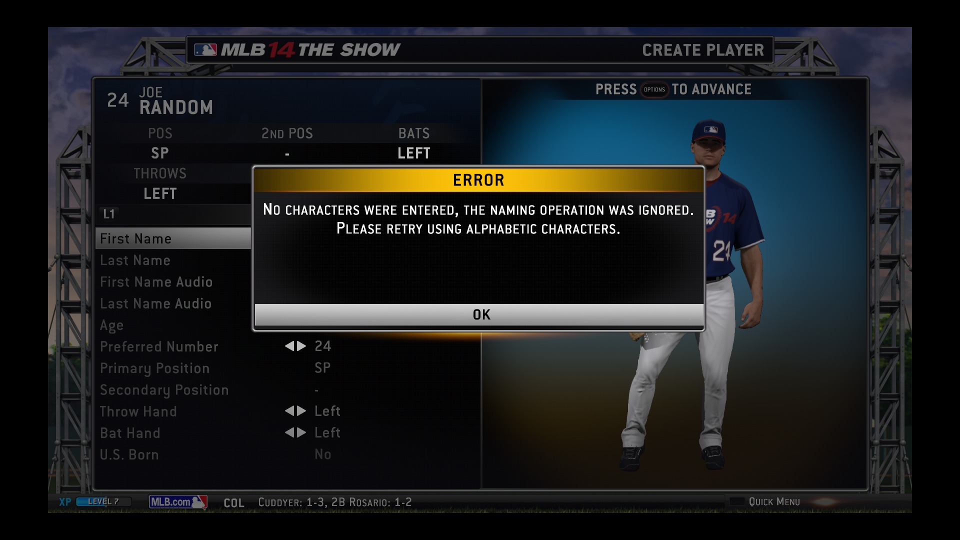
<p>The player creation process in the Road to the Show mode is quite in-depth. Here I was just starting out, putting in my player’s first name. I accidentally pressed the wrong button though while the field was blank, and got this classic error message:</p>

<p><img src="images/error-message.jpg" alt="MLB® 14 The Show™_20140521230152" /></p>

<p>First of all, I’d argue that this shouldn’t ever have given me an error message. Either don’t let the user leave the field without entering a character, or show an error message when trying to advance past the character creation process.</p>

<p>But okay, if you want to have an error message, “The naming operation was ignored” is probably not the most helpful text.</p>

<h2 id="born-in-the-usa">Born in the USA</h2>

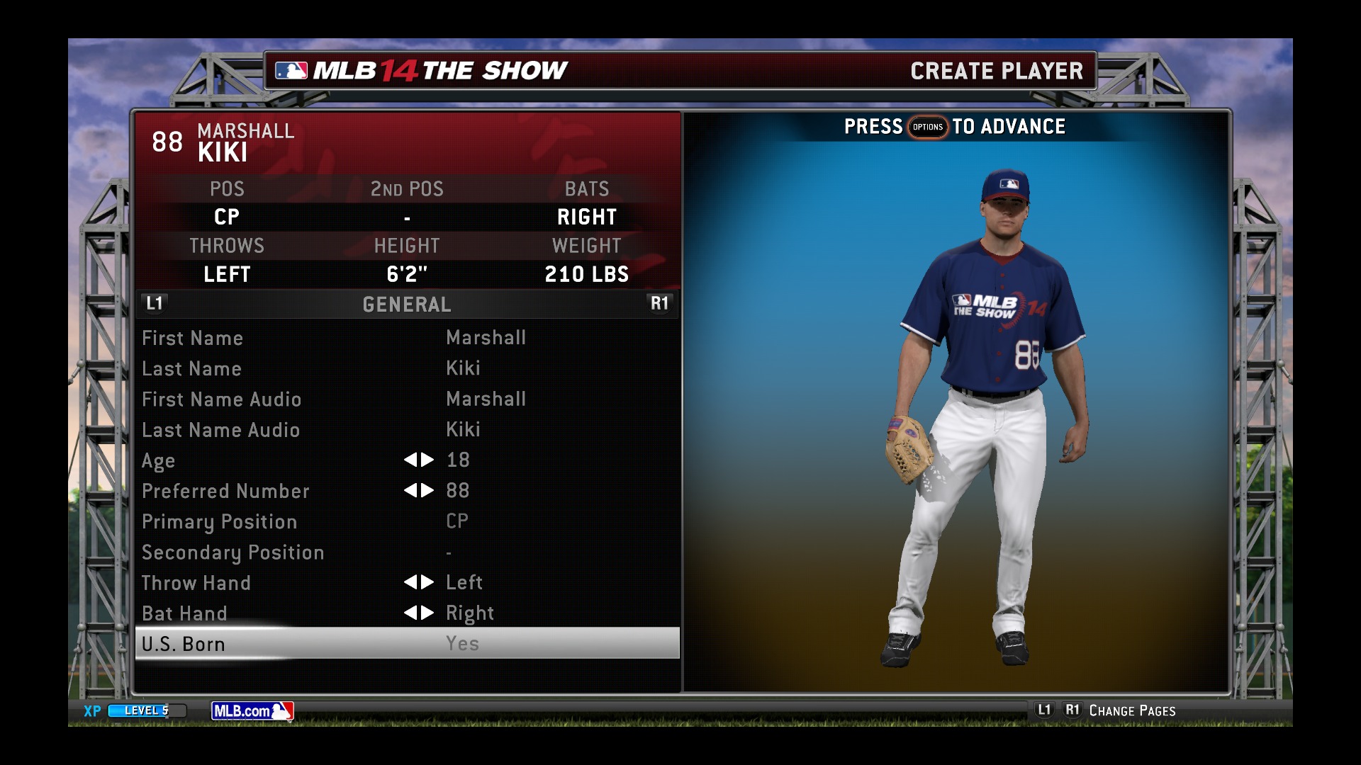
<p>Right on the first page of the character creation screen, there’s an option for “U.S. Born”. I don’t have any idea what difference this would make, but I also don’t know how to change the value. It’s grayed out, and I have no idea why.</p>

<p><img src="images/us-born-is-yes.jpg" alt="MLB® 14 The Show™_20140511154905" /></p>

<p>Disabled fields aren’t generally a bad thing; it’s just important that it’s clear to the user <strong><em>why</em></strong> it’s disabled, and it should be easy to make the control available.</p>

<h2 id="going-back-to-school">Going Back to School?</h2>

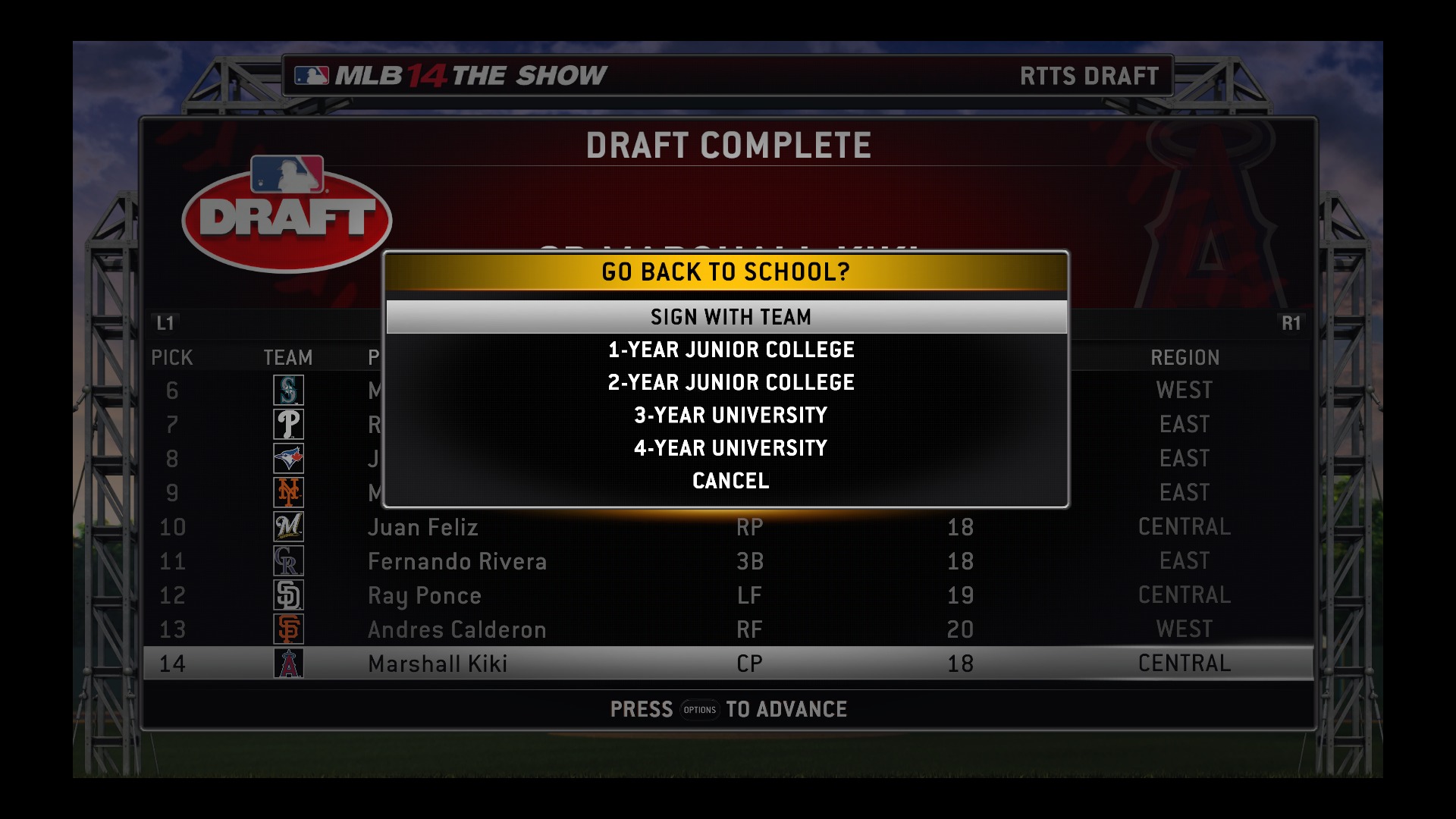
<p>After my character was drafted into an MLB organization, I got this very mysterious prompt:</p>

<p><img src="images/back-to-school.jpg" alt="MLB® 14 The Show™_20140511162643" /></p>

<p>Without any more information about what these options do, how could I possibly make a good decision here (and bonus question: what does “cancel” do)? I haven’t the foggiest idea what happens if you go to a 3-year university vs a 1-year junior college vs signing with the team, and the game never explains it at all.</p>

<p>A little online research suggests a fairly straightforward answer - you’re going back to school to get a small boost to your stats, and another shot at the draft the next year. Okay, fair enough, I guess that makes sense, even though a year’s worth of experience in AA ball would probably net you a bigger stat boost. But regardless, a little more detail of what your options are on this screen would make a huge difference.</p>

<h2 id="theneed-to-save">The Need to Save</h2>

<p>I have the same question in every sports game. I finish a game of some type of ongoing season, and I wonder…did it save my progress? I know the little “Save” icon was flashing in the corner, but it’s <strong>always</strong> over there, so I’m not exactly sure. I definitely don’t want to lose my progress. So usually, I’ll manually save again.</p>

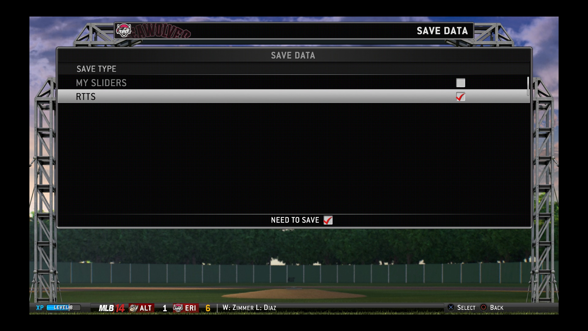
<p>MLB 14: The Show has what looks like a helpful feature, in that it has a little checkbox on the save screen indicating if you need to save or not:</p>

<p><img src="images/need-to-save.jpg" alt="MLB® 14 The Show™_20140526233613" /></p>

<p>This looks great! You save your game, the checkbox goes away, and I get that happy feeling that I am not losing my sweet, sweet progress. Except that the checkbox is <em><strong>always</strong> <strong>checked.</strong></em> That’s right, if you save your game, leave the save screen and immediately come back - the “need to save” box is checked again. So basically, it’s totally worthless.</p>

<p>I really wish that after a game was over, you’d get a message at the top/bottom of the screen confirming that your season/franchise/playoff/RttS/whatever was actually saved. A little reinforcement would go a long way towards comforting my fear of losing progress.</p>

<h2 id="conclusion">Conclusion</h2>

<p>MLB 14: The Show doesn’t have the worst menu system that I’ve seen. It’s about on par with a lot of other big sim-style sports games, which isn’t very good (although I hear the new FIFA game is really quite nice?). None of these issues are game breaking, but all of these little usability issues add up and detract from the game’s polish. And none of them should be all that hard to fix either.</p>

<p>The good news is however, the Road to the Show mode is still quite fun. These RPG-like gameplay modes have been slowly getting better across sports games over the years, and it’s one of my favorite ways to play. Except Madden’s is kinda terrible, but that’s another post.</p>

<p>What do you think of the first baseball game on the PS4? Let’s discuss in the comments!</p>]]></content><author><name>Mark DeHate</name></author><category term="console" /><category term="sim" /><category term="sports" /><category term="baseball" /><category term="demo-mode" /><category term="load-times" /><category term="main-menu" /><category term="ps4" /><category term="save-games" /><summary type="html"><![CDATA[Console baseball games are few and far between these days. MLB 14: The Show is the latest entry in the Sony-produced series, and basically the only option for fans of baseball sims. It’s one of the first sports games to come out on the next-gen console generation (the PS4 in this case), and accordingly, it’s graphically quite sexy. If you’ve ever paid attention, crowds in sports games have been laughably terrible for a long time, so I’m excited to see some much-needed diversity in crowd animations.]]></summary></entry><entry><title type="html">Numolition: An Exercise in Minimal Mobile Instructions</title><link href="http://www.thatgamesux.com/numolition-exercise-minimal-mobile-instructions" rel="alternate" type="text/html" title="Numolition: An Exercise in Minimal Mobile Instructions" /><published>2014-04-21T00:00:00+00:00</published><updated>2014-04-21T00:00:00+00:00</updated><id>http://www.thatgamesux.com/numolition-exercise-minimal-mobile-instructions</id><content type="html" xml:base="http://www.thatgamesux.com/numolition-exercise-minimal-mobile-instructions"><![CDATA[<p><img src="images/logo1.png" alt="numolition logo" /></p>

<p><a href="http://www.numolition.com/">Numolition</a> (<a href="https://itunes.apple.com/app/id824164747">iTunes Store</a>, <a href="https://play.google.com/store/apps/details?id=com.q42.numolition">Google Play</a>) is a math-y puzzle game from <a href="http://q42.com/">Q42</a>, makers of the <a href="http://www.thatgamesux.com/post/quento-shaking-my-iphone-makes-me-sad">previously</a> <a href="http://www.thatgamesux.com/post/quento-when-a-title-screen-meets-a-tutorial">discussed</a> <a href="http://quento.com/">Quento</a>. For me, it scratches a similar itch as <a href="http://asherv.com/threes/">Threes</a>, despite being a very different game. And it has way more explosions.</p>

<p>More to the point though, Numolition makes an effort to get players up to speed with the most minimal amount of instruction possible, which is really cool. There are a couple of places where it might actually border on too little information…but for a game that looks like a well-illustrated comic book, that’s certainly the side of the line you want to be on.</p>

<p>In this article, I’ll take a look at a couple parts of the Numolition UX. And as a bonus, I had the chance to ask some of these questions to <a href="https://twitter.com/mrtnkl">Martin Kool</a>, designer of Numolition - so you’ll see his responses sprinkled throughout.</p>

<h2 id="a-non-tutorial-tutorial">A non-tutorial tutorial</h2>

<p>The tutorial in this game is one of my favorite examples of a “non-tutorial tutorial”. This is a term that I use to describe games that funnel players through a tutorial in the first few levels, but it’s never acknowledged as a tutorial. More properly, <a href="https://en.wikipedia.org/wiki/Progressive_disclosure">progressive disclosure</a> is likely the right term here.</p>

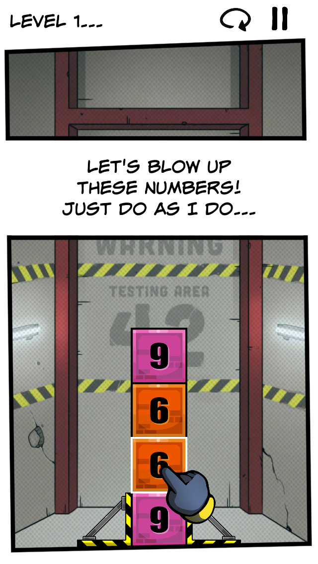
<p>Anyway, what’s special in Numolition is that the first level of the game doesn’t actually tell the player what the core mechanics are - instead, it demonstrates:</p>

<p><img src="images/level_1-start.png" alt="level_1-start" /></p>

<p>Tapping on the indicated tile will explode the two “6” tiles, and it’s quickly apparent what the point of the game is - to blow up adjacent numbers and thus clear the screen.</p>

<p>It’s interesting how little explanation the player actually gets. I mean, the first level is just “tap here and see what happens”. It seemed a little bit odd to me to kick the game off without any explanation of what it’s actually about, because it feels like the player is just along for the ride at that point - like the game is playing itself. Though at the same time, this is awesome, because I immediately understood how the game worked.</p>

<p>This is one of those things that seems straightforward in retrospect, but coming up with it is challenging. Simplicity is hard! Martin confirmed my suspicion; here’s what he had to say about this first level and associated text:</p>

<blockquote>
  <p>Ha, yes. That sentence took me about 10 iterations such as “tap two adjacent tiles” and “tap a series of…” and OMG. It just didn’t work. Finally we all decided that the hand was Anique’s hand and she was talking to you. So she could just say “do as I do”. It made total sense, and after two or three levels you get the idea of tapping series of numbers without having to read too much dialog.</p>
</blockquote>

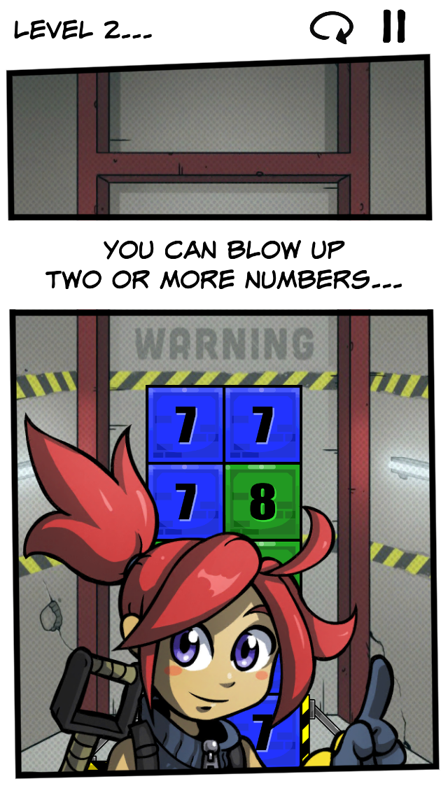
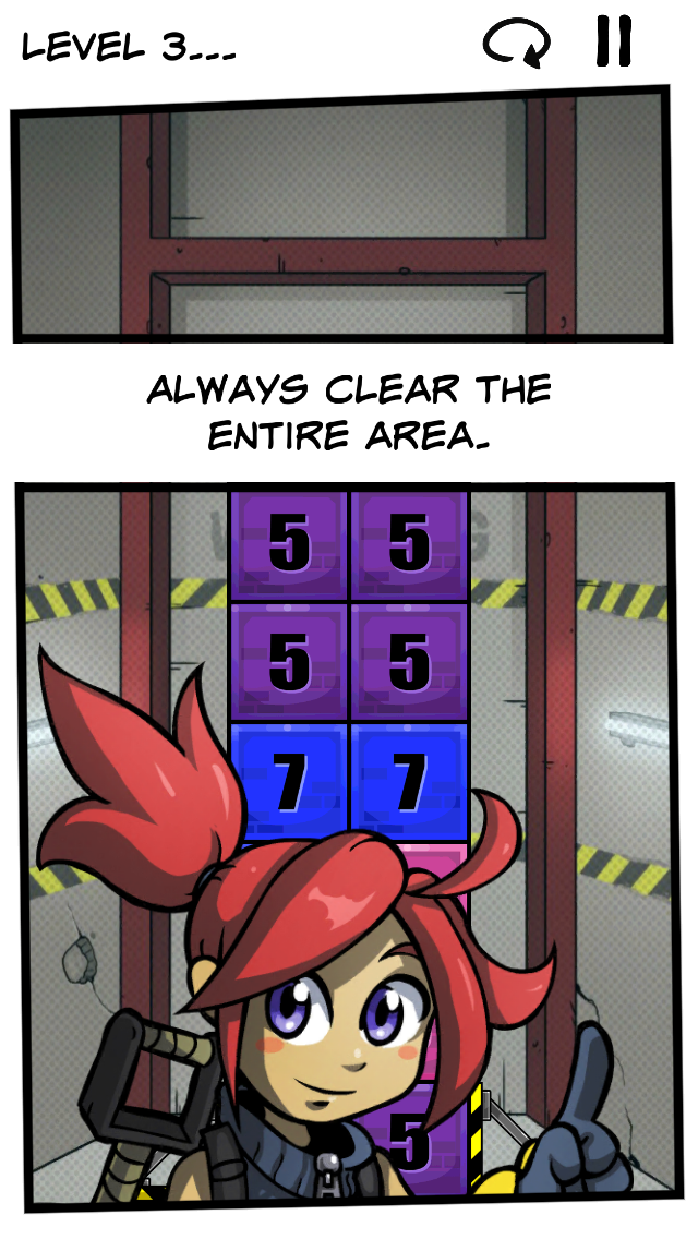
<p>Indeed, levels two and three continue to bring the player up to speed with the smallest amount of text:</p>

<p><img src="images/level_2.png" alt="level_2" />
<img src="images/level_3.png" alt="level_3" /></p>

<p>It’s a slow ramp-up for the first few levels, but Numolition keeps adding on new mechanics until the puzzles are quite challenging. The fourth level adds in sliding numbers left and right. The sixth level introduces adding together adjacent numbers. Later on, there are bonus stars for leaving some numbers on the board. The mechanics keep building and building at just the right pace, and from such simple beginnings, the game ends up with a surprising amount of depth.</p>

<h2 id="pictures-that-are-worth-up-to-1000-words">Pictures that are worth (up to) 1000 words</h2>

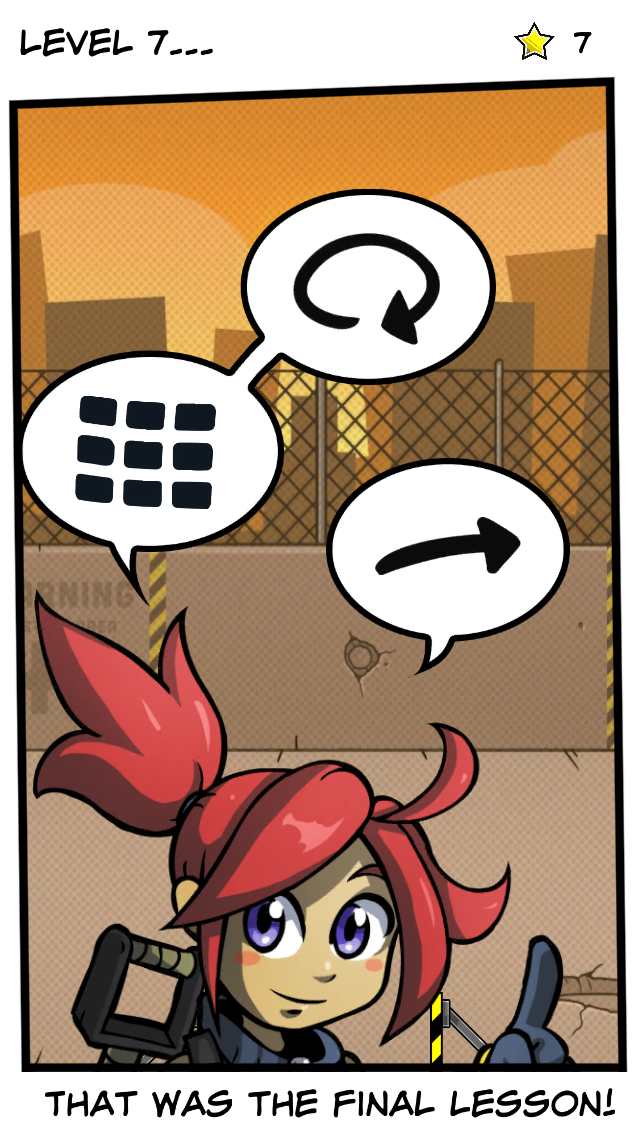
<p>There are a couple of places in Numolition that might have taken the lack of instructions a little too far. First, it took me a second to figure out what all of the icons meant without text labels. Quiz time: here’s the screen that appears after clearing a level, what do you think each of these buttons will do?</p>

<p><img src="images/level_7.png" alt="level_7" /></p>

<p>Okay, so the right-pointing arrow and the circle arrow I figured out pretty easily (next and retry, respectively). But the icon on the left, with the 9 blocks? It wasn’t quite as obvious for me that it takes the player back to the “levels” screen, probably because the actual levels screen looks more like a comic book than a panel of TVs:</p>

<p><img src="images/level-select.png" alt="level select" /></p>

<p>Of course, there are only so many things the levels icon could mean. But it certainly took me an exploratory tap to figure it out.</p>

<p>Martin agrees with me - icons are hard:</p>

<blockquote>
  <p>Yes, this was a troublesome icon. We first had an arrow back, but it wasn’t “back” similar to where that icon was used on other places. So we went with an icon that was meant to represent the level-selection pages. But I guess there is definitely room for improvement here, so if you have a solid suggestion I’d love to hear it.</p>
</blockquote>

<p>I’m curious if an icon that looked more like the levels screen (meaning, having slanted lines and irregular shaped panels) would make the action more or less apparent? It would be an interesting usability study for sure.</p>

<h2 id="stars-burning-a-hole-in-my-pocket">Stars burning a hole in my pocket</h2>

<p>Throughout the game, the player collects stars used for unlocking more features of the game. Sections that aren’t unlocked are grayed out with a big star on top of them, indicating how many stars are needed. But the game never really indicates if the sections will automatically unlock, or if the player needs to “spend” stars to open a section. See below:</p>

<p><img src="images/main-menu.png" alt="main menu" /></p>

<p>So, I was surprised to see that just tapping on the “Towers” section of the main menu actually spent my stars without any warning or confirmation. I was expecting the opposite, that the section was going to automatically unlock when I hit 15 stars. I didn’t realize that I had 15 already when I tapped on it, and then my stars were gone! Of course, I wouldn’t have spent the stars on anything else, but it was surprising nonetheless.</p>

<p>Martin shared some interesting insight into their development process here:</p>

<blockquote>
  <p>:) in an earlier version we had exactly that. Reach a certain level and stuff would get unlocked. But the downside was that it took away the feeling of freedom and choice. It was totally linear: reach this, unlock that, reach that, unlock such. Etc.</p>

  <p>We then made the weird but still okay-ish choice to make stars be two things at once: rewards, and currency.</p>

  <p>As a currency, you were able to spend them in the game, and it would give you an opportunity to choose whether you’d go to sandbox or the first tower. Or use it to skip a level. Or earn them through connecting to facebook, etc. It gives us the freedom to do more things with it eventually, such as add new “campaigns” of levels (each with different new mechanics) that you will be able to purchase with in-game earned stars. As we’re not doing this for financial gain, we don’t gave in app purchases, but getting stars like this finally felt the better choice for us.</p>

  <p>– Martin Kool, Q42</p>
</blockquote>

<h2 id="conclusion">Conclusion</h2>

<p>Numolition does an excellent job of walking the line in giving the absolute most minimum amount of instructions possible to understand how the game works. I have played through so many game tutorials where I lose patience and try to jump right into the game, and then am confused about how the game works (because I skipped the tutorial), and just stopped playing.</p>

<p>Of course, the downside of this approach is that sometimes it’s not exactly clear what the player is supposed to do. That’s occasionally a problem in Numolition, though the cases noted here are minor. Thankfully, the gameplay is easy to understand, and that’s always the primary goal.</p>

<p>So, are there any other games that you’ve played that are successful in being understandable with minimal text instructions? Or games that have an unnecessarily long tutorial (I’m thinking of <a href="http://www.thatgamesux.com/post/mobile-games-tutorials-should-fit-mobile-attention-spans">Ghost Trick</a> myself with it’s 20+ minute monster intro)? Let’s discuss in the comments below…</p>]]></content><author><name>Mark DeHate</name></author><category term="casual" /><category term="mobile" /><summary type="html"><![CDATA[]]></summary></entry><entry><title type="html">Quarriors! for iOS: A Brief Usability Review</title><link href="http://www.thatgamesux.com/quarriors-ios-brief-usability-review" rel="alternate" type="text/html" title="Quarriors! for iOS: A Brief Usability Review" /><published>2014-03-18T00:00:00+00:00</published><updated>2014-03-18T00:00:00+00:00</updated><id>http://www.thatgamesux.com/quarriors-ios-brief-usability-review</id><content type="html" xml:base="http://www.thatgamesux.com/quarriors-ios-brief-usability-review"><![CDATA[<p><img src="images/quarriors-logo.jpg" alt="quarriors logo" /></p>

<p><a href="http://quarriorsgame.com/">Quarriors</a>(from WizKids/MFV) is a “dice-building” board game that’s been adapted to iOS. Board game to digital conversions are becoming more and more common, they offer some unique challenges that purely digital games don’t need to deal with. Not only do they need to make a fun experience, there’s also the need to emulate real-world components in a usable and realistic way.</p>

<p>With that in mind, today I’m going to run through a quick usability review of <a href="https://itunes.apple.com/us/app/quarriors!/id685059840?mt=8">Quarriors! for iOS</a>. There are four topics that I’d like to point out, and they are…</p>

<ol>
  <li>Rolling virtual dice</li>
  <li>The GameCenter icon</li>
  <li>Chaotic notifications</li>
  <li>Visible highlights and hidden gestures</li>
</ol>

<h2 id="rolling-virtual-dice">Rolling Virtual Dice</h2>

<p>Full disclosure here: I love dice. There’s something about the physical-ness of them that is extremely satisfying. The more dice that I can find in a game, the better. Buckets of dice is preferred. So anytime that I have to roll virtual dice, it’s never quite as good as the original. Quarriors! does its best to simulate the dice rolling experience - by showing the player actual, rolling dice like this:</p>

<iframe width="560" height="315" src="https://www.youtube.com/embed/49GSnnwnmoo?si=ZwTtsKqDJC_sKvUo" title="YouTube video player" frameborder="0" allow="accelerometer; autoplay; clipboard-write; encrypted-media; gyroscope; picture-in-picture; web-share" allowfullscreen=""></iframe>

<p>If I was rolling dice in the real world, this is pretty close to what it would look like. On one hand, it’s fun to quickly glance at the die faces to get a peek at what you’ll be getting, as the dice come to rest. On the other hand, it’s not super fun to wait the couple of seconds for this to actually happen. When I’m playing Quarriors!, most of the time I end up just tapping the screen to skip the animation and get right to work doing something with my dice.</p>

<p>What the animation does though, is reinforce the focus of the game. It’s the dice. Even if I end up skipping the (short) animation every time, it’s clear to me that the dice are critical to the game, and I appreciate it being there. That said, I wouldn’t argue if the animation was a little faster, and showing the dice quickly slide from their resting place to the “active” pool would be really sexy.</p>

<h2 id="the-gamecenter-multiplayer-icon">The GameCenter Multiplayer Icon</h2>

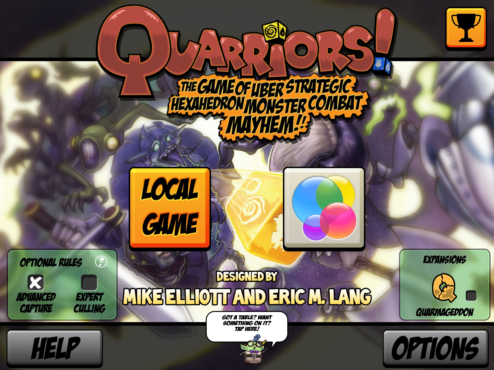
<p>On the main screen of Quarriors!, there are two primary buttons for starting a game. The clearly labeled “Local Game”, and a nameless button with a bunch of bubbles.</p>

<p><img src="images/main-menu.jpg" alt="quarriors main menu" /></p>

<p>The bubbles, of course, form the icon for GameCenter in iOS 7. Quarriors! uses GameCenter for multiplayer, interface and all. So, that big GameCenter button is for starting an online multiplayer match.</p>

<p>Using icons without words on actions is a sketchy proposition. Some symbols can be either well known or contextually appropriate - a floppy disk for save, or a rightward-pointing arrow for next (in right-to-left languages anyway). But even if users do happen to recognize the GameCenter icon, the service is used for more than just online multiplayer. Adding a small label to the button indicating that it’s for online multiplayer would solve this issue.</p>

<p>Suburbia, another board game ported to iOS, does this exactly:</p>

<p><img src="images/IMG_0014.jpg" alt="suburbia main menu" /></p>

<h2 id="chaotic-notifications">Chaotic notifications</h2>

<p>During each player’s turn, Quarriors! pops up text notifications indicating what the current phase is. It’s useful in directing players as to what they need to do next, or what the state of the computer-controlled opponents turn is. However…I have a couple of issues with the design of these notifications.</p>

<p>First, the game is very “branded” throughout with the use of the same font that’s in the Quarriors! logo. It works well enough as a logo and on the controls, but being all-caps, it’s not great for reading anything longer than a word or two.</p>

<p>In addition to being hard to read, the notifications will show up in one of three spots on the screen - top, middle, or bottom - depending on exactly what phase of the game it is. This results in a lot of all-caps text flashing on the screen that is difficult to follow, and suddenly it’s my turn again. Here’s a sample from an early round in a 4-player game:</p>

<iframe width="560" height="315" src="https://www.youtube.com/embed/rE7DktRWT_o?si=e_i07zEMG79RhTGe" title="YouTube video player" frameborder="0" allow="accelerometer; autoplay; clipboard-write; encrypted-media; gyroscope; picture-in-picture; web-share" allowfullscreen=""></iframe>

<p>If the notifications were in a consistent spot - preferably with an easier-to-read font - it would make it easier to keep track of the game’s state, and feel a little less chaotic.</p>

<h2 id="visible-highlights-and-hidden-gestures">Visible highlights and hidden gestures</h2>

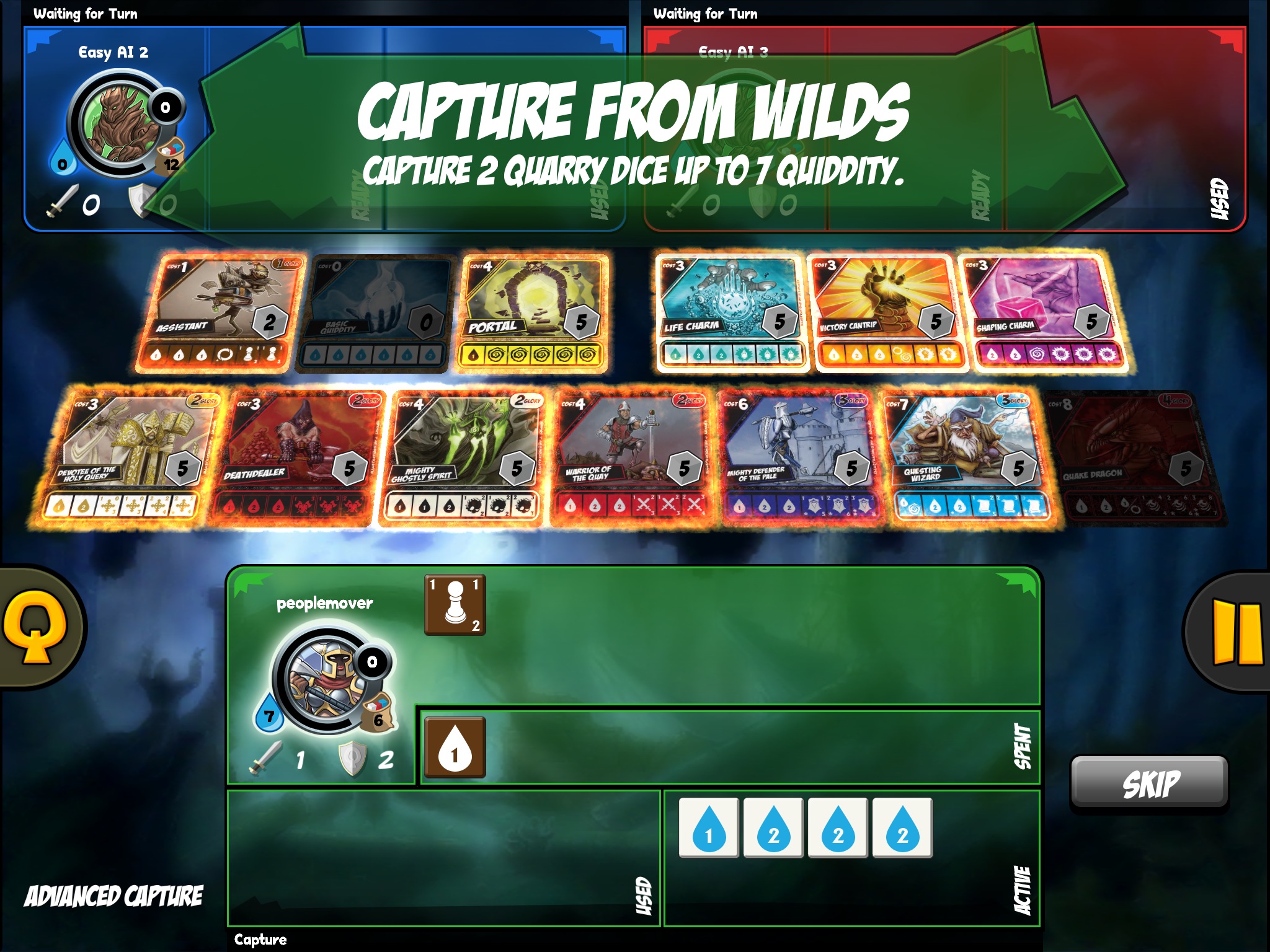
<p>A couple of other small things that I really appreciate. When it comes time to spend your “quiddity” in the game to build your army of dice, the game makes it very clear which creatures you can afford to purchase. There’s a bright orange glow that leaves little doubt as to what’s available:</p>

<p><img src="images/msg-capture-from-wilds.jpg" alt="quarriors - capture from wilds" /></p>

<p>The obvious way to capture these is to tap first on a glowing card, then on the “capture” button. It’s straightforward, no big deal. But the game makes use of a hidden, natural gesture here too - the player can drag from a card onto their dice pool, and that will do the same thing. Quarriors! never points this out explicitly - it’s just an intuitive motion that players will likely soon discover on their own.</p>

<h2 id="conclusion">Conclusion</h2>

<p>Overall, Quarriors! does a lot of things right. There are a few quirks/nits that I have pointed out here, but they are just that. It’s a great implementation of a very physical game in the real world. And it’s way faster to set up.</p>]]></content><author><name>Mark DeHate</name></author><category term="card-board" /><category term="mobile" /><category term="sim" /><summary type="html"><![CDATA[]]></summary></entry><entry><title type="html">Dota 2: Die Less with a Hero Build</title><link href="http://www.thatgamesux.com/dota-2-die-less-hero-build" rel="alternate" type="text/html" title="Dota 2: Die Less with a Hero Build" /><published>2014-02-18T00:00:00+00:00</published><updated>2014-02-18T00:00:00+00:00</updated><id>http://www.thatgamesux.com/dota-2-die-less-hero-build</id><content type="html" xml:base="http://www.thatgamesux.com/dota-2-die-less-hero-build"><![CDATA[<p><img src="images/dota-2-logo.jpg" alt="dota-2-logo" /></p>

<p>I think it’s fair to say that Valve’s Dota 2 is an intimidating game for new players. There are a lot of choices to be made at every turn - over <a href="http://thatgamesux.com/post/dota-2-i-need-a-random-hero">100 heroes to pick from</a>, each with their own set of abilities, and lots of different items to purchase to fit a variety of strategies. Plus, it’s a team-based player-vs-player game, so you need to have a good deal of teamwork to be successful.</p>

<p>Thankfully, Dota 2 has gained a number of features that are designed help new users get their feet wet in this deep pool of gaming goodness. I’d like to take a minute here to point out one of my favorite features, <a href="http://www.dota2.com/workshop/builds/overview">Hero Builds</a>. A Hero Build is an in-game, user-contributed strategy of how to build out your hero. And they are awesome.</p>

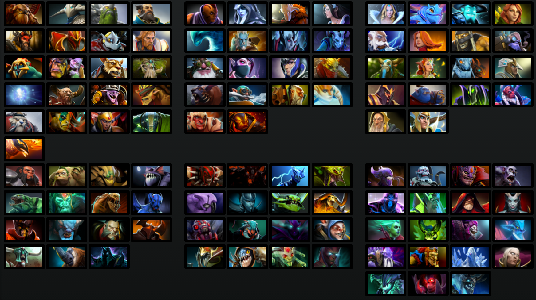
<h2 id="what-is-a-hero-build">What is a Hero Build?</h2>

<p><img src="images/Heroes.png" alt="So many heroes" /></p>

<p>A Hero Build is a walkthrough on how to play a particular hero. It doesn’t teach you the basics of the game, but it does suggest what order to level up that particular hero’s abilities in, what items to purchase, and when. Of course, there are lots of different opinions on what strategy to take for a given hero, so there are a ton of different builds out there created by different users.</p>

<p>The best part, is that all of the information is presented in-game. There is a Guide page that you can view outside the game for research, but the important stuff is built right into the UI and presented when you need it.</p>

<h2 id="how-does-it-work">How does it work?</h2>

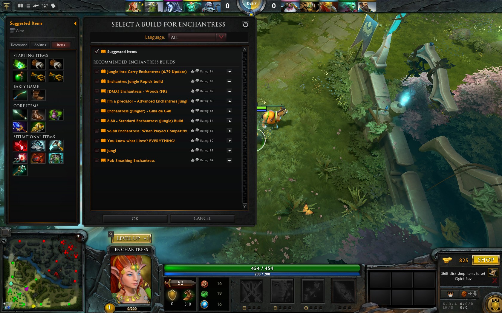
<p>In-game, there’s a menu option that will list popular Hero Builds for the character that you’re using. Just clicking the build’s checkbox will activate it.</p>

<p><img src="images/list-of-builds-full.jpg" alt="While you don't need to read the build's text, the ability to filter builds by language is a handy option." /></p>
<blockquote>
  <p>While you don’t need to read the build’s text, the ability to filter builds by language is a handy option</p>
</blockquote>

<h2 id="help-with-abilities">Help with abilities</h2>

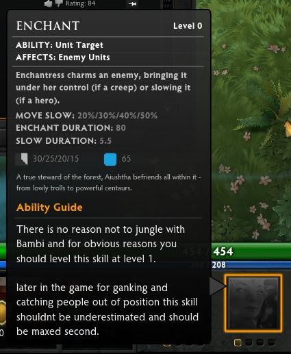
<p>Once activated, the build’s suggestion for what ability to upgrade next will be highlighted in orange, and might even add a little text strategy tip as shown in the “Ability Guide” section below:</p>

<p><img src="images/ability-crop.jpg" alt="I appreciate the advice, even without proper punctuation." /></p>
<blockquote>
  <p>I appreciate the advice, even without proper punctuation</p>
</blockquote>

<h2 id="help-in-the-shop">Help in the shop</h2>

<p>The other important part of the Hero Build is suggesting items to buy in the shop. The shop in Dota 2 has a lot of tiny icons with no text descriptions. This means it is real easy to spend a lot of time trying to figure out what to spend your hard earned money on. And even if you know what you’re looking for, in the heat of battle it can be difficult to locate in the sea of colorful images.</p>

<p>The Hero Build gives a variety of suggestions for what items would be good to purchase for the hero, and usually, some general idea of what order too. The groups as shown below are customizable, though many do follow a similar format.</p>

<p><img src="images/shop-crop.jpg" alt="shop crop" /></p>
<blockquote>
  <p>Not shown: you can also on the fly add your own items to the build, in case you disagree an item or two</p>
</blockquote>

<h2 id="why-this-is-awesome">Why this is awesome</h2>

<p>Getting started with a new hero in Dota 2 is difficult. The game is so deep, it really takes a few plays to get the hang of how a given hero plays. Using a Hero Build is one way to shorten that learning curve. It lets the player focus a little bit more on using their abilities effectively (and by extension, encourages not dying).</p>

<p>Hero Builds are a great example of Help Where You Need It. The game only brings up the build when the player needs to make a decision about what to buy, or there’s an ability to upgrade. The rest of the time, there’s no other detail to distract the player.</p>

<p>It’s the old Don Norman “<a href="http://www.aacinstitute.org/TheGoalofAAC/ThePsychologyOfAACSystems.html">knowledge in the world vs knowledge in the head</a>” discussion. If you’re reading a paper strategy guide, you’ll need to learn the information, and it will be stored in your head. That’s way harder than interpreting the information that’s displayed in the world (in this case, on the screen).</p>

<h2 id="conclusion">Conclusion</h2>

<p>Dota 2 still is a deep, deep game, with a lot of complex and difficult-to-master strategies. I mean, it’s on the Major League Gaming circuit. So having a Hero Build on-screen isn’t going to vault you to the top of the rankings. But for players new to the sport, being able to have a little “guide to this hero” available at just the right time makes the game a lot more accessible, and I’d argue a lot more fun.</p>

<p>What other games out there have this kind of in-game training? The messages in Dark Souls is one that comes immediately to mind - not exactly the same type of help as Dota 2, but still user-provided. What else is there? Let’s discuss in the comments!</p>]]></content><author><name>Mark DeHate</name></author><category term="action" /><category term="pc" /><summary type="html"><![CDATA[]]></summary></entry><entry><title type="html">Rogue Legacy: It’s Hard to Quit (No, Literally)</title><link href="http://www.thatgamesux.com/rogue-legacy-hard-quit-literally" rel="alternate" type="text/html" title="Rogue Legacy: It’s Hard to Quit (No, Literally)" /><published>2014-01-22T00:00:00+00:00</published><updated>2014-01-22T00:00:00+00:00</updated><id>http://www.thatgamesux.com/rogue-legacy-hard-quit-literally</id><content type="html" xml:base="http://www.thatgamesux.com/rogue-legacy-hard-quit-literally"><![CDATA[<p><img src="images/Rogue_Legacy_logo.png" alt="Rogue_Legacy_logo" /></p>

<p><a href="https://en.wikipedia.org/wiki/Rogue_Legacy">Rogue Legacy</a> from <a href="http://cellardoorgames.com/">Cellar Door Games</a> (<a href="http://store.steampowered.com/app/241600/">Steam link</a>) is a rogue-like platformer that is difficult to quit for two reasons. One, because it does a good job at activating my “just one more turn” syndrome. And two, because it’s not immediately apparent how you actually quit the game.</p>

<p>After booting up your game, there’s only one thing you can be sure that players will actually do - that’s leave. Like death and taxes, it’s inevitable. So, you might as well make it easy to find. Let’s look at how Rogue Legacy handles it.</p>

<p><img src="images/title.png" alt="title" /></p>

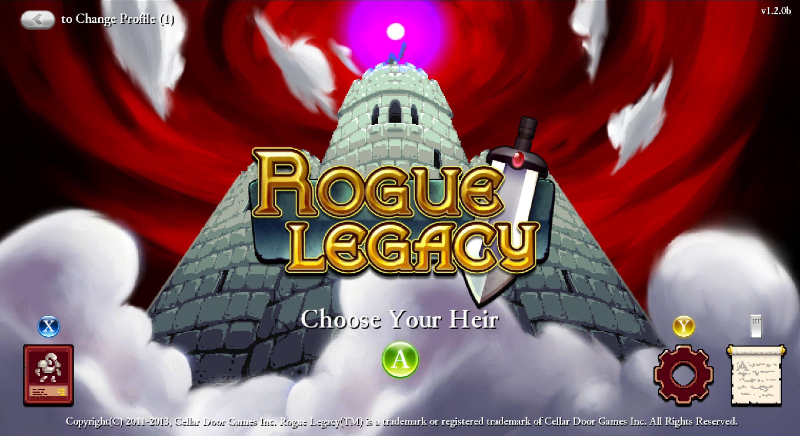
<p>Above is the main menu of Rogue Legacy, as viewed when playing with an XBox 360 Controller. It features a good call to action with the giant “Choose Your Heir” text and green “A” button. So that’s good, you definitely know where to start.</p>

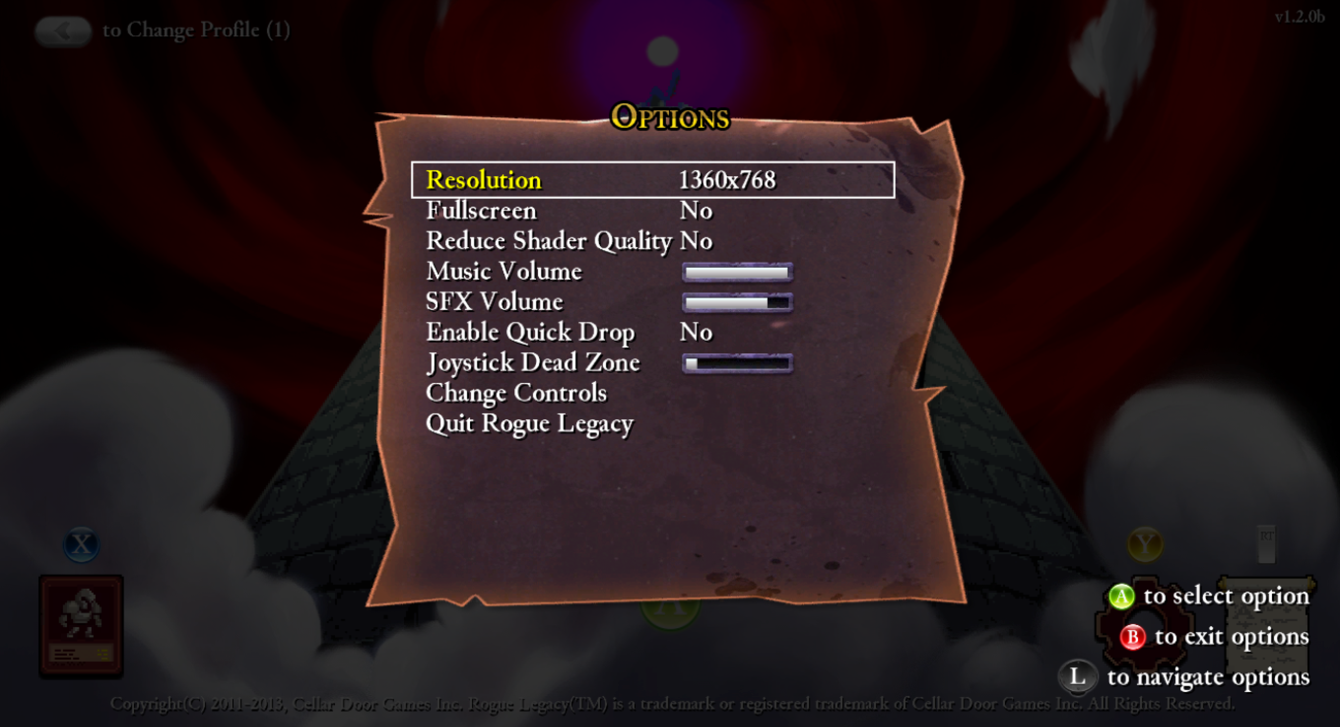
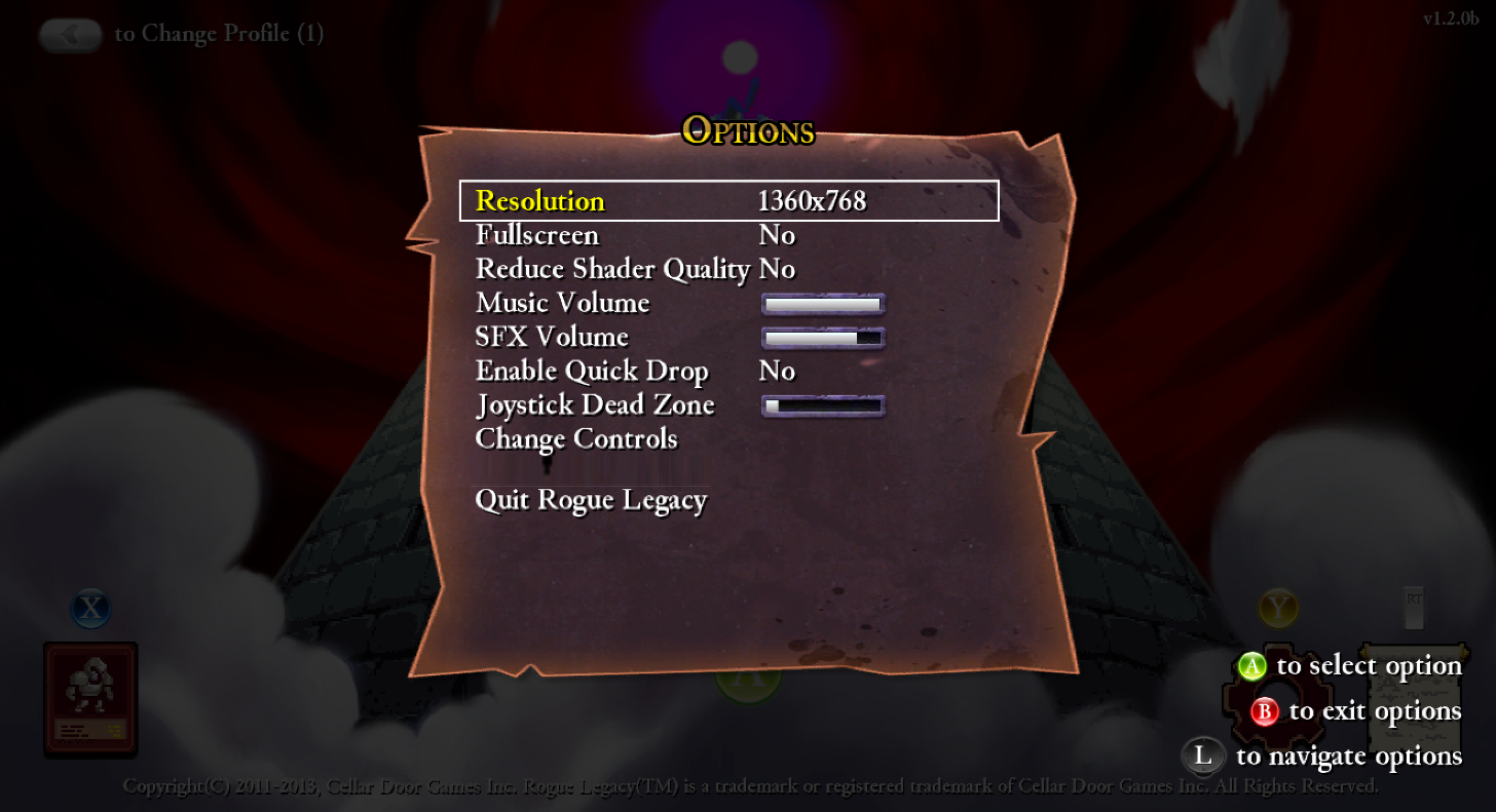
<p>But while there is an option to view the game’s credits, nowhere on the screen is there any indication of how to quit. Instead, it’s buried in the options (the gear) menu.</p>

<p><img src="images/options-screen.png" alt="options screen" /></p>

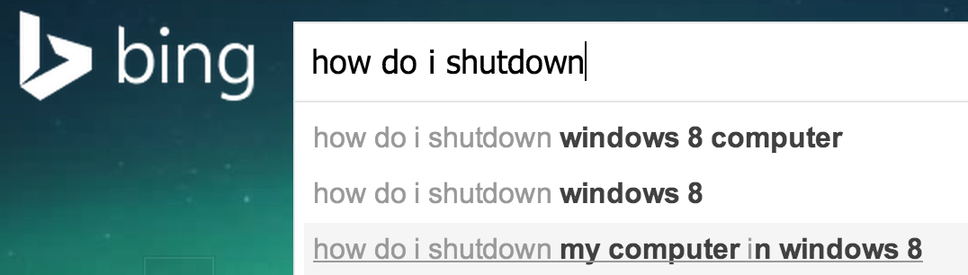
<p>There it is, buried at the bottom of the options menu. Of course, Rogue Legacy isn’t the only interface to bury their quit menu - it’s the exact same way in Windows 8. If you search for “how do I shutdown” on Bing , the first results:</p>

<p><img src="images/how-do-i-shutdown.png" alt="how do i shutdown" /></p>

<p>I’m thinking that putting quit in your settings menu isn’t a pattern that you probably want to follow just yet.</p>

<p>Making it even worse, the quit option doesn’t stand out from the rest of the menu. It looks exactly the same as everything else, making it really easy to miss. I definitely opened this page multiple times before actually noticing the “Quit Rogue Legacy” option at the bottom.</p>

<p>If this is the route that Cellar Door Games is going to take, at least put a little empty space to separate it out. Quitting is an extremely important action, while the other settings probably will never be touched. For example, here’s what I would do as a Steve Krug-inspired “<a href="http://www.tributemedia.com/blog/andy-harl/steve-krug-least-you-can-do-about-usability">The Least You Can Do</a>” usability change:</p>

<p><img src="images/options-screen-my-edit.png" alt="options screen - my edit" /></p>

<h2 id="conclusion">Conclusion</h2>

<p>It’s all about prioritizing your actions based on what users really do. And eventually, I hate to break it to you, the users will want to quit your app or game (unless you’re Facebook, I suppose). So you may as well make it easy to find. If you’re trying to trap users by hiding the quit button, you’re doing it wrong.</p>

<p>Also, I appreciate the fact that as a game designer, you want to be known for your work. By all means, I’m all about it. However, if you’re designing for your <em>users</em>, I’m sure they would rather have a “quit this game” action on the title screen more than one to view the credits.</p>]]></content><author><name>Mark DeHate</name></author><category term="action" /><category term="pc" /><summary type="html"><![CDATA[]]></summary></entry><entry><title type="html">iOOTP 2013: Consistency Wins Championships</title><link href="http://www.thatgamesux.com/iootp-2013-consistency-wins-championships" rel="alternate" type="text/html" title="iOOTP 2013: Consistency Wins Championships" /><published>2013-12-31T00:00:00+00:00</published><updated>2013-12-31T00:00:00+00:00</updated><id>http://www.thatgamesux.com/iootp-2013-consistency-wins-championships</id><content type="html" xml:base="http://www.thatgamesux.com/iootp-2013-consistency-wins-championships"><![CDATA[<p><img src="images/logo.png" alt="logo" /></p>

<p><a href="http://www.ootpdevelopments.com/out-of-the-park-baseball/">Out of the Park Baseball</a> (from Out of the Park Developments) is a PC-based baseball simulation that started back in 1999. <a href="http://www.ootpdevelopments.com/iootp-baseball-game/">iOOTP 2013</a> is the most recent iteration of the franchise that was released for iOS in the spring of 2013.</p>

<p>Putting a fully-featured, text-based baseball sim on the screen of a mobile phone is no small task. All the “gameplay” of iOOTP 2013 is essentially done through a series of menus and tables. It’s way closer to Microsoft Excel than Madden Football. It’s complicated for sure, but honestly so is running a baseball team, and that’s kinda the whole point.</p>

<p>When dealing with a big menu structure in your game, website, webapp, TV, ATM machine, car wash, or anywhere else, one of the keys to making it usable is consistency. If whatever the interface is keeps changing on your users, it’s going to be frustrating. And in iOOTP 2013, there are a few places that are frustrating because of needless inconsistency in the menus - let’s take a look.</p>

<h2 id="inconsistent-ui-element-1-exiting-toolbar-menus">Inconsistent UI Element #1: Exiting Toolbar Menus</h2>

<p>One thing that’s fairly consistent throughout most of the menus in iOOTP 2013 is the toolbar that’s on the bottom of the screen. It contains the current in-game date, along with buttons for “View”, “Action”, and “Back”.</p>

<p><img src="images/toolbar.png" alt="toolbar" /></p>

<p>Usually, View acts as a filter, modifying exactly what data is on your screen. If you’re looking at your roster, you’ll use it to show only pitchers, for example. In this screenshot, you can switch between which lineup you’re looking at - not exactly a filter, but it’s close enough:</p>

<p><img src="images/view-menu.png" alt="view menu" /></p>

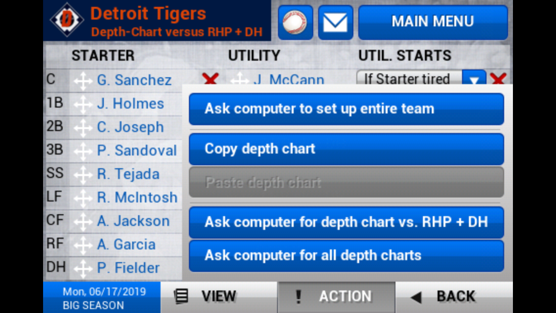
<p>The Action menu holds a variety of, well, actions - like offering a player a contract extension, or in the screenshot below, having the game generate an optimal lineup.</p>

<p><img src="images/action-menu.png" alt="action menu" /></p>

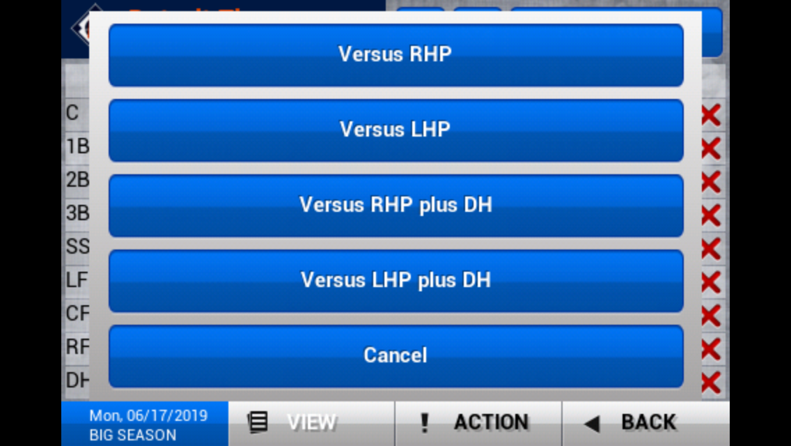
<p>However, the View and Action menus don’t work exactly the same way. In the View screenshot above, you’ll see there is a “Cancel” button at the bottom. In every View menu, the user needs to press the Cancel button to get back to the previous screen. The Action menu doesn’t have such a button - tapping anywhere outside the overlay will make it go away.</p>

<p>I assume the developers here were thinking that the “View” menu covers more of the screen, so it’s more like a pop-up, where the “Action” menu is more menu-like, where it’s a smaller portion of the screen. However, as a user, that’s a very tiny distinction that isn’t important to me, if I even managed to notice it. They are both buttons on the bottom toolbar that I access all the time. If they are going to look this similar, they need to work the same way!</p>

<h2 id="inconsistent-ui-element-2-back-button-expectations">Inconsistent UI Element #2: Back Button Expectations</h2>

<p>Also on the toolbar is the “Back” button. Most of the time, this is quite helpful, because it usually takes the user back where they expect. Way back in 1999, <a href="http://www.nngroup.com/articles/the-top-ten-web-design-mistakes-of-1999/">Jakob Nielsen declared that</a> ”<em>The Back button is the lifeline of the Web user</em>”. It’s especially helpful in iOOTP 2013, because a wayward horizontal swipe might whisk the user off to some other page.</p>

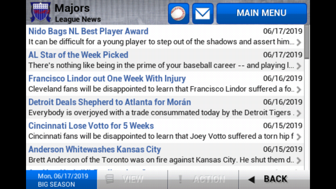
<p>Unfortunately, sometimes iOOTP deems certain sections of the game to be exempt from the same back behavior. One example is the “League News” section. On the main League News page, a list of news articles appears like so:</p>

<p><img src="images/news-home.png" alt="news home" /></p>

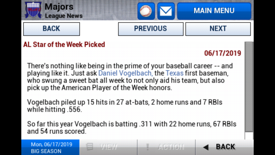
<p>Tapping on a headline, of course brings up the full article:</p>

<p><img src="images/news-detail.png" alt="news detail" /></p>

<p>Now, notice the two back buttons on this screen - in the upper left is the back button that works inside the news section. So tapping the upper left back button brings the user back to the main news page. The “normal” back button in the bottom toolbar brings the user to whatever page they were on before the news home page.</p>

<p>I mess this up basically every time I’m on this page, because I use the back button constantly - it’s definitely my lifeline in iOOTP 2013. Other parts of the system have trouble too - occasionally, when using the View menu to switch between pages, the back button won’t take you back there either.</p>

<p>I suppose there are two lessons here then. First, if you’ve got two buttons labeled the same thing (especially “Back”), you’re probably doing something wrong. Second, if the expectation is that the “Back” button in your app takes you to the previous page, don’t try to get creative with what that means by defining different sections of your app that break the rules.</p>

<h2 id="inconsistent-ui-element-3-paginated-vs-scrolling-tables">Inconsistent UI Element #3: Paginated vs Scrolling Tables</h2>

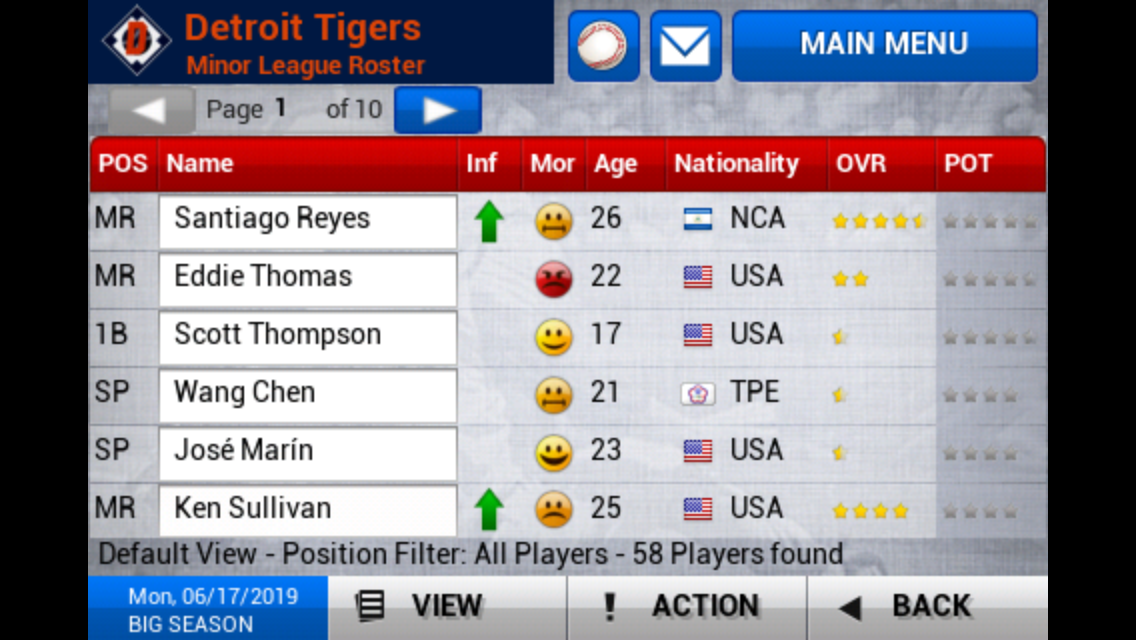
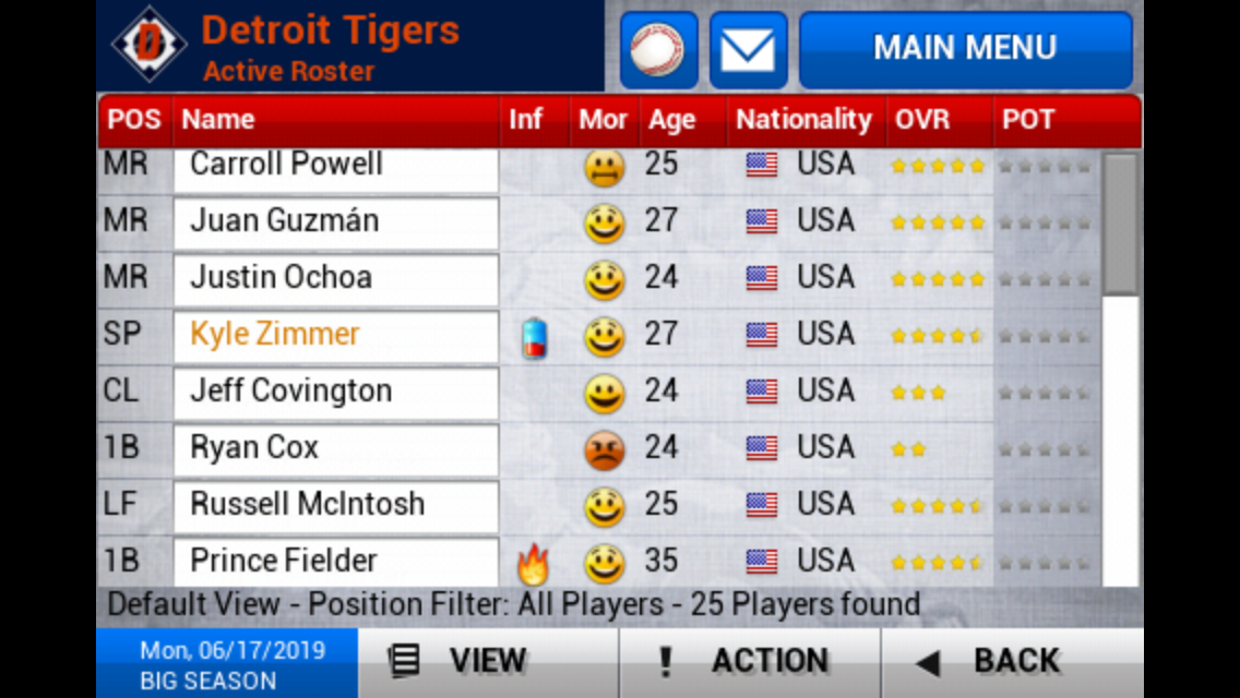
<p>There are a lot of tables in iOOTP, as to be expected. The odd thing is, they don’t all work the same way. Some of them offer a scroll bar, others have pagination.</p>

<p>Here’s the screen for my minor league roster:</p>

<p><img src="images/minor-league-roster.png" alt="minor league roster" /></p>

<p>And here’s the same view for my major league roster:</p>

<p><img src="images/active-roster.png" alt="active roster" /></p>

<p>It’s the same set of columns, just one has pagination, and the other scrolls. The difference though, is the number of records displayed. Through some unscientific testing, I’ve found the limit to be about 50 - so if there are more than 50 rows displayed, the game switches to a paginated view. Less than 50, you’ve got scrolling.</p>

<p>At first glance, that distinction might make sense (or at least seem intentional, which is something). But in practice, it’s frustrating. It’s common for me to switch between my major league roster and my minor league roster, and the last thing I’m thinking about is “oh how do I see more people in this table”. Even worse, my minor league roster size is right around the limit - that means, depending on the time of year (before or after the draft), that screen is constantly changing how it works.</p>

<p>I’m guessing this was put into place for some technical reason - loading that many rows at once in a scrollable table just takes too long. Technical constraints aren’t fun for the user, but it’s reality (or the alternative is a slow loading page - also not fun). If there’s some UX concept where pagination is easier to use with large tables, well, I don’t know what it is.</p>

<p>What would improve this situation is to increase the limit to a value that’s outside what normally would be found in a table. If the limit was 100 rows, I wouldn’t notice it nearly as much. Some tables would always be paginated, some would scroll, and that would be that. Consistently inconsistent is something to strive for (how’s that for a t-shirt slogan?).</p>

<h2 id="conclusion">Conclusion</h2>

<p>A baseball sim isn’t the most natural fit for a tiny screen, no doubt <em>(aside: iOOTP 2013 is a universal app, so it’s iPad friendly - I haven’t played it there though because I’d need to start another season…a cloud-based save platform would be really killer here)</em>. When you’ve got a complex game/app that’s built for mobile, it’s all the more reason to make sure the interface is consistent. None of these issues above are game-breaking, but they are all solvable problems that would go a long way towards having a polished experience.</p>

<p>What other complex games that suffer from interface inconsistency have you played? Let’s discuss!</p>]]></content><author><name>Mark DeHate</name></author><category term="casual" /><category term="mobile" /><category term="sim" /><category term="sports" /><summary type="html"><![CDATA[]]></summary></entry></feed>