When Metaphors Go Bad: The Cell Phone in GTA IV
Metaphors are used in interfaces all the time. The metaphor of the desktop is perhaps the most commonly cited. We don’t talk about the desktop a lot these days, but the collective we does talk a ton about the skeuomorphism that is running rampant in Apple’s various products. Your opinion on that topic may vary, but I’ll take stab in the dark and say your opinion of the Microsoft Briefcase is either 1) what is that? or 2) ugh that’s a terrible metaphor (fun fact: Briefcase is available in MS Windows 7, but has finally been retired from Windows 8. A sad day indeed…)
Metaphors in gaming interfaces are used frequently too, and not always well. Grand Theft Auto IV makes frequent use of a cell phone for contacting other in-game characters. Being set in 2008, as text messaging was on the rise, this totally makes sense. Unfortunately, being an appropriate metaphor doesn’t mean that it’s an easy to use interface, and here’s where the game runs into all kinds of trouble.

Size Matters
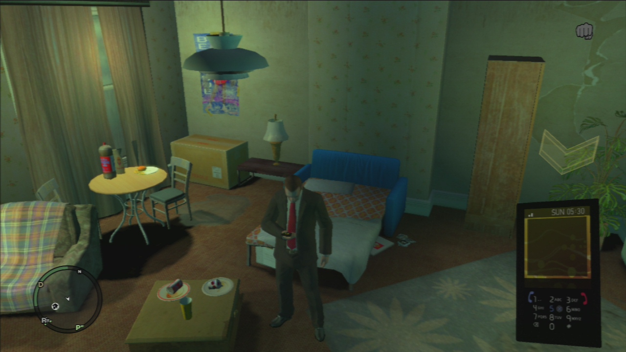
My largest issue with this isn’t about the metaphor at all - it’s that the cell phone is really hard to read on any tv that I’ve tried to play on. The cell phone opens up in the lower right corner of the screen, and it’s tiny. Maybe it’s just my eyes, but between the size and the general dark colors, I have a real hard time reading what’s going on. Other games have auxiliary interface that take up most of the screen, and while that’s a little more akin to a pause menu, GTA IV would benefit from a size enhancement of their cell phone.
Phone Expectations
 ]
]
Different primary actions despite looking identical
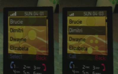
While a lot of the phone is moderately true to the functions that a “feature phone” would have, there are a few inconsistencies that crop up. Some of the protagonists’ saved contacts only can be called. Some of the more major characters in the game however, have a wider variety of actions available, so despite looking the same, they don’t actually act the same. Notice the subtle “call” vs “select” buttons in this screenshot. The game is inconsistent in how closely it follows the metaphor, and that’s the problem. If your interface uses a metaphor, be consistent in when you decide to follow it and when you don’t.

Teeny tiny yes and no text
Speaking of, those tiny blue and red words in the real world would correspond to “soft buttons” that are on the phone that would be physically pressed. In GTA IV, there are no such buttons on your phone, and the game doesn’t ever tell the player how to access those functions. The player just needs to use the standard “ok” and “back” buttons on whatever controller they are using (on my PS3 controller that maps to “X” and “O”, respectively). This is good in that the game is keeping some consistent conventions, but a little hint of how to access each function would go a long way. Especially when the game is stepping outside the expectations set by the metaphor.
Accessing Multiplayer…From the Phone?


Thanks for the tip
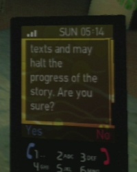
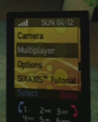
Probably the biggest way GTA IV breaks the cell phone metaphor is by the inclusion of a “multiplayer” option. The game even realizes how ridiculous this is by posting up an obvious note when the option is highlighted telling you what this does. Clearly, this is not something you’d expect to see on a mobile phone, and it’s something that I’d guess takes 100% of gamers by surprise. If your interface does something that every one of its users will think is weird, that may be a red flag.
The problem here is caused by a great decision made elsewhere in the game - GTA IV doesn’t have a proper start menu. That’s right, as soon as the player turns on the game, they are dumped right into the city streets. This is really great, because start screens are usually a waste of time. As a result though, multiplayer doesn’t have a good home. A less weird choice would have been to use the pause menu, although possibly less discoverable, I’m not sure.
Another strange choice was to put a link to the Sixaxis tutorial on the mobile phone as well. This option takes gamers into a short tutorial where they are introduced to how motion control is used in the game. There is definitely a “controls” screen in the pause menu - that would have been a much more logical place to put it.
Recap
Despite the implementation flaws, the cell phone concept in GTA IV is still pretty cool. You can dial various numbers you see around the city, or even call 911 and have the fire department show up (to steal their fire truck, obviously!) The series has basically defined the open-world genre, and a mobile phone is a reasonable inclusion. It’s just that when parts of the metaphor (like setting your own ringtone) are so carefully thought after, other parts that are lackluster can be really annoying.
Metaphors are hard to implement in a UI precisely because people have real-world expectations already. If the interface is new, users will have to learn it, and we try to make that process not too painful. But when a user already knows how to use an interface, and then the system proves them wrong because their expectations don’t quite match up…that can be even more frustrating than learning something entirely new.
There’s a big difference between “I’m learning something brand new” and “I’m relearning this system’s version of something I already know”!