Skyrim: Four Quick Thoughts on the UI's Usability

I’m finally getting around to playing The Elder Scrolls V: Skyrim. I know, where have I been, right? Nearly all of my friends across the gaming spectrum have taken their vacation into Tamriel and are back again, so I’m a little late to the party. But for a game that’s won so many Game of the Year honors, it’s better late than never.
I’ve just gotten a handful of hours into Skyrim on the XBox 360 so far, and I’m already noticing a few questionable usability decisions. I mean, it’s definitely sexy, but the game has a whole mod (SkyUI) dedicated to fixing its menu system - that’s not a great sign. I’ve got four little complaints already, so without further ado…
Units, Always Use Units!!
This is one of life’s golden rules that I first learned not from anything design-related, but actually from high school Chemistry. It’s that you should always label your values. A number doesn’t mean anything unless you know what kind of unit it’s expressing.
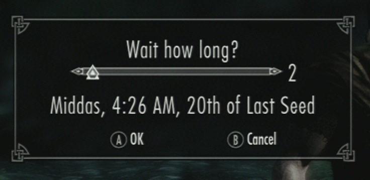
Skyrim’s wait screen (where you’re waiting intentionally as opposed to a loading screen) asks the player how long they want to wait, but never bother to put in that you’re waiting in “hours”:

Sure, what else would you be waiting in other than hours? 2 minutes seems ridiculous as does 2 days. But when you’ve got things like “Middas” and “20th of Last Seed” on the screen, it’s not a given. I definitely paused (briefly) when I saw this the first time and had to consider what was about to happen. Just put units on your numbers, it’s good for everybody.
My Name is Mark, and I’m a Hoarder
I’ll admit it - I’m a bit of a hoarder when it comes to RPGs. I complained about limited inventory size in Borderlands 2 on the site before, and I had similar problems with The Witcher 2 and Diablo III. Even though I usually avoid crafting mechanics in games, I still feel the need to pick up everything I can (this might contribute to why I’m progressing so slowly in Skyrim!) This means I’m constantly carrying over my 300 pound weight limit, and I’ve got to go through my inventory to clear things out.
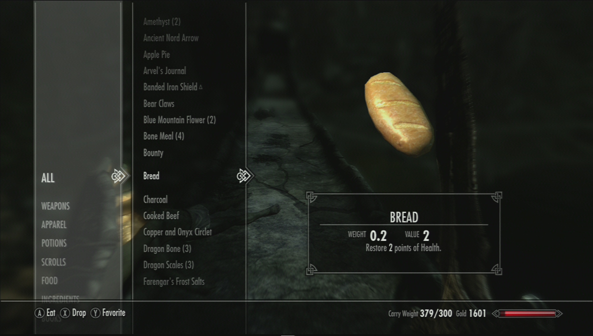
Unfortunately, Skyrim doesn’t give me any good way to do that. Much like cleaning out your email inbox when it’s reaching the limit, usually the best strategy is to find the biggest, least valuable things, and drop them. While Outlook is pretty good at sorting by size, that’s not an option in Skyrim.

Notice in this screenshot that I’m a good 79 pounds over the limit, and all Skyrim gives me is an alphabetical list of inventory items, with no indication what any item’s weight is until I point at it. Not helpful.
For the PC-based Skyrim users, this is something that SkyUI has covered - it turns the inventory into a table, making each item’s weight visible at the same time.
Inexplicably Difficult Follower Trading
During your time in Skyrim, the player can choose a “follower” to fight along with on the journey. In addition to being a meat shield, one of the more handy things they can do is carry your stuff for you (see previous topic on having too much stuff). And while you can’t explicitly tell your followers to equip items, the AI will try to make good decisions for what to use.
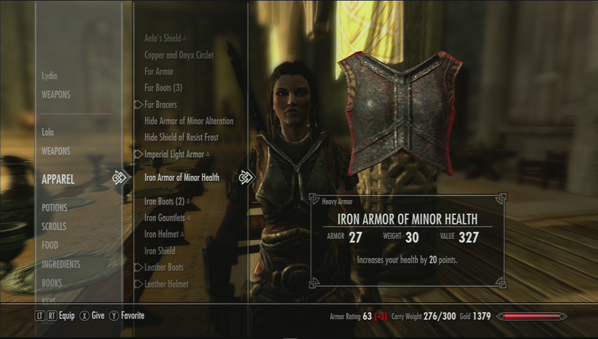
Here’s the screen used to trade with your followers:

In the left-most column, you can see my follower’s inventory (Lydia) listed on top of my items (Lola). This means there’s no way to directly compare your items with what your follower has - and in fact, it’s downright inconvenient to back out of the menu you’re in and scroll up to see what your friend has.
Speaking of the follower screen, Skyrim also doesn’t give you much of a hint that your follower is running out of storage space until he or she can’t hold any more. If something in your inventory is too heavy for your follower to carry, it is grayed out. Although on one hand, I would definitely appreciate the chance to see exactly where I stand, on the other hand it is information that I probably don’t need most of the time. An interesting tradeoff, although in a heavy RPG like this, I’d prefer to have more information than too little.
Back Back Back Back Back….
One more quick nitpick…menus on the XBox 360 (and PS3 too) are usually pretty standard. The “A” button is progress/enter, and “B” is go back/return. No problem. But for some reason, Skyrim elected to take the Back button really seriously. Regardless of how deep you are in any menu, the B button returns you all the way out to the game. Well…most of the time anyway. Some menus don’t work that way (if you’re viewing the map from the quest menu), which makes it even worse. This is super annoying.
I actually do appreciate the idea here, as you can get pretty deep in menus and having an immediate escape hatch sounds like a reasonable feature. But it’s not something that I expect, and I use the menus constantly. When something’s been a convention for this long, don’t reinvent the wheel - just meet your users’ expectations.
Conclusion
There is a lot to say about Skyrim, and a lot to say about its UI. Being quite a while after the game’s release though I’m certainly not the first person to talk about it - Eric Schwarz wrote a great article on Gamasutra talking about how ridiculous the skills menu is, along with other UI weirdness. Rock, Paper, Shotgun did a bit of venting about the game’s interface when the game was first released too.
So what do you think of the UI in Skyrim? I’m sure I’ll have more to say as I delve deeper into the business of slaying dragons, but in the meantime I want to know your thoughts! Give me a shout in the comments below!