Quento: When a Title Screen Meets a Tutorial
Title screens and tutorials are both topics that I’ve covered before on thatgame’s(ux). I complained about the epic hand-holding tutorial in Ghost Trick. I wondered if title screens only exist to waste my time, and later declared that intro videos must die. Today I’m offering an example of how to do both of these things right, and even on the same screen.
The mobile game Quento (iTunes link, also quento.com) from Q42 features an exceptionally clever start screen that doesn’t teach the whole game, but it does a wonderful job at introducing the game’s core mechanic to the player. Finally, a game that doesn’t just want us to mindlessly “press start” for no good reason!
Here’s the title screen for Quento:
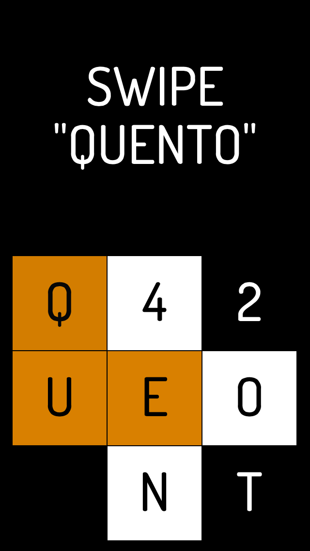
So before getting any information on what the game’s about, the player already knows how to play - how awesome is that? Of course, first time players do get some guidance in the form of a tutorial that progressively builds in complexity, but that’s not the point here. Quento took a potentially useless “tap to start” moment and made it an opportunity to constantly teach and reinforce how the game works.
Martin Kool of Q42 posted a really interesting comment on my last article about Quento, and he mentioned how this feature came about:
“This implementation followed after the initial feedback that -without something like this- you needed a person so tell you for the first time what to do, but not always a person is there to tell you, like when you simply download the game from an app store.”
Added bonus points: each level in Quento has a different vibrantly-colored background, and the colors that flash up on the start screen match the color of the current level. A classy touch.
What if other mobile games had their mechanic on the start screen?
While Quento has a simple enough mechanic that a single word - “swipe” - is all the player needs to hear, not all mobile games have the same luxury. Let’s look at some examples.
Puzzle Craft
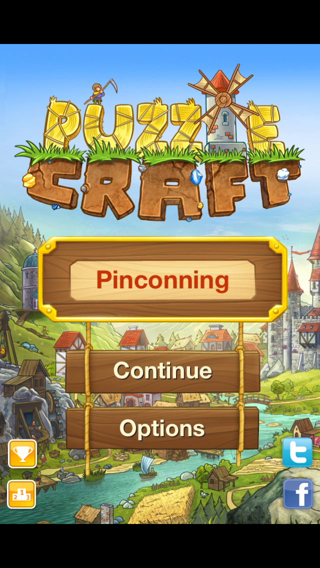
It’s a match-3 style kingdom builder mashup. Thankfully this is a title screen you don’t see very often, because most of the time you’re popped right into your town. Anyway it wouldn’t be too far-fetched to have a simple match-3 sort of screen here, where the player has to swipe a finger across three pieces of wood or something. However, that’s not a great representation of what it’s actually like to play the game, so it might end up being a little bit weird.
Spaceteam
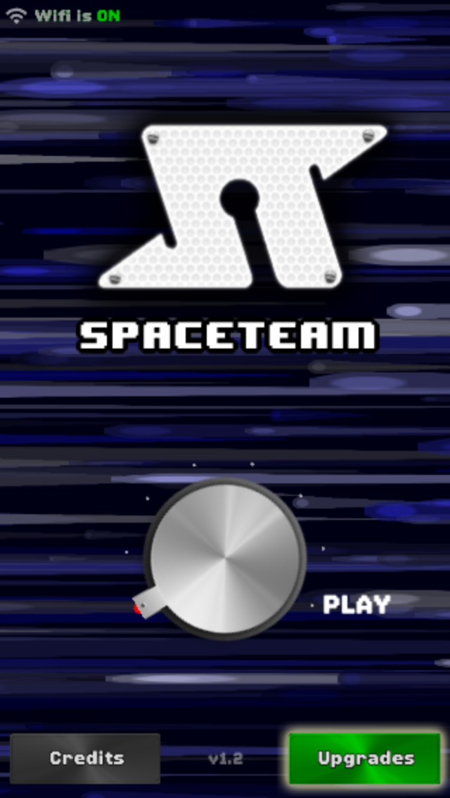
Spaceteam (iTunes link) is a “cooperative party game” for iOS that is in the same family as the Artemis Spaceship Bridge Simulator. If you haven’t played it, it’s a bunch of yelling at other people in the room to press buttons, flip switches, and turn dials on their phones (and it’s awesome). It does have a start screen that features some game mechanics though - the player has to twist that dial all the way to play before the game fires up. As the dial turns, the background gets more intense too, matching the game’s intensity. Good stuff.
SimCity
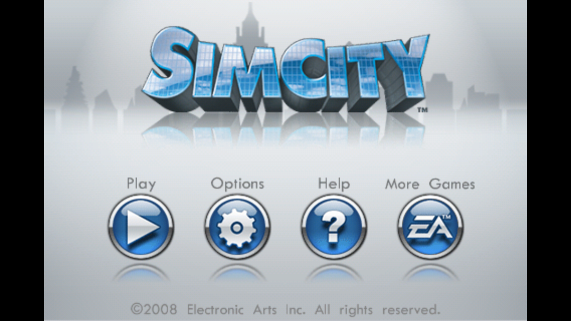
So pretty clearly, I think a “start” button is the right choice for a complicated game like this. But it’s a fun design challenge, what kind of mechanic could you use to indicate you want to start a game of SimCity? Maybe connecting two points with power lines? Power lines aren’t as critical as roads are in SimCity, though connecting two roads with another road isn’t super exciting.
Angry Birds
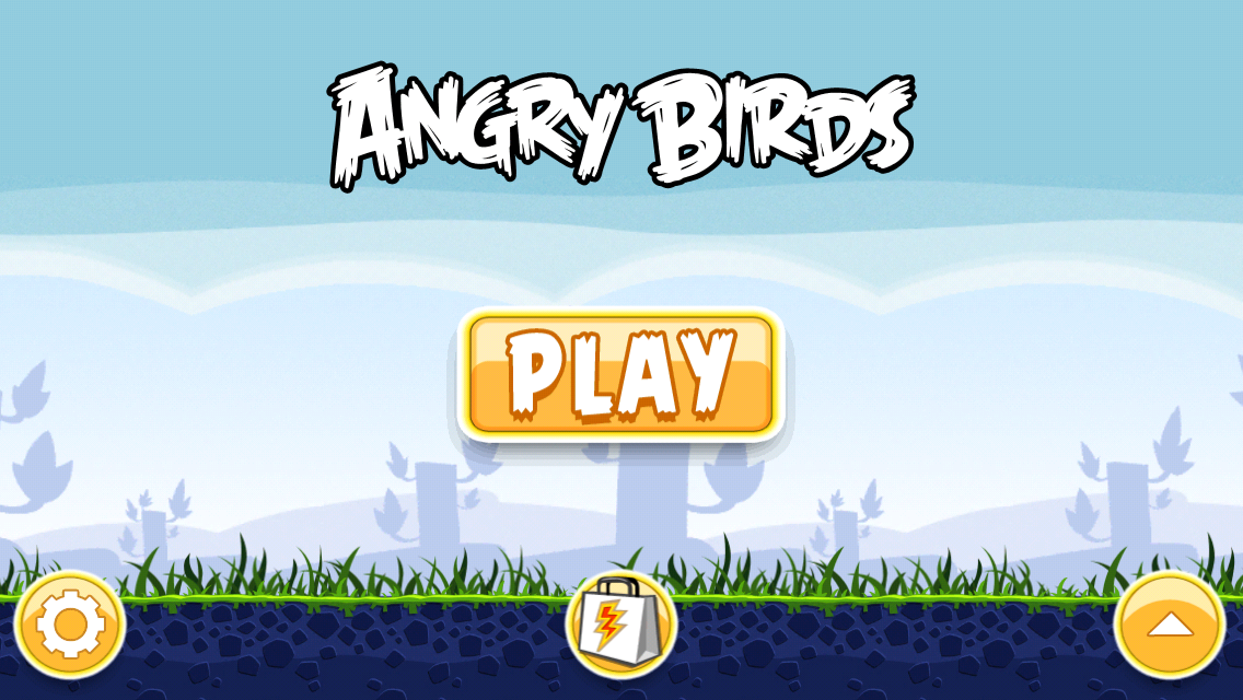
How cool would it be if instead of the big, easy to hit, boring “play” button, you actually had to fling a bird into something to get started with Angry Birds? It might be amazing. But, if it requires some skill to even fire up the game, that’s probably a bad thing. I’m also not sure if the concept of slingshotting an Angry Bird is quite as universal as the concept of “swipe” (most likely, learned every time you unlock your phone).
Fruit Ninja
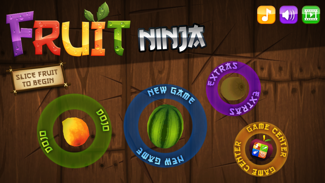
This is the best example of a game that teaches its mechanic on the start screen that I can think of. It’s a simple fruit-slice that’s displayed on a small piece of text as well as a quick animation to show users the way. And man is it satisfying to cut a watermelon in half with your finger!
Conclusion
If you can use your title screen to do something more than annoy or slow down users, it’s a good thing. Quento is a perfect example of giving users a little insight into the game as soon as possible. And it even helps reinforce how the title is spelled!
Are there other examples of this that you’ve seen in mobile games? Let me know in the comments!