Quarriors! for iOS: A Brief Usability Review
![]()
Quarriors(from WizKids/MFV) is a “dice-building” board game that’s been adapted to iOS. Board game to digital conversions are becoming more and more common, they offer some unique challenges that purely digital games don’t need to deal with. Not only do they need to make a fun experience, there’s also the need to emulate real-world components in a usable and realistic way.
With that in mind, today I’m going to run through a quick usability review of Quarriors! for iOS. There are four topics that I’d like to point out, and they are…
- Rolling virtual dice
- The GameCenter icon
- Chaotic notifications
- Visible highlights and hidden gestures
Rolling Virtual Dice
Full disclosure here: I love dice. There’s something about the physical-ness of them that is extremely satisfying. The more dice that I can find in a game, the better. Buckets of dice is preferred. So anytime that I have to roll virtual dice, it’s never quite as good as the original. Quarriors! does its best to simulate the dice rolling experience - by showing the player actual, rolling dice like this:
If I was rolling dice in the real world, this is pretty close to what it would look like. On one hand, it’s fun to quickly glance at the die faces to get a peek at what you’ll be getting, as the dice come to rest. On the other hand, it’s not super fun to wait the couple of seconds for this to actually happen. When I’m playing Quarriors!, most of the time I end up just tapping the screen to skip the animation and get right to work doing something with my dice.
What the animation does though, is reinforce the focus of the game. It’s the dice. Even if I end up skipping the (short) animation every time, it’s clear to me that the dice are critical to the game, and I appreciate it being there. That said, I wouldn’t argue if the animation was a little faster, and showing the dice quickly slide from their resting place to the “active” pool would be really sexy.
The GameCenter Multiplayer Icon
On the main screen of Quarriors!, there are two primary buttons for starting a game. The clearly labeled “Local Game”, and a nameless button with a bunch of bubbles.
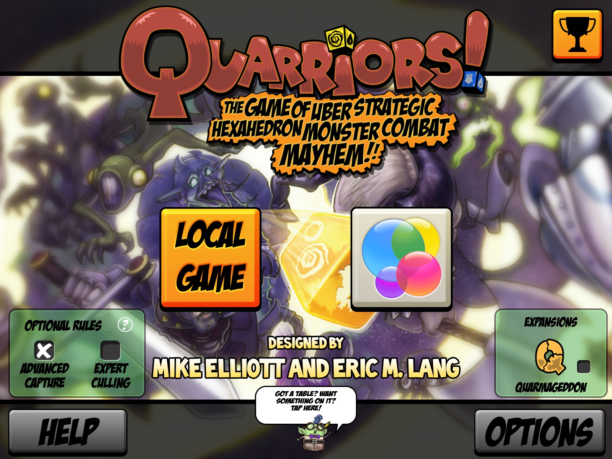
The bubbles, of course, form the icon for GameCenter in iOS 7. Quarriors! uses GameCenter for multiplayer, interface and all. So, that big GameCenter button is for starting an online multiplayer match.
Using icons without words on actions is a sketchy proposition. Some symbols can be either well known or contextually appropriate - a floppy disk for save, or a rightward-pointing arrow for next (in right-to-left languages anyway). But even if users do happen to recognize the GameCenter icon, the service is used for more than just online multiplayer. Adding a small label to the button indicating that it’s for online multiplayer would solve this issue.
Suburbia, another board game ported to iOS, does this exactly:

Chaotic notifications
During each player’s turn, Quarriors! pops up text notifications indicating what the current phase is. It’s useful in directing players as to what they need to do next, or what the state of the computer-controlled opponents turn is. However…I have a couple of issues with the design of these notifications.
First, the game is very “branded” throughout with the use of the same font that’s in the Quarriors! logo. It works well enough as a logo and on the controls, but being all-caps, it’s not great for reading anything longer than a word or two.
In addition to being hard to read, the notifications will show up in one of three spots on the screen - top, middle, or bottom - depending on exactly what phase of the game it is. This results in a lot of all-caps text flashing on the screen that is difficult to follow, and suddenly it’s my turn again. Here’s a sample from an early round in a 4-player game:
If the notifications were in a consistent spot - preferably with an easier-to-read font - it would make it easier to keep track of the game’s state, and feel a little less chaotic.
Visible highlights and hidden gestures
A couple of other small things that I really appreciate. When it comes time to spend your “quiddity” in the game to build your army of dice, the game makes it very clear which creatures you can afford to purchase. There’s a bright orange glow that leaves little doubt as to what’s available:
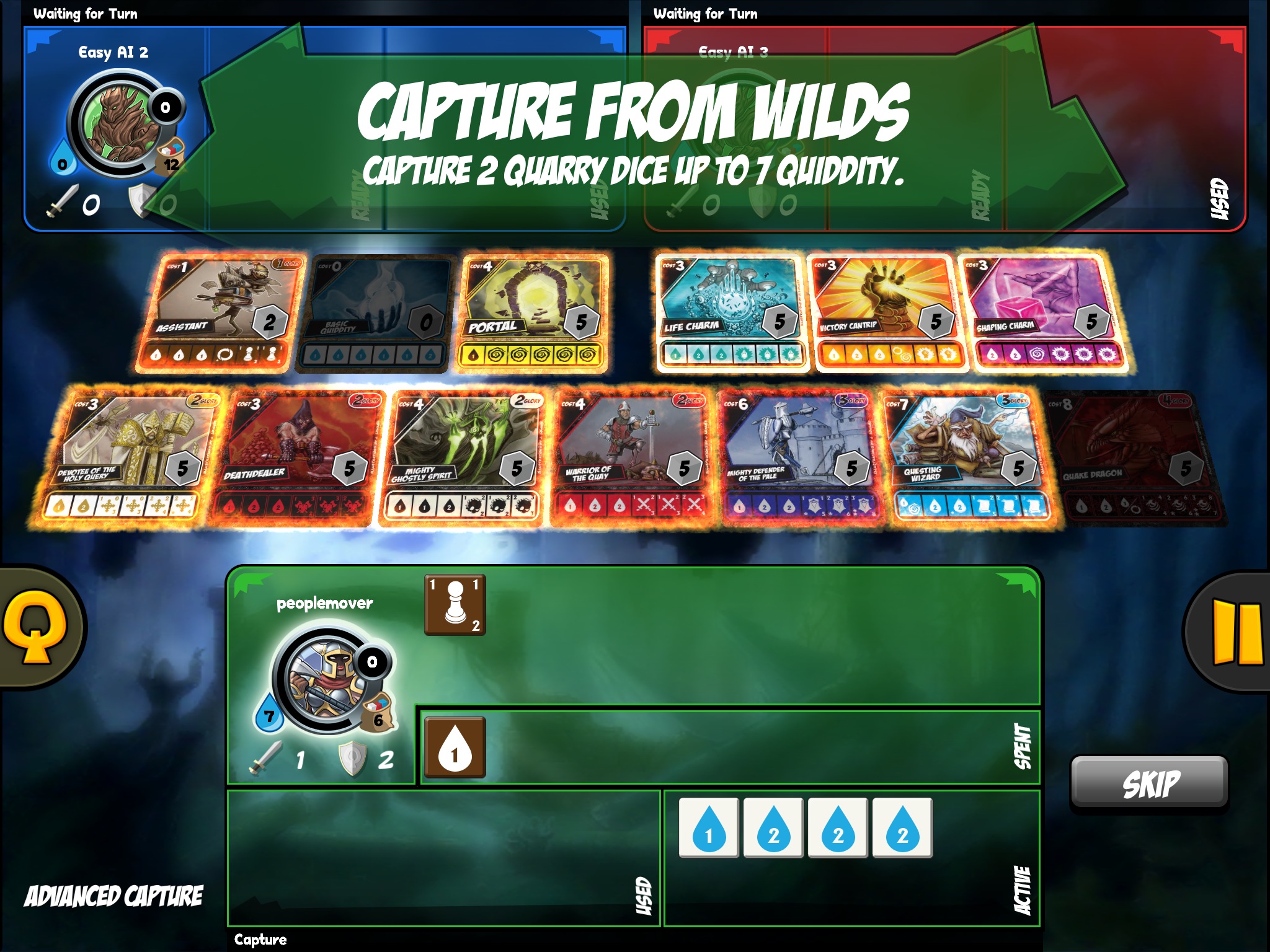
The obvious way to capture these is to tap first on a glowing card, then on the “capture” button. It’s straightforward, no big deal. But the game makes use of a hidden, natural gesture here too - the player can drag from a card onto their dice pool, and that will do the same thing. Quarriors! never points this out explicitly - it’s just an intuitive motion that players will likely soon discover on their own.
Conclusion
Overall, Quarriors! does a lot of things right. There are a few quirks/nits that I have pointed out here, but they are just that. It’s a great implementation of a very physical game in the real world. And it’s way faster to set up.