Puzzle Craft: Good At Killing Time, Not Good At Usability
Puzzle Craft (iTunes link) is a combination match-3 and town-building game out for iOS developed by Ars Thanea and published by Chillingo (owned by EA, but isn’t everybody?). It was released recently to much critical fanfare as a very effective time-killer, and in my brief stint with the game, I can confirm that it’s quite good at passing the time. This casual game dominates at the “just one more turn” trap that many similar games use.
What it’s not good at though, is following a variety of simple good usability practices, and these cause me a fair amount of mental anguish each time I encounter them. Like Joel Spolsky says, it’s the tiny frustrations that can make all the difference in usability, so let’s talk about five of them in more detail below.
The game text isn’t in a consistent location
This was something that bothered me right out of the gate. The game starts off with a tutorial that guides you through the mechanics of the game. I actually thought it railroaded players through without explaining what was happening, but that’s another story.
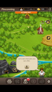
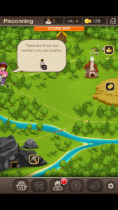
Here’s the problem - all of the game’s text was delivered in the form of little speech bubbles coming from various characters in your village. Cute idea, sure. However, the little people pop in from either the left, right, or bottom of your device - this means you have no idea where the next piece of information is. Considering there’s a fair amount of text happening, I found it irritating to be constantly searching for where the next bit was going to pop in.
Consistency is good, as this UXBooth article discusses. Put your game’s text in the same place every time, and don’t make users search for it.
Tiny targets
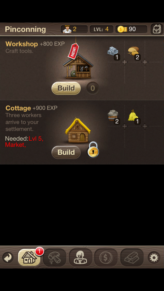
Check out those tiny buttons at the bottom
Apple’s iOS Human Interface Guidelines indicate that touch targets should be a minimum of 44 points x 44 points. The discussion of points these days as it relates to pixel density (“Retina”) screens hurts my head though, so I prefer Nokia’s guidelines which indicate a minimum of 1cm x 1cm (so much easier, right?)
In any case, most of the touchable buttons in Puzzle Craft are nowhere near that size. In my un-scientific testing, the main buttons on the bottom measure in at about .75cm square, and the “back” and “settings” buttons are stretching to get .5cm square! That’s way smaller than recommended, and my average-sized fingers definitely had a difficult time hitting those tiny targets. And the back button is a critical button for getting out of lots of screens, so (unlike settings) it’s not an infrequently used action.
Smashing Magazine has a great article on touch target sizes. Bigger is better, that’s the moral of the story here. And speaking of that “back” button…
Home should be where the house is
In the vast history of GUIs, certain icons have persisted long enough to have more or less universal meaning. Despite the obsolescence of the floppy disk, a button with a floppy on it means “save”. A curved arrow means “refresh”. An arrow to the left, “back”. Even the cloud icon (of which there can only be one) is starting to develop into a universal symbol.

One of the other most popular in my opinion is a house representing “home”. I’m not sure what the history of the home icon is, but it’s at least as old as the pre-Netscape Mosaic browser. So the player has a certain expectation that pressing the home button in Puzzle Craft will take them back to the overview of their town. But it doesn’t. Instead, here the house icon actually means “build”, and you need to press the previously mentioned tiny “back” button to get back to the overview.
There are lots of icons that would have been better suited to this purpose - a saw and hammer perhaps? Or, make the house look more unfinished/under construction. Repurposing a well-ingrained icon like a house only causes confusion.
Unclear active/inactive button states
Something that drives me crazy in all interfaces is when I can’t tell the difference between buttons/actions that are available vs ones that are unavailable. Puzzle Craft might be the worst example of this that I’ve ever seen. Take a look at this cropped set of buttons from the game and take a guess which one is available and which isn’t:
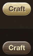
If you’re like me, you’re thinking the dark backgrounded one is available, right? That tan color reminds me a lot of what a gray-ish disabled button would look like. Even if you don’t think so, neither is screaming “click me” very loudly - the two states of this button are not at all clear. It’s only through some context clues (or trial and error) that I discovered that the light colored buttons are in fact the available buttons.
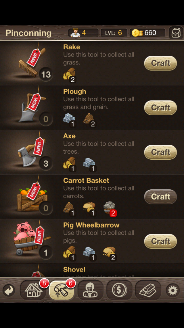
Okay, well maybe that’s not 100% accurate. The dark buttons are technically tappable too…but it indicates that the player doesn’t have the resources for the transaction they’re about to carry out. This kinda makes the whole thing even more confusing actually because it’s trying to convey a lot of information with the color of the button. Inactive button states in UI design aren’t always the best choice, although this implementation at least does give the user some information when the action isn’t available.
The interface even gets less consistent the more you look at it. You can see in the above screenshot that the buttons at the bottom of the screen have a dark background, and are always clickable. Those buttons turn tan when you are on the corresponding screen. So those colors don’t exactly match up in how they are used, making it even more confusing.
Here are the takeaways here: 1) make your unavailable buttons look clearly unavailable, and 2) all buttons that look the same should work the same.
Lack of information when you need it
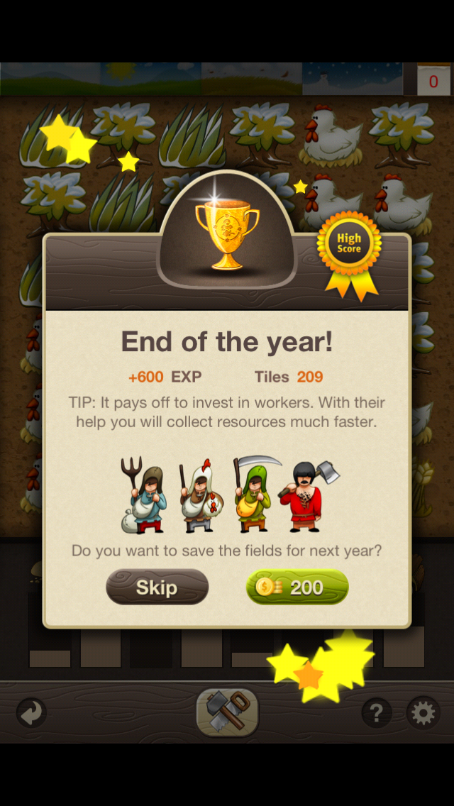
One more. The “puzzle” part of this game is based around the match-3 genre, where the player has to get three of the same tiles in a line in order to collect them. Puzzle Craft gives the player X number of turns in order to make this happen (the number varies based on a bunch fo factors), and at the end, it sometimes prompts the user to pay coins to save the tiles for the next time they play.
Here’s the problem: the modal pop-up window prevents the player from seeing what tiles are actually available. This makes it really hard to make a good decision about if the tiles are worth saving or not. A similar problem - this transaction costs say 100 coins, but the game doesn’t tell the player how many coins they have. If I’m about to buy a soda from a vending machine, if I need to use my last dollar, that’s a big deal. Same thing here, that information is really critical to make a good decision and it’s not available.
So that’s becoming a cliche here on the site, but it’s a big deal - give the user the information they need exactly when they need it.
Conclusion
Regardless of the type of game - from Puzzle Craft to Infinity Blade - usability is very important. The fundamentals of usability are still fundamentals, and the issues I’ve uncovered here certainly aren’t groundbreaking. But still, if you’re building a game that’s as addictive as this one, at least give me the common courtesy of buttons that are big enough for me to press!
