Origin: A Classic Example of the Diagonal Problem
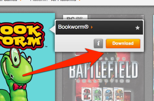
EA’s Origin service launched back in June 2011 as an EA-only version of the Steam digital distribution platform. I haven’t had a lot of need to use it until recently, when the Sim City beta launched (which by the way, I am excessively stoked about). When I fired it up this weekend, I recognized a classic usability problem that I really thought we collectively had defeated already: The Diagonal Problem.
As far as I can tell, Jakob Nielsen coined this term back in a 2009 Alertbox article titled “Mega Menus Work Well for Site Navigation”. The problem can occur in any kind of poorly designed hover menu - when you have a small label that displays a big menu on hover, if the mouse ends up temporarily outside the path of the active item, the menu will close.
Here, I recorded a short video of the situation in Origin…
It’s not a deal-breaker, but man it’s irritating when you can’t get to a hover menu before it goes away. Origin has a serious case of the Diagonal Problem too, because the hover target (the giant game image) is so massive. To succeed in navigating the menu, you must be careful to guide the mouse over just the right path, and that only happens after three or four failures.
It’s even more irritating because there are a variety of ways to at least help the problem if not totally solve it. This UXMovement article called “Why Hover Menus Do More Harm Than Good” offers three different takes on a solution, and all of them involve clicking on the item to show the menu. That would work in Origin, although if you’re covering up other games with the menu, that might get a little annoying.
Another suggestion in the UXMovement article is to have the menu expand on click. This would be great in Origin - I’m thinking something like the new Google Image Search layout. Clicking on a game image would expand the space between games with the hover content.
In the Jakob Nielsen article mentioned above, he suggests to make the hover menu stick around a little bit longer to give users a bit of wiggle room if they are making a diagonal move across the screen. Actually he says this:
“The very best implementations can sense when a user is moving the pointer from the navbar item to a destination within the drop-down” -Jakob Nielsen, Mega Menus Work Well for Site Navigation
So telling a system to “sense” this seems a bit fuzzy, but if you can figure that out more power to you. I suppose you could do some magic to tell if the mouse was headed diagonally towards the hover menu, which would make for one heck of a sexy menu if you got it right.

One final example comes from Steam. Steam bypasses the problem by not having only two items appear on hover, and they appear inside the image itself. One is either “install” or “play”, and the other is “details”. This really breaks it down into the two most important actions that a user could take - either let me play the game, or…anything else I want to do.
Conclusion
I know people have a lot of beef with Origin over much bigger topics than this one. But regardless it’s frustrating to see these small and easily fixable details get overlooked. Hopefully someday the Origin client will get a bit of UI love.
So I haven’t spent a ton of time messing around in Origin; what’s the rest of the interface like? Or, are there other examples of simple usability problems that you see crop up in other interfaces? Let’s talk in the comments!