Numolition: An Exercise in Minimal Mobile Instructions
![]()
Numolition (iTunes Store, Google Play) is a math-y puzzle game from Q42, makers of the previously discussed Quento. For me, it scratches a similar itch as Threes, despite being a very different game. And it has way more explosions.
More to the point though, Numolition makes an effort to get players up to speed with the most minimal amount of instruction possible, which is really cool. There are a couple of places where it might actually border on too little information…but for a game that looks like a well-illustrated comic book, that’s certainly the side of the line you want to be on.
In this article, I’ll take a look at a couple parts of the Numolition UX. And as a bonus, I had the chance to ask some of these questions to Martin Kool, designer of Numolition - so you’ll see his responses sprinkled throughout.
A non-tutorial tutorial
The tutorial in this game is one of my favorite examples of a “non-tutorial tutorial”. This is a term that I use to describe games that funnel players through a tutorial in the first few levels, but it’s never acknowledged as a tutorial. More properly, progressive disclosure is likely the right term here.
Anyway, what’s special in Numolition is that the first level of the game doesn’t actually tell the player what the core mechanics are - instead, it demonstrates:
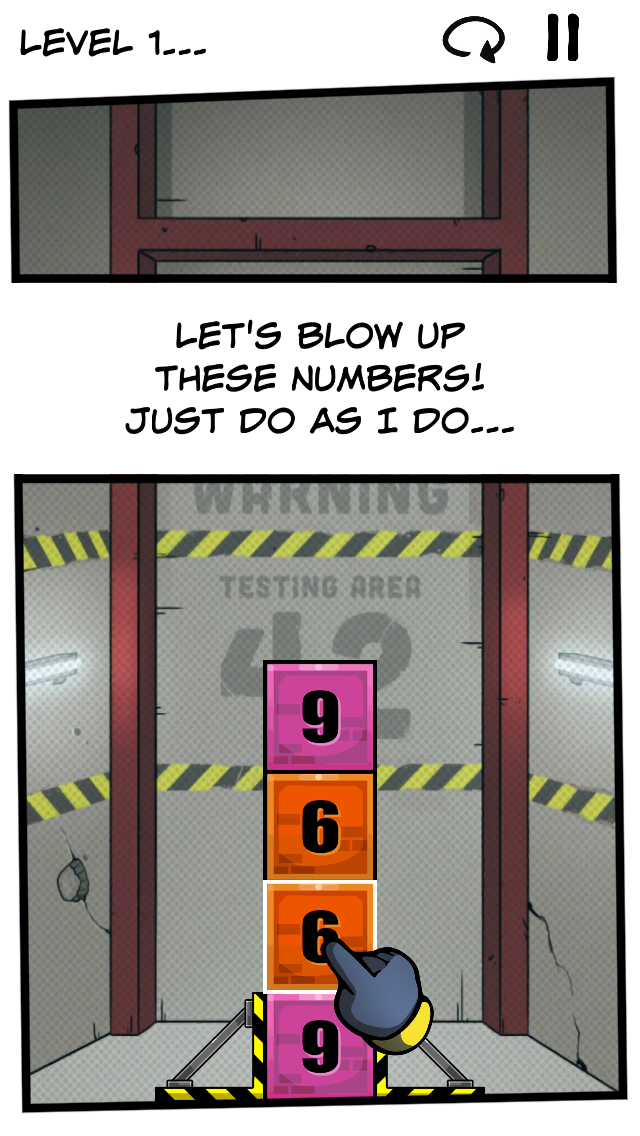
Tapping on the indicated tile will explode the two “6” tiles, and it’s quickly apparent what the point of the game is - to blow up adjacent numbers and thus clear the screen.
It’s interesting how little explanation the player actually gets. I mean, the first level is just “tap here and see what happens”. It seemed a little bit odd to me to kick the game off without any explanation of what it’s actually about, because it feels like the player is just along for the ride at that point - like the game is playing itself. Though at the same time, this is awesome, because I immediately understood how the game worked.
This is one of those things that seems straightforward in retrospect, but coming up with it is challenging. Simplicity is hard! Martin confirmed my suspicion; here’s what he had to say about this first level and associated text:
Ha, yes. That sentence took me about 10 iterations such as “tap two adjacent tiles” and “tap a series of…” and OMG. It just didn’t work. Finally we all decided that the hand was Anique’s hand and she was talking to you. So she could just say “do as I do”. It made total sense, and after two or three levels you get the idea of tapping series of numbers without having to read too much dialog.
Indeed, levels two and three continue to bring the player up to speed with the smallest amount of text:
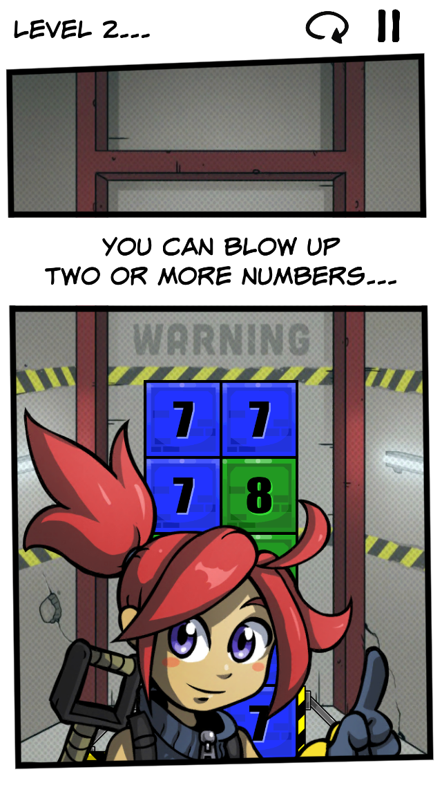
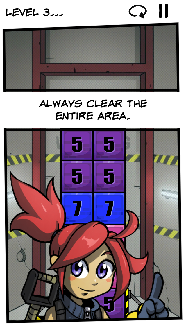
It’s a slow ramp-up for the first few levels, but Numolition keeps adding on new mechanics until the puzzles are quite challenging. The fourth level adds in sliding numbers left and right. The sixth level introduces adding together adjacent numbers. Later on, there are bonus stars for leaving some numbers on the board. The mechanics keep building and building at just the right pace, and from such simple beginnings, the game ends up with a surprising amount of depth.
Pictures that are worth (up to) 1000 words
There are a couple of places in Numolition that might have taken the lack of instructions a little too far. First, it took me a second to figure out what all of the icons meant without text labels. Quiz time: here’s the screen that appears after clearing a level, what do you think each of these buttons will do?
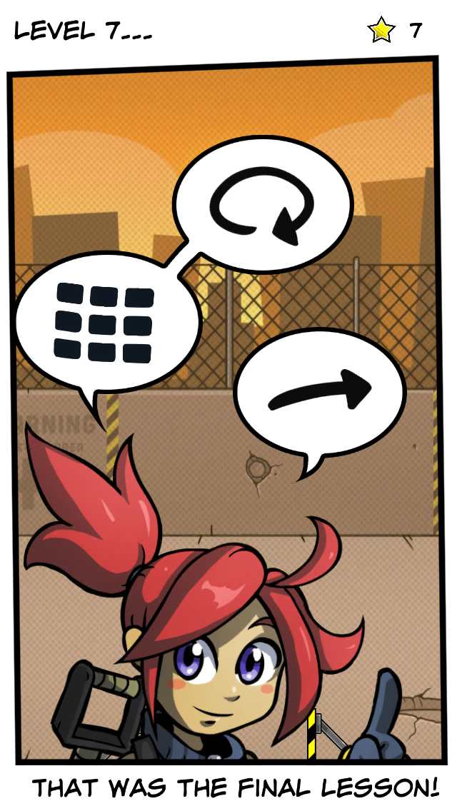
Okay, so the right-pointing arrow and the circle arrow I figured out pretty easily (next and retry, respectively). But the icon on the left, with the 9 blocks? It wasn’t quite as obvious for me that it takes the player back to the “levels” screen, probably because the actual levels screen looks more like a comic book than a panel of TVs:
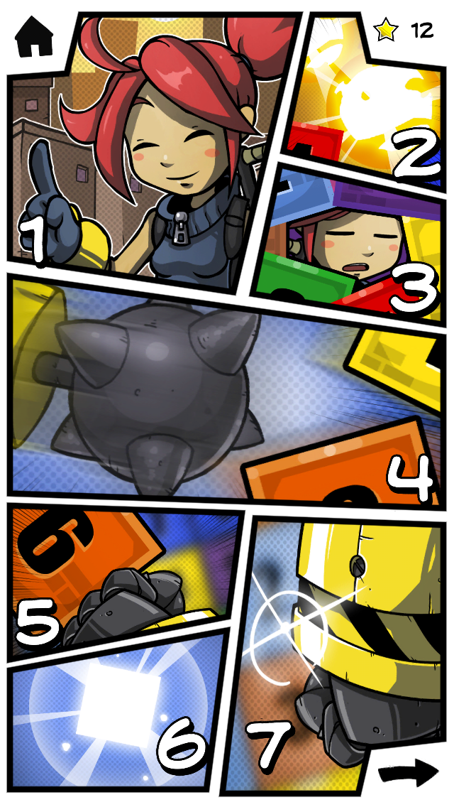
Of course, there are only so many things the levels icon could mean. But it certainly took me an exploratory tap to figure it out.
Martin agrees with me - icons are hard:
Yes, this was a troublesome icon. We first had an arrow back, but it wasn’t “back” similar to where that icon was used on other places. So we went with an icon that was meant to represent the level-selection pages. But I guess there is definitely room for improvement here, so if you have a solid suggestion I’d love to hear it.
I’m curious if an icon that looked more like the levels screen (meaning, having slanted lines and irregular shaped panels) would make the action more or less apparent? It would be an interesting usability study for sure.
Stars burning a hole in my pocket
Throughout the game, the player collects stars used for unlocking more features of the game. Sections that aren’t unlocked are grayed out with a big star on top of them, indicating how many stars are needed. But the game never really indicates if the sections will automatically unlock, or if the player needs to “spend” stars to open a section. See below:
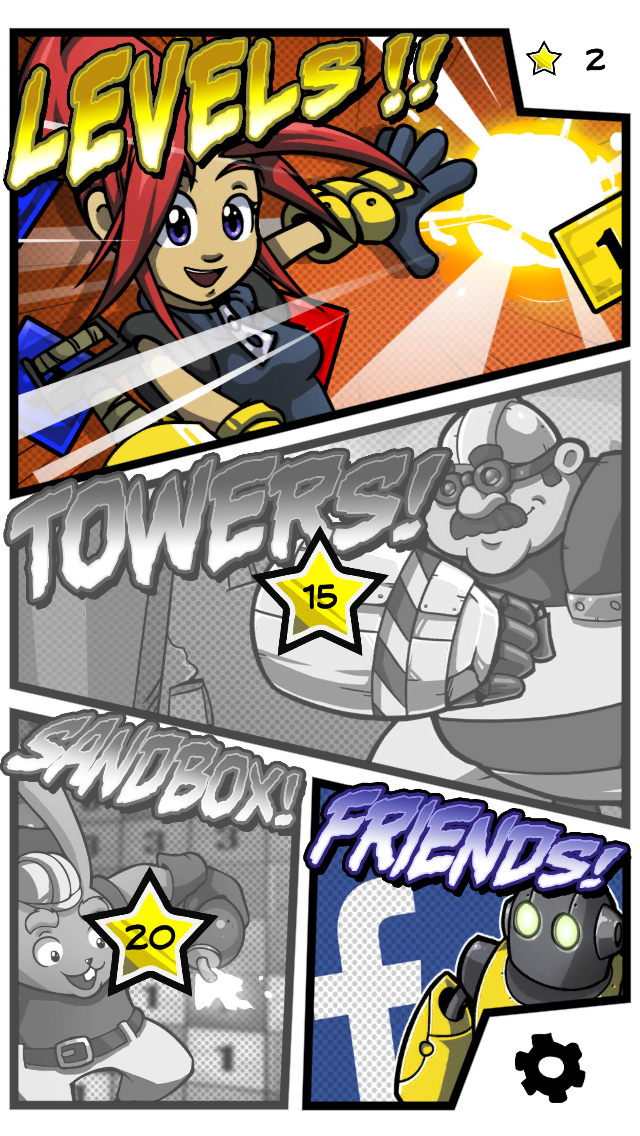
So, I was surprised to see that just tapping on the “Towers” section of the main menu actually spent my stars without any warning or confirmation. I was expecting the opposite, that the section was going to automatically unlock when I hit 15 stars. I didn’t realize that I had 15 already when I tapped on it, and then my stars were gone! Of course, I wouldn’t have spent the stars on anything else, but it was surprising nonetheless.
Martin shared some interesting insight into their development process here:
:) in an earlier version we had exactly that. Reach a certain level and stuff would get unlocked. But the downside was that it took away the feeling of freedom and choice. It was totally linear: reach this, unlock that, reach that, unlock such. Etc.
We then made the weird but still okay-ish choice to make stars be two things at once: rewards, and currency.
As a currency, you were able to spend them in the game, and it would give you an opportunity to choose whether you’d go to sandbox or the first tower. Or use it to skip a level. Or earn them through connecting to facebook, etc. It gives us the freedom to do more things with it eventually, such as add new “campaigns” of levels (each with different new mechanics) that you will be able to purchase with in-game earned stars. As we’re not doing this for financial gain, we don’t gave in app purchases, but getting stars like this finally felt the better choice for us.
– Martin Kool, Q42
Conclusion
Numolition does an excellent job of walking the line in giving the absolute most minimum amount of instructions possible to understand how the game works. I have played through so many game tutorials where I lose patience and try to jump right into the game, and then am confused about how the game works (because I skipped the tutorial), and just stopped playing.
Of course, the downside of this approach is that sometimes it’s not exactly clear what the player is supposed to do. That’s occasionally a problem in Numolition, though the cases noted here are minor. Thankfully, the gameplay is easy to understand, and that’s always the primary goal.
So, are there any other games that you’ve played that are successful in being understandable with minimal text instructions? Or games that have an unnecessarily long tutorial (I’m thinking of Ghost Trick myself with it’s 20+ minute monster intro)? Let’s discuss in the comments below…