Magic 2013 for iOS: Too Many Screens Before the Main Menu
I played a lot of Magic: the Gathering for a few years back in the 1997 range. I spent a fair amount of time and money on the game, but eventually I ran out of people to play with, and that pretty much ended my Magic career. My wallet was thankful, though I always missed playing. Fast forward a few (quite a few) years to 2012 when Magic 2013 for iPad was released. Card games on the iPad seems to be a natural fit, and I was excited to pick it up.
Firing up the app for the first time, I immediately noticed how many screens there are before I could make it to the main menu. A few weeks ago I mentioned how video game intro videos must die, and it’s never been more true here. But it’s not just an intro video - it’s a whole series of screens that are absolutely useless to the user.
Assuming you want to get playing as fast as possible (seems likely?), there are five taps the player needs to make before they finally make it to the main menu, and none of them offer any value. Let’s take a look
Tap 1: Useless Wizards of the Coast logo
The game starts with an animated logo for Wizards of the Coast, creator of Magic: the Gathering. It’s short, but it doesn’t offer any value. It’s standard issue on PC and console titles, and it isn’t crazy to be on an iOS title either. That doesn’t make it any more helpful for a gamer that’s got a limited amount of time to play though.
Tap 2: Useless Stainless Games logo
Stainless Games is the game studio that built the iOS title, and they get their logo on a splash screen too. Again, it only takes a couple of seconds, but the player will see it every time unless they tap the screen to skip it. No value.
Tap 3: Really Useless Game Center Pop-Up

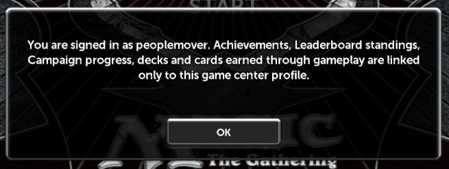
I really don’t understand what this pop-up is about. So it’s telling me that I’m signed in with my Game Center ID? Are there a lot of users that have to deal with multiple Game Center IDs on the same device? The game already uses the default iOS Game Center notification saying “Welcome, [your game center id]” once you finally get to the main menu, so I don’t understand the value of this pop-up. Especially forcing the player to tap OK every single time the game is started; that seems excessive.
Tap 4: My Favorite, the Useless Title Screen
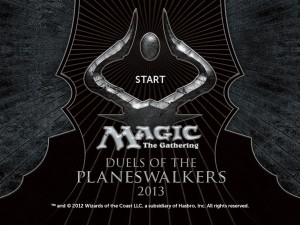
Once you clear the random pop-up, of course, we get a classic “Press Start” screen that has to be skipped through. This is a relatively common practice that has come up before on the site, and it’s super useless here. With a console or PC game, a “demo mode” triggered by sitting on the title screen long enough at least a little more sense than it does with an iOS game.
Tap 5: Really Useless Intro Movie
Once you get past the useless title screen, the expectation is that the user is ready to go, and we finally can reach the main menu - the last hurdle before fun is achieved. But in Magic 2013 for iOS, after this screen an intro movie plays. Who watches an intro movie for a card game? This is another topic that’s come up before (Video Game Intro Videos Must Die), and while I’m all about having cinematics in games, this is a terrible idea on a space-limited tablet, and an even weirder thing for the subject matter (a card game).
When I tried installing Magic 2013 the first time, I had to do a fair amount of cleaning to free up the 1.2 gb required for the game. The intro video alone is 21 mb of that, and it’s included in 9 languages, so that accounts for nearly 200 mb of space! For something that is a) on fixed storage and b) almost certainly never watched because it is only loosely related with actual gameplay, that’s totally not worth it.
Conclusion
All of this happens before the player ever makes it to the main menu, so players are still a couple of screens away from actually having any fun. Compare this with a game like Jetpack Joyride, which starts in one tap, and it’s pretty clear which was designed for mobile consumption. Sure, Magic: the Gathering is designed to be way more in-depth than Jetpack Joyride, so maybe that’s not entirely a valid comparison. In any case, being complicated is no excuse for delaying gamers from actually playing your game, and it wouldn’t hurt my feelings if I could get there a little bit faster.


