Lollipop Chainsaw: The Information Scent of Notifications
The concept of “information scent” is relatively simple: when a user is trying to find some information, they rely on clues in the environment to tell them if a given path is going to be worthwhile (wikipedia link on information scent). This is why link titles in websites are so important - hopefully, that link in the last sentence gives you a very good idea of what’s to come on the other side.
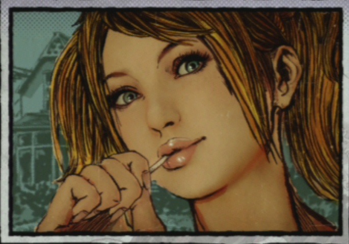
Juliet Starling, our hero
Lollipop Chainsaw is a hack-and-slash title that has the player playing a zombie-killing cheerleader (this makes total sense). While the game’s UI is super stylish in its comic book motif, I’m going to talk about probably the lamest possible part of this game - how it tells the player that there is new content in one of the menus. I know, with so many rainbows, sparkles, and other awesome touches on this game, it’s a bit of a tragedy…but somebody has to do it.
It’s a nitpick about how notifications are a little weird in the game, and a quick discussion on how information scent factors into in the UI of Lollipop Chainsaw.
Like a lot of action hack-and-slash affairs, Lollipop Chainsaw has the player collecting a bunch of things. There are in-game items to collect (lollipops), different skills to learn, costumes to buy, and more. There are many different screens to show your progress, all accessible under the heading of “Juliet’s Stash” in the pause menu.
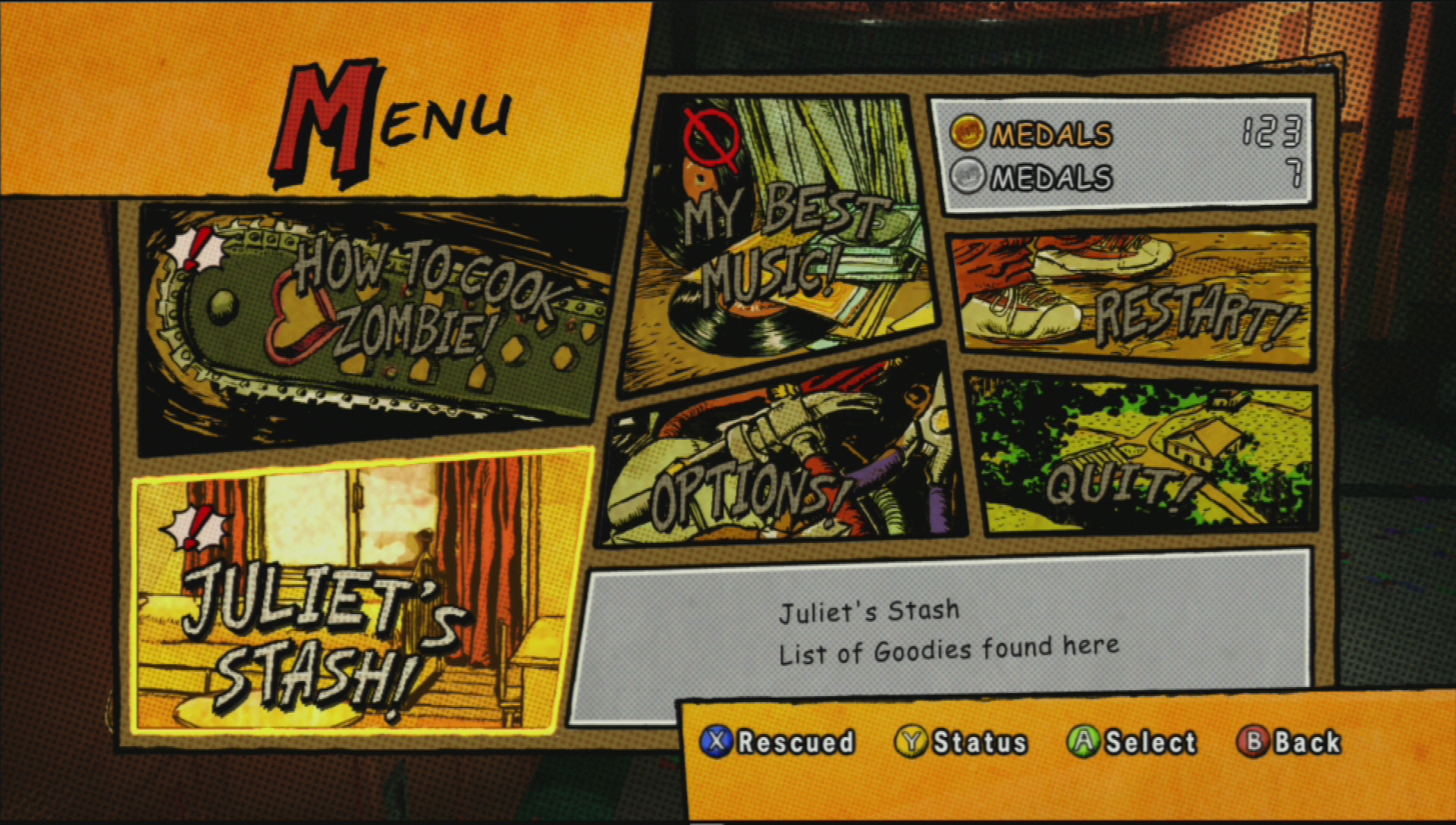
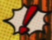
Do you see the little red exclamation icon? That’s how the game tells the player that something new is happening available there. This icon is used very consistently throughout the UI, which is great. It’s quickly etched into the player’s brain what this means.
However, what isn’t so great is how little it helps the player once they take the leap into Juliet’s Stash. After entering Juliet’s Stash from the pause screen, this is what appears:
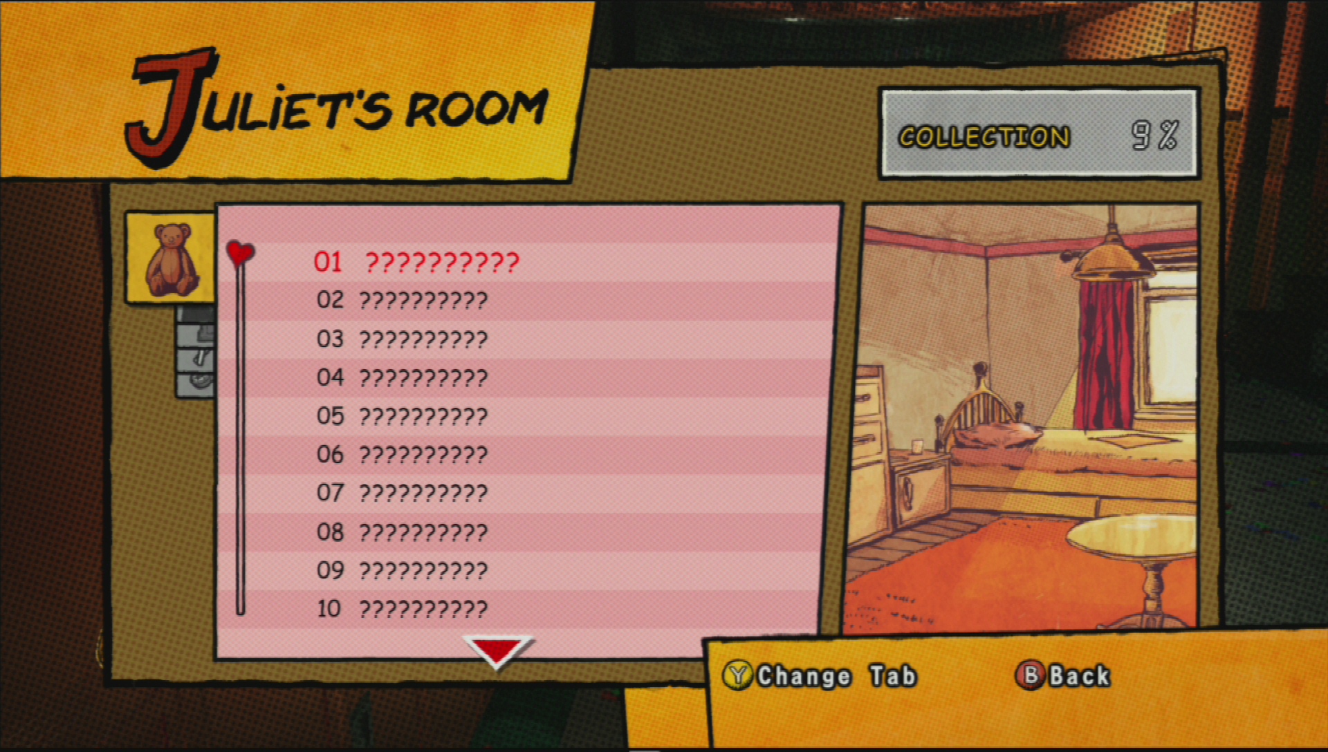
That’s a lot of question marks.
Problem #1: Where am I?
The player is now transported into “Juliet’s Room” - different from “Juliet’s Stash”, which the title would have indicated. Naming quibbles aside, without any description of what this page is about, at first glance the player doesn’t have any way to find out what is supposed to be on this page. I think the page actually aggregates all the unlockable items in the game, although I’m not even sure myself (if anybody knows for sure, please let me know in the comments!).
Problem #2: Where’s the new stuff?
The second problem is despite the notification icon displayed on the pause menu, it’s not immediately visible on this screen. So what’s new? We’ve got to look a little harder to find out. Here’s a quick video of me, scrolling through my list of unlocked items in Juliet’s Room:
There are actually multiple new items on the list, but they aren’t until item #48 and beyond. Also notice how there isn’t any way to acknowledge a new item? I think if you pass over an item it stops being “new”, though it’s not clear.
Problem #3: Cycling through vertical tabs
This one isn’t related to the notification topic, but I just wanted to throw it out there. To cycle through the different tabs in Juliet’s Stash, it’s a one-button press to go forward and back. This is actually a little annoying, because if you miss the page you’re looking for, you’ve got to cycle all the way back through. Okay, it’s not that annoying, but this is a super-simple screen, there’s no reason to not have at least a forward and backward button.
Solutions & Wrapping Up
The information scent given off by the notification exclamation icon in Lollipop Chainsaw is actually quite good. It’s clear to me that something of note is happening behind whatever link or item it’s attached to - it’s not immediately clear that something is new, but that’s quickly learned.
However, getting users to the right place is only half the battle - you still need to hold their hand to direct users to exactly what is important. Jakob Nielsen has a great article on information scent that talks about how important it is to “provide feedback about the current location and how it relates to users’ tasks”.
In the example above, with a list of 120+ collectible items, it makes a lot of sense to give each item its own, unique number - that way if you need help figuring out what say, number 72 is, it’s a lot easier to reference. However greeting users with an array of question marks isn’t a great way to illustrate why the screen exists, much less helping them find what’s new.
A couple of simple solutions - make the first couple of collectible items immediately available. There are always a couple of “gimmies” in any collection, put them at the top and it will help the user figure out what’s going on. Maybe a quick count of how many items are new? Or put a list on the right-hand side that recaps the most recently found items. Any of these suggestions would help ground the user and give them a better handle on exactly what is new on this screen.
This technique is rather basic in any game with collectables (which is pretty much all of them, right). How do other collection-heavy games handle showing the user what new things they have picked up? Let me know in the comments below!