League of Legends: Menu Madness
![]()
This game is easily one of my favorites but its menus leave a lot to be desired. Clunky, ugly, and entirely without a unified vision; these menus are not what you would expect from Riot’s crew.
In-game Shop
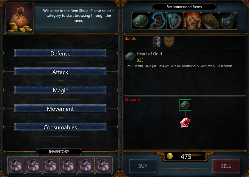
Let’s start where we left off in my last League of Legends article, the in-game shop. Entire matches revolve around this little menu. It has such an impact on the game that it’s hard to forgive its imperfections. 
It has a lot of usable features such as recipe trees and the ability to buy a composite item with partial or no ownership of its components which works beautifully and quickly. The ability to access the shop at all times and even buy when dead is crazy convenient. So it’s not all bad but just try to find an item by name using the clunky/linear button system.
There’s no search and all the sorting options build through a progressive reveal so that you must step down each path. If there are valid reasons for hiding options, they are foreign to me. Is a dropdown or similar control too much to ask for? If I want to jump straight from AD weapons to AP weapons the UI needs to help or gtfo.
All of this could be rendered moot if only the convenience of recommended items was mine to control, at least outside of a match. Maybe even a few named variations for different scenarios. There is a workaround involving custom folders, item codes and .ini files; sounds pretty user friendly, right? Clearly I’m not the only one who thinks that feature would be worthwhile.
Rune Screen
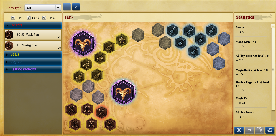
Contrary to my negative remarks, I think the store has a fairly logical design compared to the rune screen. First off, wtf are marks, seals, glyphs, and quintessences and how do they differ? I have yet to identify what makes these things unique or interesting in any way - hell even their coloration is boring pastel (which is at odds with everything else in LoL).
The interface is composed of a highly random crescent of slots with an expanding inventory panel. The items themselves cannot be searched nor purchased from this screen so you can enjoy jumping back and forth each time you’re looking to upgrade. What’s worse is that you cannot sell or trash an owned rune. You can instead combine them (if you find this hidden feature) into other crap runes you don’t want.

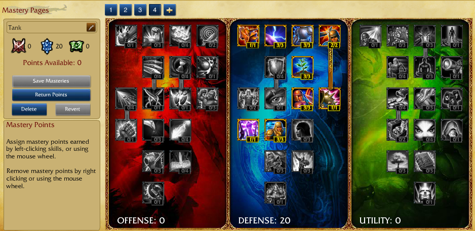
Speaking of hidden features, good luck realizing you can name your rune pages. I stumbled upon it by accident and was more saddened by the design than pleased by the function. The action isn’t even addressed the same way between the rune and mastery pages. They feel completely disjointed and a bit like the work of an amateur, or at best two different teams that failed to communicate a style. As a saving grace you can have multiple pages…so they’ve got that going for them.
Masteries
As I said, I love this game so I’m going to throw them a bone and end on a high note: mastery pages. This is exactly what you expect to see in any modern rpg. There are trees of ‘masteries’ which slightly impact a number of stats. They don’t feel too critical and there’s no cost associated with changing your mind. They feel comfortable. You can make as many as you want and name them what you wish (and it’s actually pretty obvious this time).

What does it all boil down to? Pick a style and stick to it so that your users always know what to expect.