iOOTP 2013: Consistency Wins Championships
![]()
Out of the Park Baseball (from Out of the Park Developments) is a PC-based baseball simulation that started back in 1999. iOOTP 2013 is the most recent iteration of the franchise that was released for iOS in the spring of 2013.
Putting a fully-featured, text-based baseball sim on the screen of a mobile phone is no small task. All the “gameplay” of iOOTP 2013 is essentially done through a series of menus and tables. It’s way closer to Microsoft Excel than Madden Football. It’s complicated for sure, but honestly so is running a baseball team, and that’s kinda the whole point.
When dealing with a big menu structure in your game, website, webapp, TV, ATM machine, car wash, or anywhere else, one of the keys to making it usable is consistency. If whatever the interface is keeps changing on your users, it’s going to be frustrating. And in iOOTP 2013, there are a few places that are frustrating because of needless inconsistency in the menus - let’s take a look.
Inconsistent UI Element #1: Exiting Toolbar Menus
One thing that’s fairly consistent throughout most of the menus in iOOTP 2013 is the toolbar that’s on the bottom of the screen. It contains the current in-game date, along with buttons for “View”, “Action”, and “Back”.

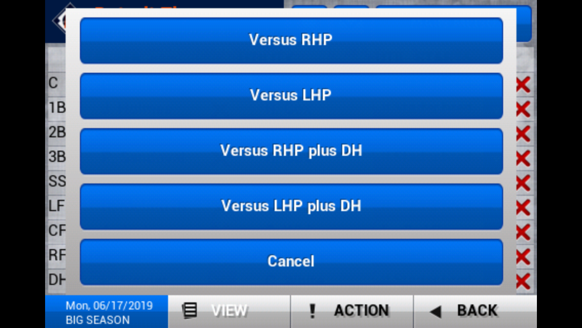
Usually, View acts as a filter, modifying exactly what data is on your screen. If you’re looking at your roster, you’ll use it to show only pitchers, for example. In this screenshot, you can switch between which lineup you’re looking at - not exactly a filter, but it’s close enough:
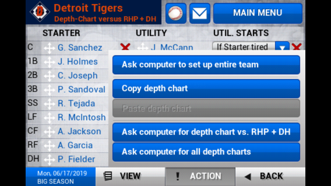
The Action menu holds a variety of, well, actions - like offering a player a contract extension, or in the screenshot below, having the game generate an optimal lineup.
However, the View and Action menus don’t work exactly the same way. In the View screenshot above, you’ll see there is a “Cancel” button at the bottom. In every View menu, the user needs to press the Cancel button to get back to the previous screen. The Action menu doesn’t have such a button - tapping anywhere outside the overlay will make it go away.
I assume the developers here were thinking that the “View” menu covers more of the screen, so it’s more like a pop-up, where the “Action” menu is more menu-like, where it’s a smaller portion of the screen. However, as a user, that’s a very tiny distinction that isn’t important to me, if I even managed to notice it. They are both buttons on the bottom toolbar that I access all the time. If they are going to look this similar, they need to work the same way!
Inconsistent UI Element #2: Back Button Expectations
Also on the toolbar is the “Back” button. Most of the time, this is quite helpful, because it usually takes the user back where they expect. Way back in 1999, Jakob Nielsen declared that ”The Back button is the lifeline of the Web user”. It’s especially helpful in iOOTP 2013, because a wayward horizontal swipe might whisk the user off to some other page.
Unfortunately, sometimes iOOTP deems certain sections of the game to be exempt from the same back behavior. One example is the “League News” section. On the main League News page, a list of news articles appears like so:

Tapping on a headline, of course brings up the full article:

Now, notice the two back buttons on this screen - in the upper left is the back button that works inside the news section. So tapping the upper left back button brings the user back to the main news page. The “normal” back button in the bottom toolbar brings the user to whatever page they were on before the news home page.
I mess this up basically every time I’m on this page, because I use the back button constantly - it’s definitely my lifeline in iOOTP 2013. Other parts of the system have trouble too - occasionally, when using the View menu to switch between pages, the back button won’t take you back there either.
I suppose there are two lessons here then. First, if you’ve got two buttons labeled the same thing (especially “Back”), you’re probably doing something wrong. Second, if the expectation is that the “Back” button in your app takes you to the previous page, don’t try to get creative with what that means by defining different sections of your app that break the rules.
Inconsistent UI Element #3: Paginated vs Scrolling Tables
There are a lot of tables in iOOTP, as to be expected. The odd thing is, they don’t all work the same way. Some of them offer a scroll bar, others have pagination.
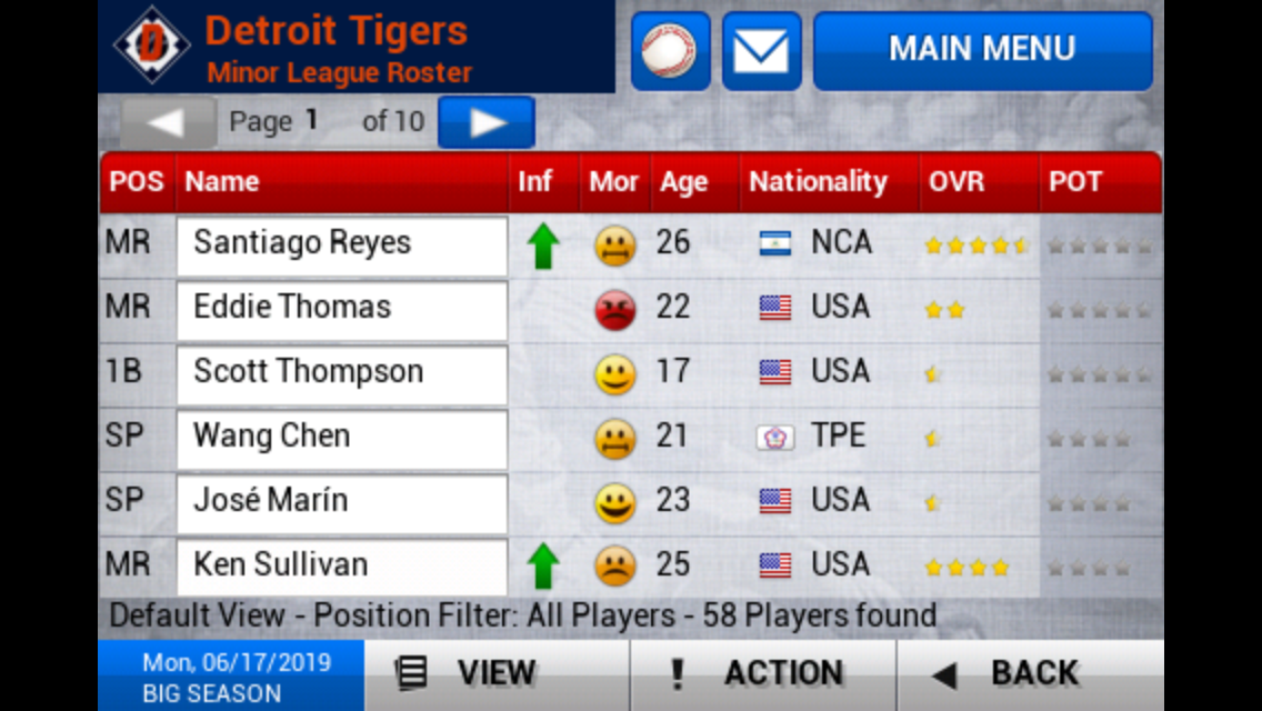
Here’s the screen for my minor league roster:
And here’s the same view for my major league roster:
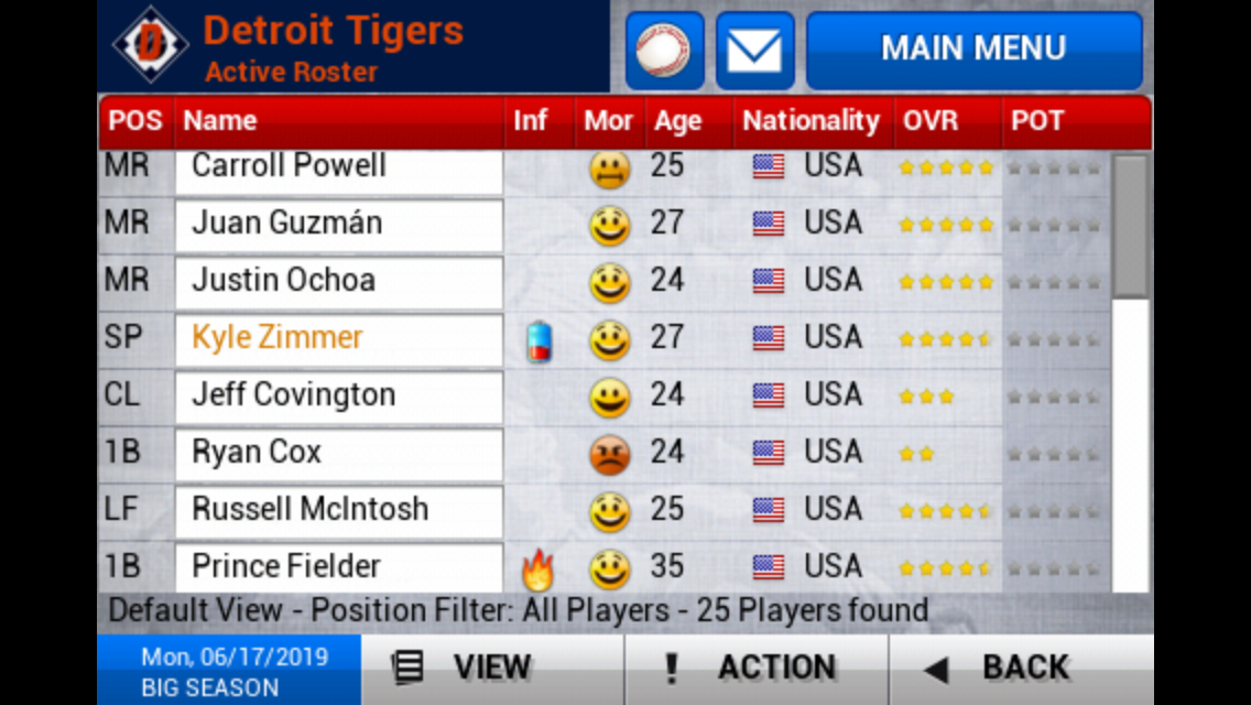
It’s the same set of columns, just one has pagination, and the other scrolls. The difference though, is the number of records displayed. Through some unscientific testing, I’ve found the limit to be about 50 - so if there are more than 50 rows displayed, the game switches to a paginated view. Less than 50, you’ve got scrolling.
At first glance, that distinction might make sense (or at least seem intentional, which is something). But in practice, it’s frustrating. It’s common for me to switch between my major league roster and my minor league roster, and the last thing I’m thinking about is “oh how do I see more people in this table”. Even worse, my minor league roster size is right around the limit - that means, depending on the time of year (before or after the draft), that screen is constantly changing how it works.
I’m guessing this was put into place for some technical reason - loading that many rows at once in a scrollable table just takes too long. Technical constraints aren’t fun for the user, but it’s reality (or the alternative is a slow loading page - also not fun). If there’s some UX concept where pagination is easier to use with large tables, well, I don’t know what it is.
What would improve this situation is to increase the limit to a value that’s outside what normally would be found in a table. If the limit was 100 rows, I wouldn’t notice it nearly as much. Some tables would always be paginated, some would scroll, and that would be that. Consistently inconsistent is something to strive for (how’s that for a t-shirt slogan?).
Conclusion
A baseball sim isn’t the most natural fit for a tiny screen, no doubt (aside: iOOTP 2013 is a universal app, so it’s iPad friendly - I haven’t played it there though because I’d need to start another season…a cloud-based save platform would be really killer here). When you’ve got a complex game/app that’s built for mobile, it’s all the more reason to make sure the interface is consistent. None of these issues above are game-breaking, but they are all solvable problems that would go a long way towards having a polished experience.
What other complex games that suffer from interface inconsistency have you played? Let’s discuss!