Dungeon Raid: We Need Invisible Fingers
After my article on 10000000 for iOS, I got a recommendation to check out a similar iOS title, Dungeon Raid (iTunes link). It’s a tile-matching game that has slightly different gameplay, but a common RPG element put on top. If you ask me, anytime you can solve puzzles and upgrade your weapons, it’s bound to be a good time.
And it is a good time. However…there’s one problem, while not unique to this game, that I’ve found particularly irritating here. The big benefit to touchscreens, of course, is removing that disconnect between you and your content that’s caused by a mouse and keyboard. Unfortunately, not only is your finger significantly bigger than a mouse pointer, it’s also attached to your hand. So when tapping items on the screen, your finger has a nasty habit of covering exactly what you want to look at.
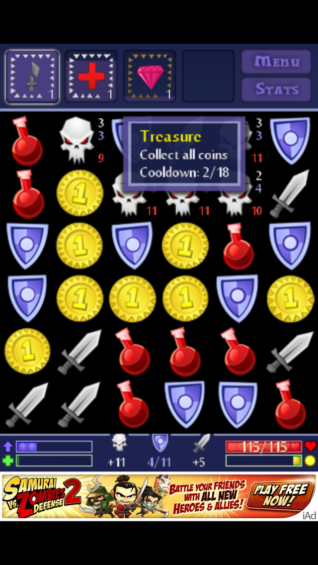
Let’s look at exactly what I’m talking about. Below is a screenshot of the game - the squares at the top represent various abilities that you get throughout the game. If you hold your finger on one of them, it will tell you a brief description of what it does, which is pretty helpful. Each of these abilities has a “cooldown” too, so that’s another important piece of information that’s in this tap-and-hold popup.
That’s the screenshot. Here’s what it looks like in the real world:
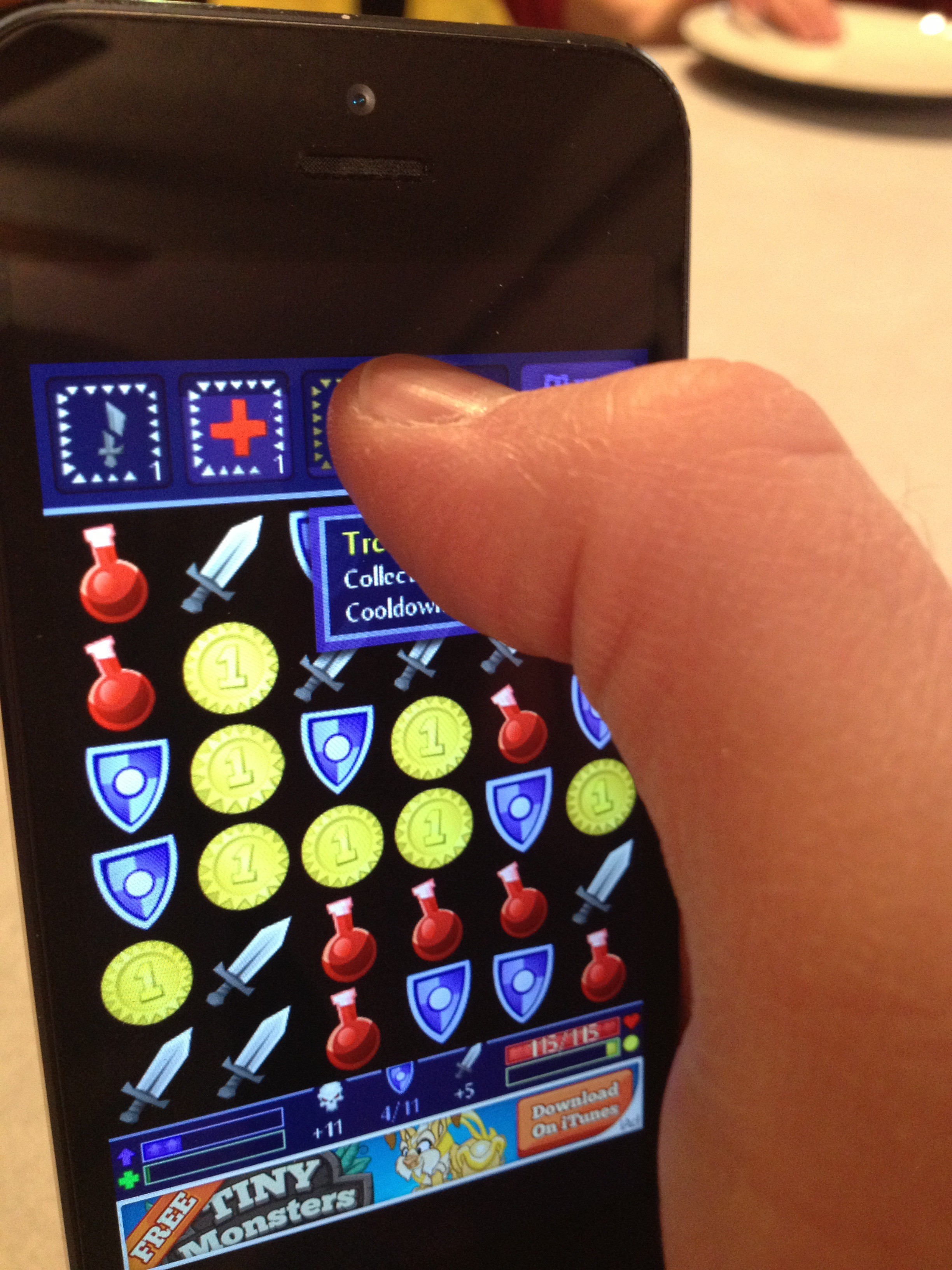
Yeah, it’s a little difficult to read with a thumb in the way. Of course, the natural way to solve this is to awkwardly tilt your phone so you can see under your thumb:
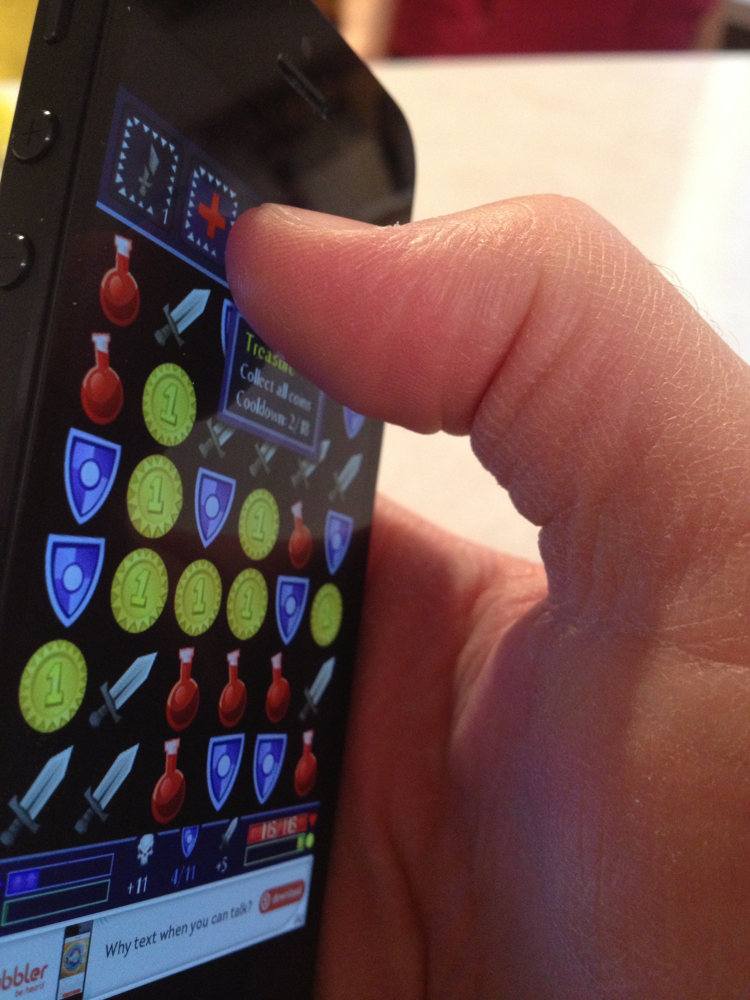
Thankfully, it’s not the only way. If you slide your finger to the right or left, the tip will stay up so you can look at it. As long as you lift up your thumb from somewhere other than the button, it shouldn’t fire that ability. But that’s not exactly the most intuitive (or convenient) solution, and I’m a little curious if that was even done on purpose or not.
I appreciate the game including this important help text. Especially for a casual mobile game, it’s really important for players to be able to remind themselves what the skills do. The icons are good, but not super descriptive, and the cooldown information isn’t displayed anywhere else. So definitely, that information has to exist somehow, and I think having it in a tap-and-hold popup like this is a perfectly reasonable choice.
What are solutions to this problem? Other than having invisible thumbs (which would be pretty great, except maybe if you’re chopping vegetables)? The most obvious one for me is to move the popup to the left or right. Regardless if you’re a righty or lefty, either side would be less obstructed than the bottom. It would be ideal if the interface was flipped - so the bar of skills are on the bottom instead of the top, and the popup could display unobstructed above the icon.
What other solutions are out there; I’m sure I’m missing some? Let me know in the comments below!