Borderlands 2: Thoughts on Usability
In last week’s article, I talked about how the crazy amount of loot and the lack of a good, simple method to compare items can make an otherwise great Borderlands 2 a sluggish inventory-management fest. After a little bit more playtime, I’ve come up with a few more usability related thoughts on this game including:
- Various methods of picking up loot
- How much I love the world map in Borderlands 2
- Scroll bars are your friend
- The skill tree is more focused, but probably less useful
- Some unnecessarily sexy visual effects in the menu screen
Read on to find out more!
Inconsistent methods of picking up loot
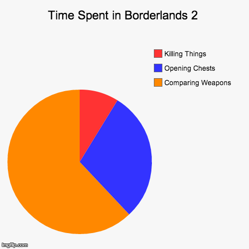
If I had to build a pie chart describing how my time in Borderlands 2 was spent, it would look something like the chart at right. As covered in my previous post (and this exceptionally true Penny Arcade comic), a ton of time in Borderlands 2 is spent managing weapons. And of course, to get all these weapons you have to open a ton of chests, so that’s probably the next most time-consuming task.
Unfortunately, depending on what exactly the player is picking up and where it came from, it’s not always the same procedure. Generally, items to pick up fall into one of three categories: money, ammo, or equipment (weapons, shields, etc). These items can either appear when an enemy is killed, or when a chest/lootable object is opened.
One thing is consistent: to pick up equipment, the player always has to manually pick it up. This makes sense, as inventory space is quite limited. Money and ammo are automatically picked up when it’s dropped from an enemy, however when it’s from a chest, the player has to manually pick it up. It’s a little clunky and a tiny bit inconsistent, although I’d argue not a huge deal.
But let’s think about this - why would it work this way, why is the game forcing players to pick up ammo and money that they almost certainly want? There’s no penalty for having too much money or ammo. In Borderlands 2’s co-op mode, money and ammo are shared, so there’s no “save all the pistol ammo for me” to worry about (this is awesome, BTW). Whenever the player picks up money, a little counter shows up in the lower-right corner of the screen showing how much was picked up, and their current total. Super handy, the game could do the same thing with ammo.
So the best reason I can think of to treat ammo and money differently when it’s in a chest is just “it would be weird”. There’s definitely something to be said about how odd it would be to open a chest and see nothing inside, only some counters popping up in the corners of your screen. Or possibly more weird, the only ammo that would be left in the chest is stuff that you can’t pick up because you’re already full of that type. Is that weird enough to not have automatic ammo and weapon pickup? Apparently Gearbox thinks so.
An accessible and appropriately detailed map!
 ]
]
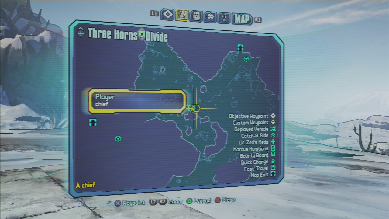
I mentioned the world map of Borderlands (the original) in a recent article about accessing world maps, and I’m happy to see that there hasn’t been much that’s changed in Borderlands 2. I love the map for two reasons:
- You can hold down Select (on the PS3 version anyway) to immediately access the map - no required paging through multiple menu screens, just direct access.
- It’s just detailed enough to be helpful. The maps clearly mark the things you need to see, and ignore landmarks that would just clutter it up.
The locations in Borderlands 2 are mostly wide-open spaces, so the map isn’t critical to success here. But I wish more games (like The Witcher 2 perhaps?) would have a map that works as well as this one does.
This is why we use scroll bars
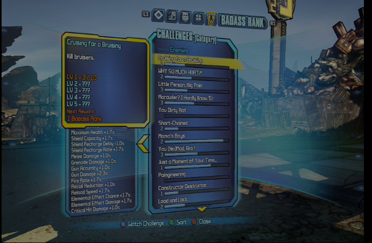
Here’s an interesting quirk. None of the menus in Borderlands 2 feature a scroll bar, so the player really has no idea how big a particular menu is. For example, at right is the list of challenges that improves the player’s Badass Rank. There’s an arrow at the bottom indicating there are more not shown on the screen, but it doesn’t give the player any hint there are 112 total challenges! Scrolling through the list is so epic it’s almost funny. See for yourself:
A slightly unwieldily skill tree
The skill tree in Borderlands 2 hasn’t changed much functionality-wise, but there have definitely been some visual changes. Let’s compare:
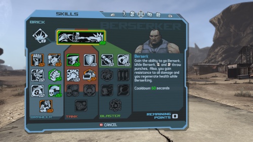
The skill tree from Borderlands 1
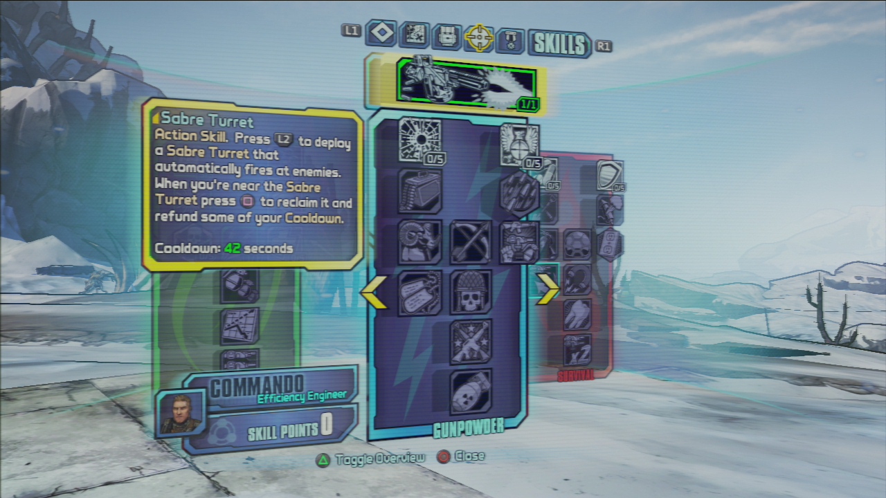
The skill tree from Borderlands 2
In Borderlands 2, you can only see one track at a time, and you have to cycle back and forth between them to check out the skills. There is a “skill tree overview” option that will show everything at once, but it’s not interactive at all.
This change makes it a little bit more difficult to move around through the skill tree. The limited number of skill points makes this screen the site of a lot of tough decisions, and I’d be happier to see all the skills at once to make it a little bit less tedious to plan out my character’s path.
Increased sexiness through rotation
All of these menus discussed above live on a newly 3d-ish curved screen that your character is viewing in the game. You can rotate your view with the right thumbstick, enabling…well not really anything. But you can watch your character watching the menus! (is there an Xzibit “yo dawg” meme in there somewhere?)
So what purpose does this serve? To potentially make the player nauseous? I don’t know. I suppose it’s a chance to view your character’s customized skin. It’s certainly not a usability problem, although I might rather see that right thumbstick used to scroll text instead of the trigger buttons (I screw that up every time!), although I might be the only person to actually try and read that text.
It is definitely sexy though, and it has an added bonus of being even sexier in co-op, because you can see your friends looking at their menu screens. A nifty visual effect for sure.
Conclusion
If I had to give Borderlands 2 a broad general usability grade - I’d say it’s pretty average. The major complaint I have was in the last post, about how there are a ton of guns in Borderlands 2 and not a good way to make an apples-to-apples comparison. Other than that, the menus and other UI elements aren’t complicated because the game isn’t complicated. At least UI-wise, it’s a straightforward title with a little extra polish and flair in its sophomore effort. Nothing wrong with that.
What do you think? Are there some quirks in the UI of Borderlands 2 that I missed? Am I just being too nitpicky and should be singing the praises of this super fun game? The comments are below, use them!
