Borderlands 2: Mission Information When You Need It

In comparison with the original, Borderlands 2 hasn’t changed all that much. Gameplay-wise it’s more of the same, and that’s not necessarily a bad thing. There are definitely a few tweaks in the game’s framework - obviously new classes and skills, 87 bazillion guns, at least one new currency, and a lot more shininess in the UI.
And speaking of the UI - there was one relatively minor change that caught my attention. The Fast Travel Network screen shows players where the missions are that they need to complete right where they need to see it. I really appreciate tiny changes that make big improvements from game to game, and this definitely falls into that category. It’s not a new concept for sure, and it’s even been featured on That Game’s UX before from another game, but it’s still worth celebrating. Read on to find out more!
So let’s get right to it. Borderlands 2 features the “Fast Travel Network”, which teleports players to all kinds of places in the Borderlands universe. It’s way faster than walking. In Borderlands 2, the screen where the player chooses a destination also features missions that are available at that place. Of course, the player has to accept the mission from somewhere else first, but once that happens, it will show up right on the Fast Travel screen indicating the location where that mission can be completed.
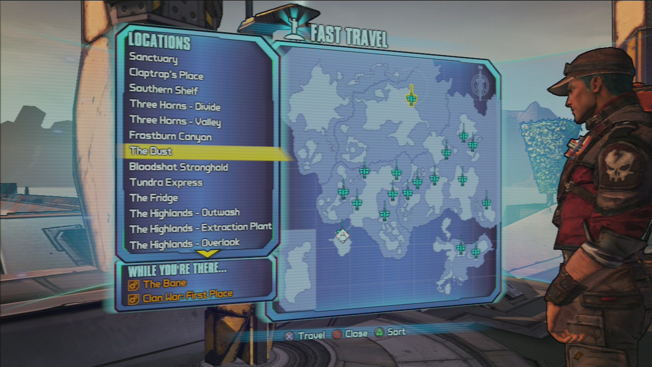
Notice the “While You’re There” section? That shows you missions available at that location
It’s becoming a bit of a theme here on the site - this is information exactly when you need it, and that’s pretty great. Alternatively, the player is forced to open up the status menu, pick a destination, back out of that menu, then return to the fast travel menu. Super inconvenient. But that’s exactly what happened in the first game - hopefully you remembered where you were supposed to go, because there are no reminders here.
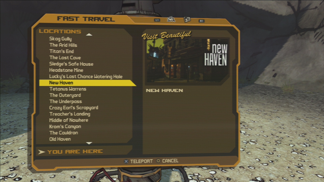
Borderlands 1 Fast Travel screen - notice it doesn’t tell you anything about what is available at that location
Here’s the way that I play Borderlands 2 - whenever I see a side mission is available, I immediately accept it, even if I don’t go take care of it right away. Then when I get a few different quests built up in one area of the map, I’ll go over and finish them all at the same time. It’s just a matter of trying to be more efficient in taking care of missions. Including the mission information on the fast travel screen is a big help to make this happen.
The very first article on That Game’s UX talked about a similar feature introduced in Mass Effect 2 - when browsing Mass Effect 2’s galaxy map, it shows the player what missions are available at each location in the universe. Because of the slow transitions between menus, it was even more irritating in Mass Effect 1, so that was a welcome addition for sure.
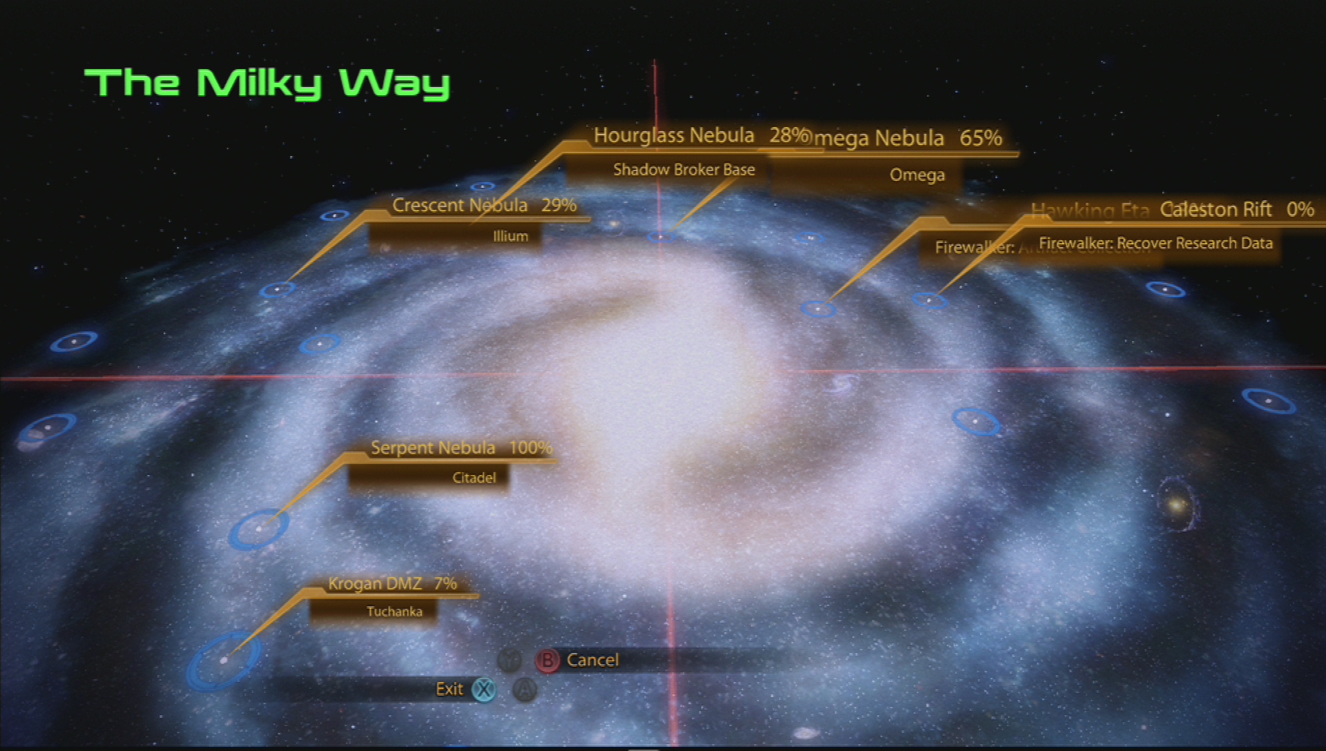
Mass Effect 2’s Galaxy Map
One Step Further
I mentioned how much I enjoy the map in an earlier article on the usability of Borderlands 2, and here’s another reason why. The mission select screen organizes missions by location, which is handy, but within a map the player still probably wants to know which missions are closest to their position. At least I know I do. So it’s pretty easy to figure that out since the mission screen is right next to the map in sequence - highlight a mission, hit L1 (on the PS3 version anyway), and check it out. And since the screens are very responsive (unlike The Witcher 2 as I’ve mentioned before) it is still relatively convenient to do all this screen swapping.
That said, I think it would still be even cooler if you could somehow see all the available missions on the map at one time. Maybe non-active missions could be dimmed out, but still visible? Or would that be too confusing since the player couldn’t easily see what mission that refers to? Possibly. Where’s a user test when we need one, right?
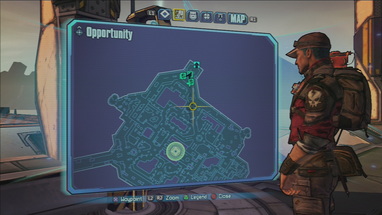
Only the active mission is displayed on the map screen, but it’s pretty easy to toggle between missions
Conclusion
Borderlands 2’s “Fast Travel Network” puts the available missions right where the user needs them - as they are making a decision about where to travel. That makes life a lot easier, and it’s one extra verification that the player is going in the right direction before they endure a lengthy loading screen. There’s nothing worse than sitting for 20 seconds for a level to load, and then figuring out it’s the wrong one. Okay, so maybe there are worse things, but only a couple.
What do you think - have you noticed this feature? Are there games other than Mass Effect 2 and Borderlands 2 that do something similar? Can you think of any more improvements you’d like to see in the mapping system of these kind of big open-world-ish sort of games? Speak your mind in the comments!